Button states provide key information to your users and communicate what’s possible in a user interface. This is how to design them
Buttons are everywhere in user interfaces. They guide users through a user experience and have many functions. We use buttons to save our work, to buy things online and to submit forms. All designers should know the UX impact of button state design.
No doubt you’ve clicked a link in your time so you’ll already have a vague idea of button states. Links, back in the day, used to turn purple when you clicked them. That’s a change of state. This idea translates to buttons.
When a user interacts with a button, it changes state. It’s as if the button were speaking to the user. Button states are a way for the interface design to communicate information to the user.
Let’s find how you can design button states. We’ll cover 3 states: normal, hover and pressed all in Justinmind’s tool. 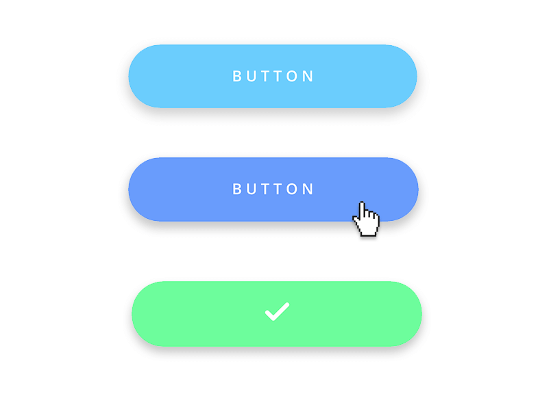
We also have another post about the general guidelines of button design – if you want to learn about buttons in a broader light.
How to design button states in Justinmind
Now we know what button states are, it’s time to prototype our own.
Step one: Download Justinmind
To get started on your own button states, download Justinmind’s UI design tool. Once downloaded, create a new web prototype. There is now an empty canvas in front of you.
Step two: Construct your normal button state
To make our normal button state, drag a rectangle from the widget palette onto the canvas. Adjust the size to your liking. This will form the basis of your button UI design.
Select the rectangle you placed on the canvas. In the Properties tab, you will see the following options:
- General
- Position
- Size
- Background
- Text
- Padding
- Margin
- Border
- Shadow
These options allow us to customize the rectangle that we have placed on the canvas and turn it into a button.
We have made our button 150px by 40px which you can do in the Size property. You can make your button responsive by changing the pixel value into a percentage in the drop-down menu.
Next, let’s round the border so it has a curved edge. In the Border property, give your rectangle a solid border. In the Round field, write a value of 40. Choose your border color, too.
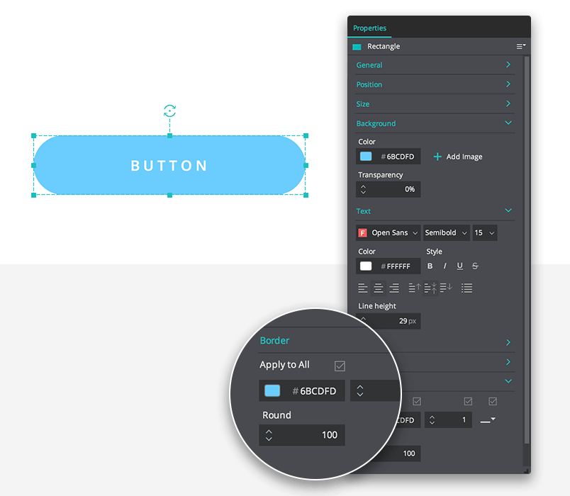
In the General property, you can add button text in the Value field. We’ve written ‘Button’ in our example. Original, we know.
In the Background property, add your own color. Below the Background property is the Text property. Here you can change the color of your text.
Now you have a normal state button.
Step three: Duplicate your button and design their states
We have our base normal state button. It’s our foundation. We can create different states using the wireframe tool Properties tab and the Events tab.
Right click and copy the button you made. Paste it onto the canvas.
Create the hover state
Select the button you pasted on the canvas and click Add Event in the Events palette below. Choose your Trigger in the Dialog. For the hover state choose Mouse > On Mouse Over > Change Style.
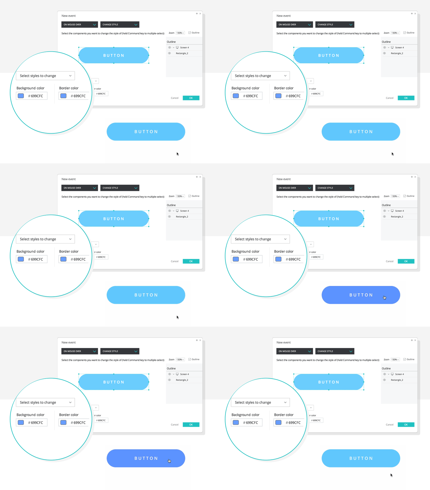
While still in the Dialog, select the button you copied on to the canvas. There is a drop down menu which allows you to select which styles to change. Go to Background > Color. Choose the color you wish the button to change to when the mouse pointer hovers over it. Then click OK.
Now you have a hover state button.
Create the pressed state
Duplicate your hover state button. This time we’re going to add more interaction for the pressed state.
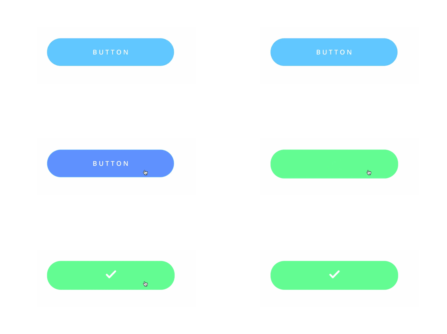
When a user clicks the button, we want to show a loading GIF then have the button turn green and show a tick.
We’ll need a loading GIF and a tick icon to do this. You can get a loading GIF from loading.io. You can create a tick using the line widgets or use an image, it’s your choice. Position these UI elements on top of your button in the middle.
Select your button and click Add Event. In the Dialog, select On Click > Set Value. Click OK. Now in the Events panel, click the gear symbol. Click “Add actions after selected”. Select your loading GIF in the Dialog and select Mouse > On Click > Show.
Now let’s turn the button green. In the tool, add another Event. Select On Click > Change Style. From the drop down menu, select Background and then Color. Change your border color doing the same process. Click OK.
For the last two events, we want to hide the loading GIF and show a tick. To do this add another Event, select the loading GIF and choose On Click > Hide. Next select your tick from the Outline panel in the Dialog and choose On Click > Show. Click OK.
In your Events palette, you’ll have 5 interactions, as shown above. Between them are 4 diamond icons which set the sequence of the interaction. Every interaction, except the second one, should be set to “With previous”. The second should be set to “Time after previous started”. Set the time to 500 milliseconds.
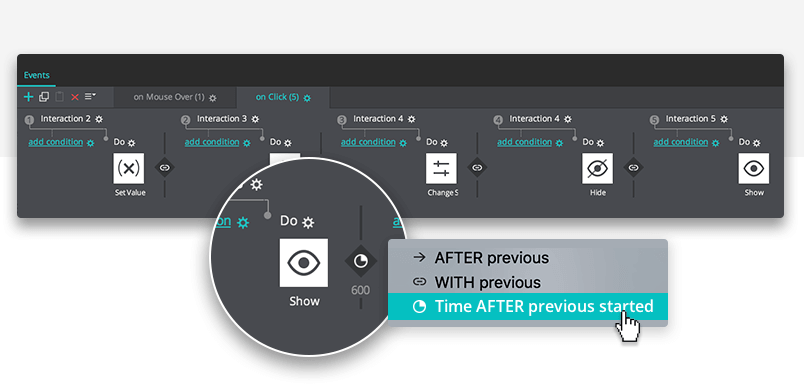
Simulate your prototype. Click the button and it should display a loading GIF, change color and display a tick.
Best practices for designing button states
There are a few pointers you can learn so your button states follow convention. In Dan Saffer’s book Microinteractions: Designing with Details, Don Norman writes, “Microinteractions are about the critical details that make the difference between a friendly experience and traumatic anxiety.”
We don’t want to make our users anxious. We want to create a user experience that is painless and effortless. Sound button design is even more important in data-heavy products, such as dashboard design. Here are 3 best practices to follow when you design your own buttons and their interactions:
Make it look like a button
It may sound obvious, but there are websites with buttons that look nothing like buttons. Users shouldn’t have to click the button to see if it is a button. They shouldn’t hover over it to find out either.
On a desktop, users expect hover states. But there are times when hover states would be useless. They are redundant on mobile devices, for example. UI designers have to build UI elements in a way that they afford clickable behavior from the user. It’s also important to have the button fit in with the broad visual hierarchy of the screen.
How do you make something look like a button? Use bold colors. Make it button-shaped. A button should stand out from the other UI elements on the screen. If it blends in, users won’t recognize it as a button. Read more about accessibility design in our post.
Use text instead of icons
Icons are very helpful because it’s easier for us to recognize an image than process language. But not everyone interprets icons in the same way. There is no current standardization for icon usage. It’s a user’s previous experience that informs their understanding of an icon. Use text labels for clarity. If you forego a text label, it’s imperative to add a tooltip so that people can still find out what the button does.
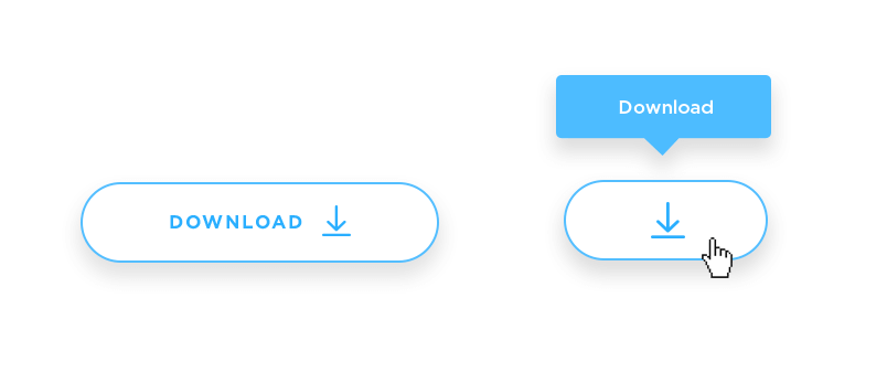
Most people understand a danger sign. But a button with a lock icon? What does that mean? Save? Share? Secure? Encrypted? Who knows. If you do use an icon, pair it with text. This technique is used frequently in long forms, such as surveys. Check out how it works in our research survey examples post.
Write strong verbs to compel the user to action
With buttons, use action specific language. Verbs work better. Your button text should be concise. Buttons have limited space so it’s not the time to bring out your inner poet.
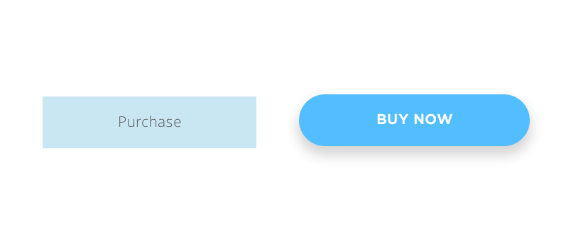
Strong and short verbs like “Share”, “Buy”, “Install now”, “Start” are preferable. They’re direct, understandable and compel the user to action.
How to design button states – the takeaway
Button states communicate. They give the user information that empowers them to make a decision or complete an action. Follow these conventions so that your button is recognized and used.
If your button looks like a button and acts like a button then your users won’t experience confusion. Button states help prevent any confusion and provide the clarity your users deserve. Want to push your button design even further? Check our our post on neumorphism and see if your buttons could use this trendy style!
Related Content
 Why should you use user personas and how do you create them? Get all the steps to build one, as well as a great example and a list of user persona generators!15 min Read
 UX design books that cover everything from layout design to the theory of user testing. Want to expand your horizons? Check out this awesome list!9 min Read
 UX design portfolios are your chance to showcase your top skills and best work. Check out this post for awesome portfolio examples and websites!10 min Read


