Justinmind 10.2 is here with SSO, a new Figma plugin and other major improvements
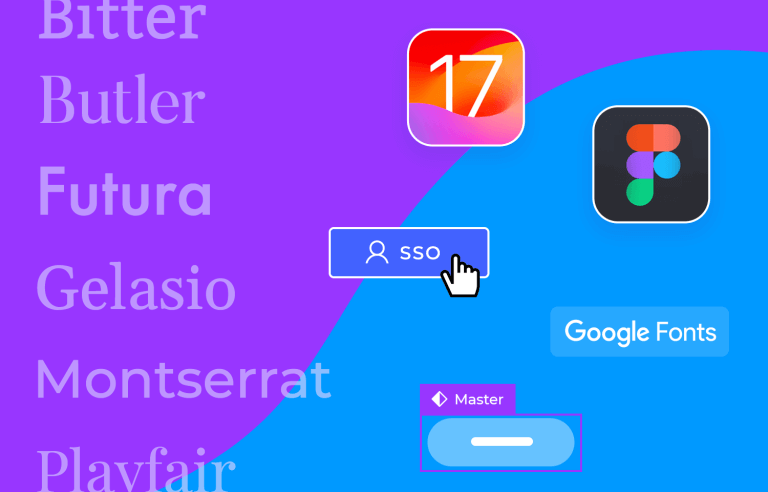
This new version of Justinmind includes new native iPhone devices and a new and updated iOS library, as well as an improved Masters experience. You’ll also find new features, including a new Figma plugin, Single Sign-On and new way to manage your fonts to make your workday more efficient and intuitive.
Try free Justinmind 10.2!Start designing and prototyping mobile apps

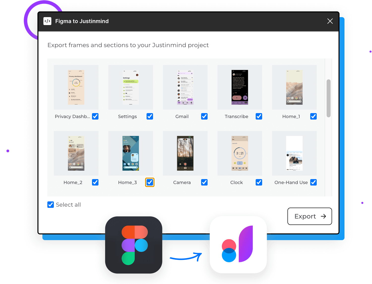
This new plugin gives you great control to export your projects or specific design frames from Figma to Justinmind. So whether you want to export your entire project or just selected design frames, the new plugin will allow you to easily export your assets and frames so that you can focus on designing and creating better prototypes.
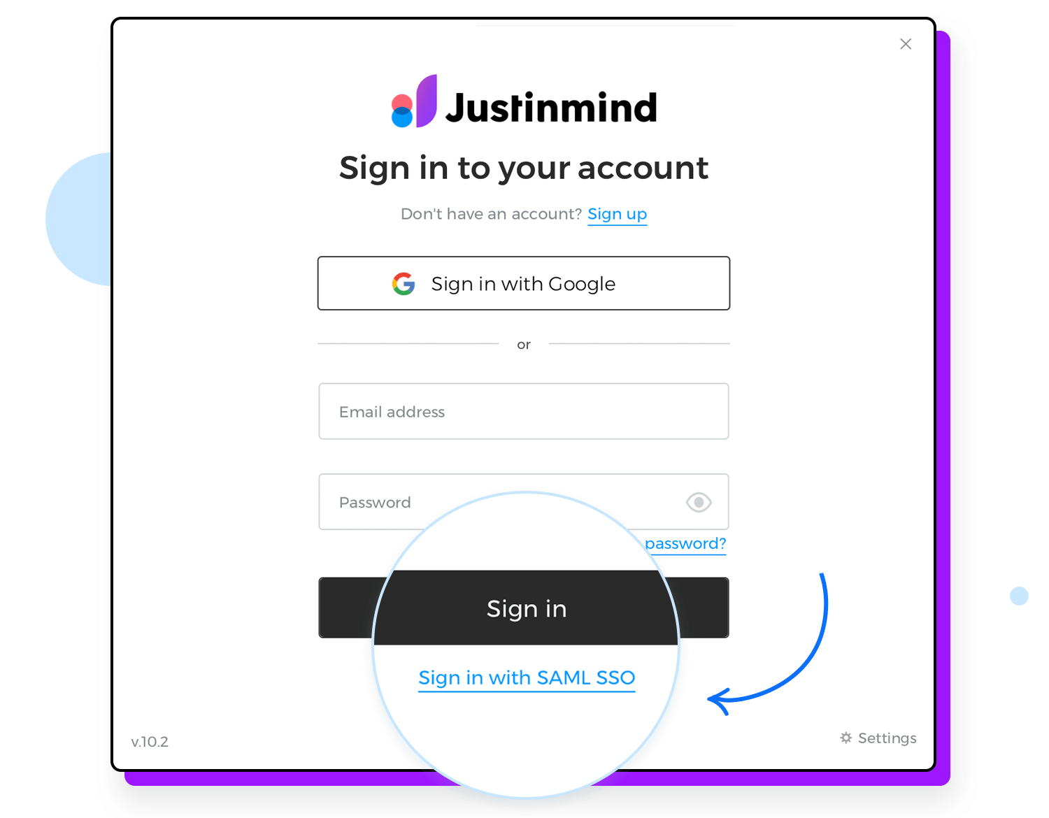
We’re pleased to announce the addition of Single-Sign On (SSO) to our application. The SSO feature allows to access Justinmind using your organization’s existing SAML SSO identity provider, such as Okta, Auth0, Microsoft Entra, OneLogin.
In addition to increased security and ease of use, this feature optimizes the login process and improves user management. With SSO, you can use the organization’s credentials to access Justinmind eliminating the need to manage additional usernames and passwords, while also providing a seamless and streamlined user management and administration.
To improve your overall Justinmind user experience and make it more intuitive we’ve introduced a new way to use and manage fonts.
First, you’ll notice that you have now access to all Google fonts directly from the Justinmind editor. When you open or create a project, you’ll be able to see the fonts available directly in the font picker. That’s it, easy peasy. This way you’ll have a wider range of fonts to choose from readily available for any of your projects.
Also, with this version, we’ve improved font management so that all editors within an account can share and access the same fonts, and visualize the fonts in each project correctly.
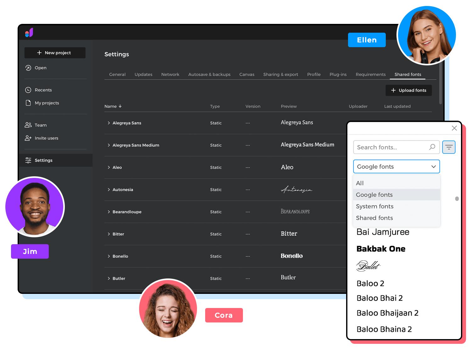
Now, users and groups within a same account will be able to share fonts making sure that all editors and viewers are using and viewing the same fonts and its correct version.
With this new option, shared fonts are made available to the entire organization and guarantees the same font will be used in the different company projects.
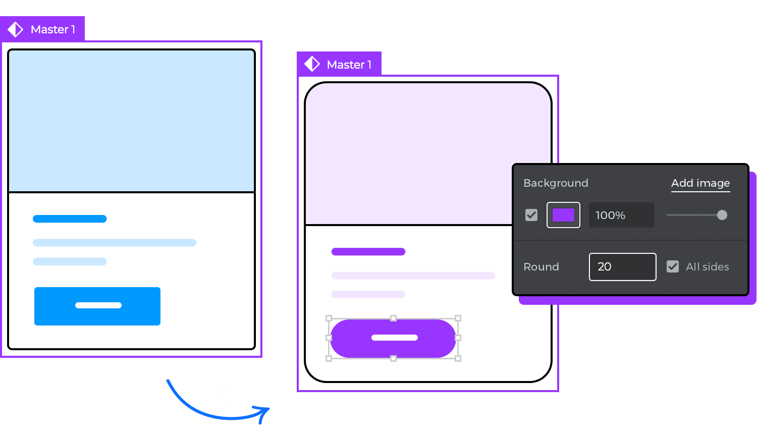
The complete Masters user experience has been improved, so that Master components are easier to edit and manage, and offering the flexibility you need.
Using Masters will now allow you to edit the properties and interactions of specific instances, meaning that you’ll be able to edit them just like regular design elements, with changes only affecting the particular instances being edited in a particular screen. However, if you make changes to the Master component, all instances will reflect the respective change to ensure consistency across the project.
Time to get creative!
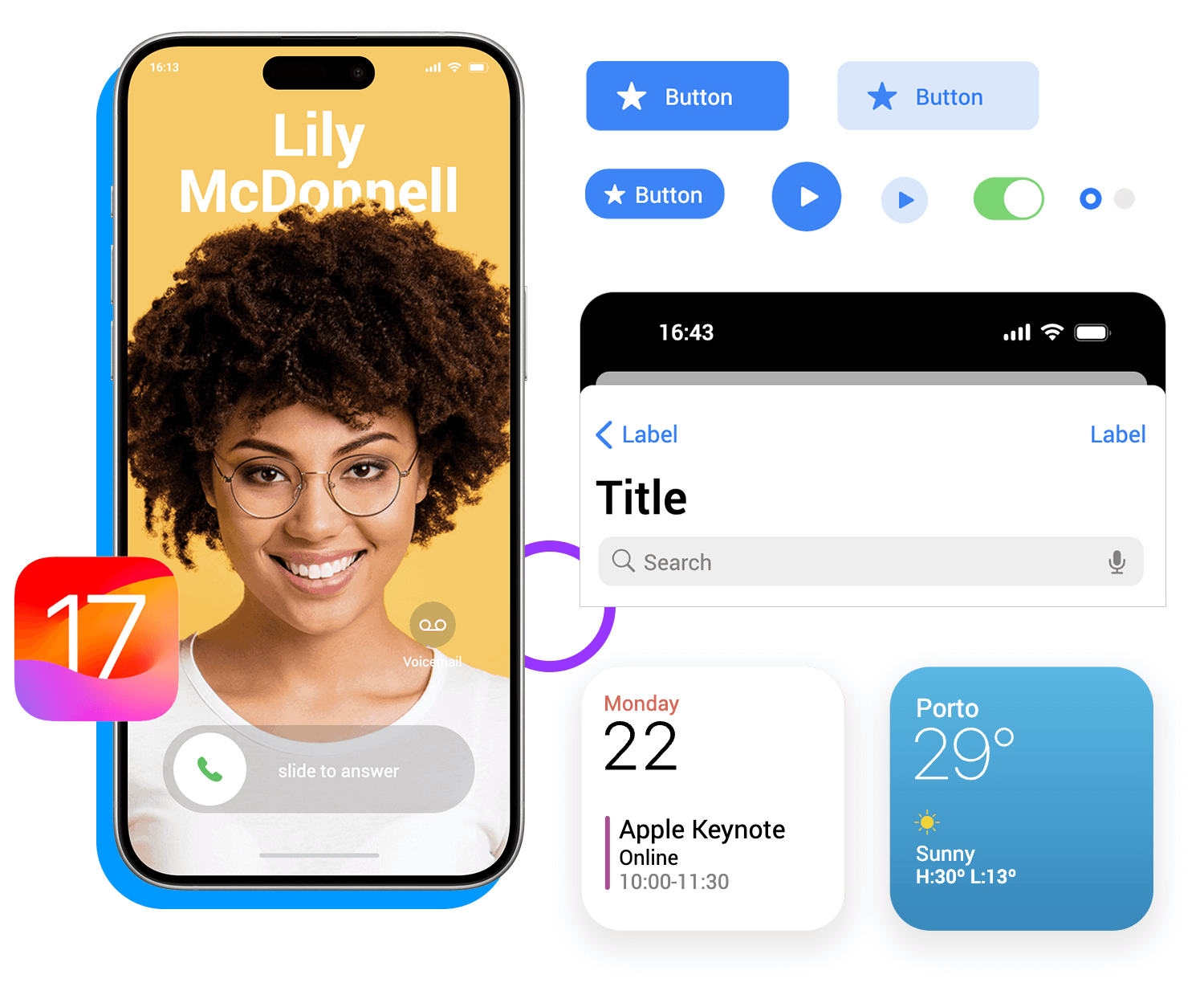
In this version iOS components library has been upgraded to iOS version 17. This comprehensive UI library lists all of the most popular as well as most used components and styles to create any type of iOS design, or you can check it out to get inspired to create any other type of project.
As always, our iOS UI kit follows the latest iOS guidelines and is categorized to reflect Apple’s design system to make it easier for you to find everything you need.
In the same line, we’ve added new mobile device frames and their simulators, so that you can rapidly preview and test your web or app during the design process. In this version you’ll find the iPhone 15 Pro which is 6.1-inch and the Pro Max at 6.7-inch. Remember you can use those same device dimensions will also work for your iPhone 15 and 15 Plus projects.
- Fixed OnScroll for mobile app viewers
- New text property: Lower/upper/firstletter case
- Fixed Transfer account ownership for single user accounts
- Fixed Undos for cloud projects with a solo editor
- Fixed OnScroll in a Dynamic panel
- Fixed issues when using Dynamic Panels
- Nested Masters in Data Grids works correctly
- Resizing cells with margin works properly
- Gradients show properly when simulating
- Fixed Cursor changing to default when zooming.
- Fixed Callout resize
- Font change in a locked element works correctly.
- Creating an “Insert Into” event for a dynamic panel in a smart template works correctly.
- Fixed Right margins in Content grid when simulating
- Fixed Elements in panels with vertical-middle layout when highlighting interactive areas
- Now you can order the groups of your libraries
- Fixed issues with masks
- Fixed Multiple bugs in scenarios
- Rotating elements work correctly in some use cases.
- Fixed some crashes and other minor bugs
As always, we are here to help, if you have any questions or comments let us know!
PROTOTYPE · COMMUNICATE · VALIDATE
ALL-IN-ONE PROTOTYPING TOOL FOR WEB AND MOBILE APPS
Related Content
 Our new free Bootstrap icons UI kit is here with new icons to enhance your web apps!11 min Read
 Our new free Vuetify UI Components Library is here to tune up the way you prototype your digital products!8 min Read
 Prototype interactive, friendly and powerful UI and UX without the need to start from scratch with Justinmind's Free Primefaces UI library.8 min Read
