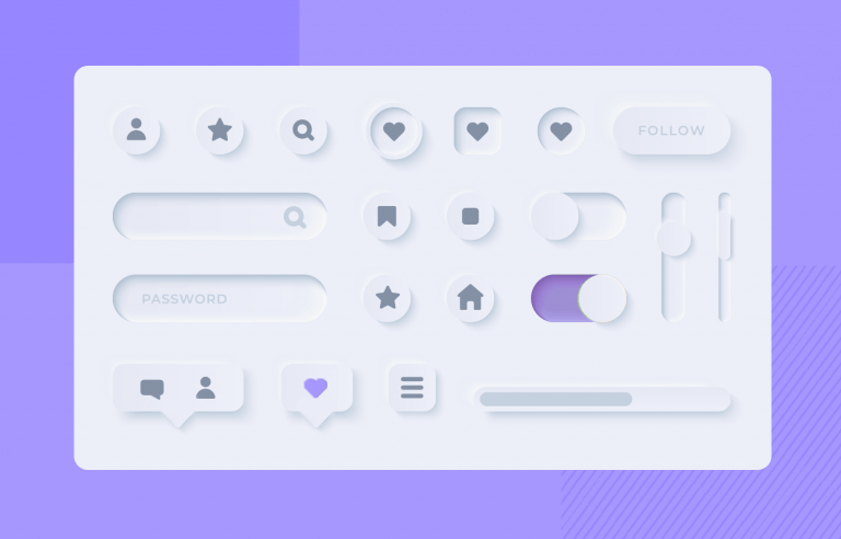
What does neumorphism look like in UI design and what can it do for your product? We've got the full run-through for you on this new trend!
Neumorphism was born from skeuomorphism and went on to create an entire new UX style. Designers from all over the world have seen catchy neumorphic designs on Dribbble and Behance – and now, it’s a trend in its own right.
Design flat or neumorphic prototypes with Justinmind!
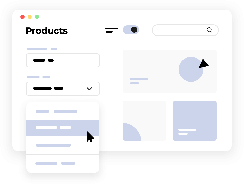
But what is neumorphism? How does one apply that to UI design? What impact does this style have over the feel and usability of the interface?
We’re ready to dive deep into neumorphism, starting by what it is, what it means and listing out some great (and free) UI kits for neumorphic screens. You’ll love them so much, you’ll want to keep your favorite UI design tool open and at hand!
Neumorphism is a new take on skeuomorphic design. Even though it relates to skeuomorphism, there is a new focus in the entire UI design style with neumorphism. This focus is not necessarily on the contrast or similarity between the real and digital worlds, but rather the color palette.
Yes, you read that right. Neumorphism is all about the color of the entire screen, and delivering an entirely unique experience for users.
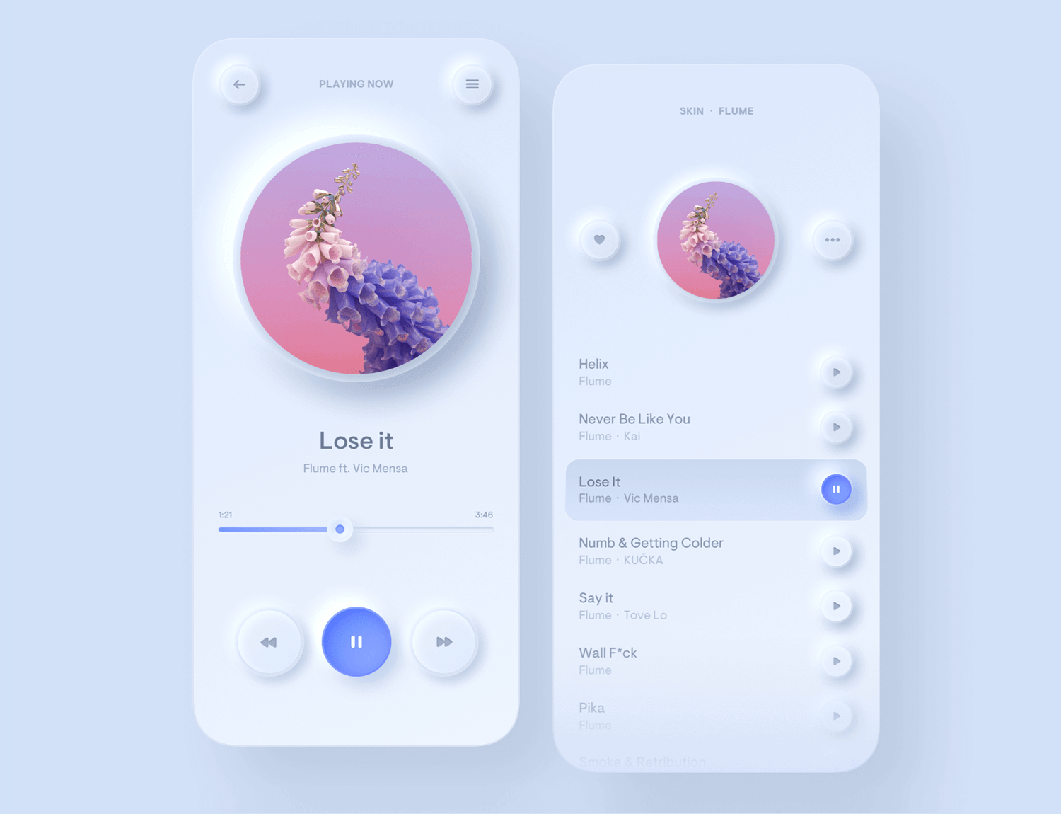
From Filip Legierski.
Imagine your classic iOS or Android interface for a music player. You have the background, on which we place several components, adding layers and creating depth. With neumorphism, you’d be creating a soft interface, in which the UI elements aren’t placed on the background – but behind it.
It gives a feel that components like buttons or cards are actually inside the background, and are only visible because they’re protruding from within. The general style is all about solid colors, low contrast and the right play of shadowing in the UI design.
One of the most interesting things about neumorphism is that it draws from both skeuomorphism and other massively popular styles, such as flat design. Yes, both of those are opposite to each other – and neumorphism falls somewhere in between.
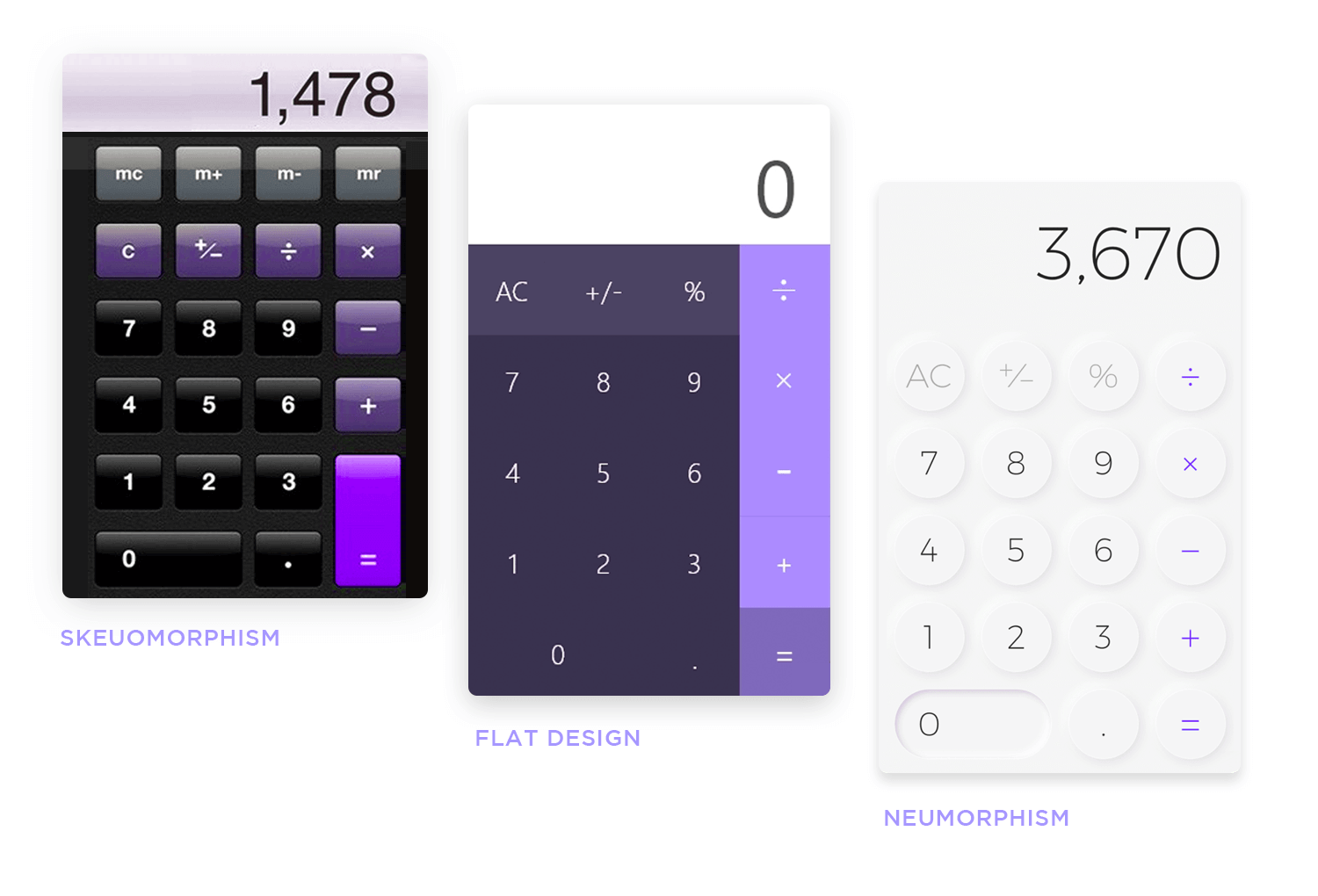
Calculator elements from Mojimomo and William Tapp.
This trend focuses on getting rid of all flashy aspects of the interface, creating a soft visual that stays consistent throughout the entire product. It doesn’t focus on recreating reality in the digital world, like skeuomorphism. Instead, it tries to create something completely new in the universe of UI design.
Neumorphism is all about subtle contrast and solid colors. But how can we create an interface that delivers a wow-factor without any flashy elements? In neumorphism, it’s all in the use of shadowing and light.
In broad strokes, the main ingredient is making sure that your element and your background are the same exact color. This is so that we can then create the feel that these components are coming out from inside the background, using shadowing to create the protruding look.
You’ll want to ensure your background and components’ color works well in solid form, as you’ll need to apply this same color all around the UI design. For the shadow game to work, your background can’t be fully black or plain white.
You’ll need some sort of color, in order for the shadow to deliver on the visual trick. Once you have the main color, you can then look for two shadows: dark and light shadow.
These are the added details that you’ll apply on all components, creating a uniform style in the UI design.
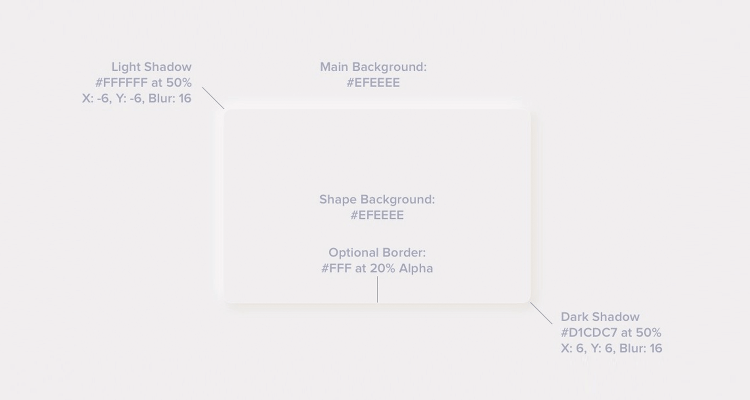
From the man himself, Michal Malewicz.
That’s about it for neumorphism. Using this as a base on which you build the UI design of the product, you can also mold it to suit your style. Many designers add a pop of color in strategic areas of the screen, either as a way to improve usability, add flare or just stay on-brand.
Neumorphic cards are different from other design styles that we are familiar with such as cards in Material Design, for example, because they don’t look like they are floating. There is no shadow to create that floating effect, not even when the user hovers above that card.
That’s because they extrude from the background, creating a raised look in the UI design.
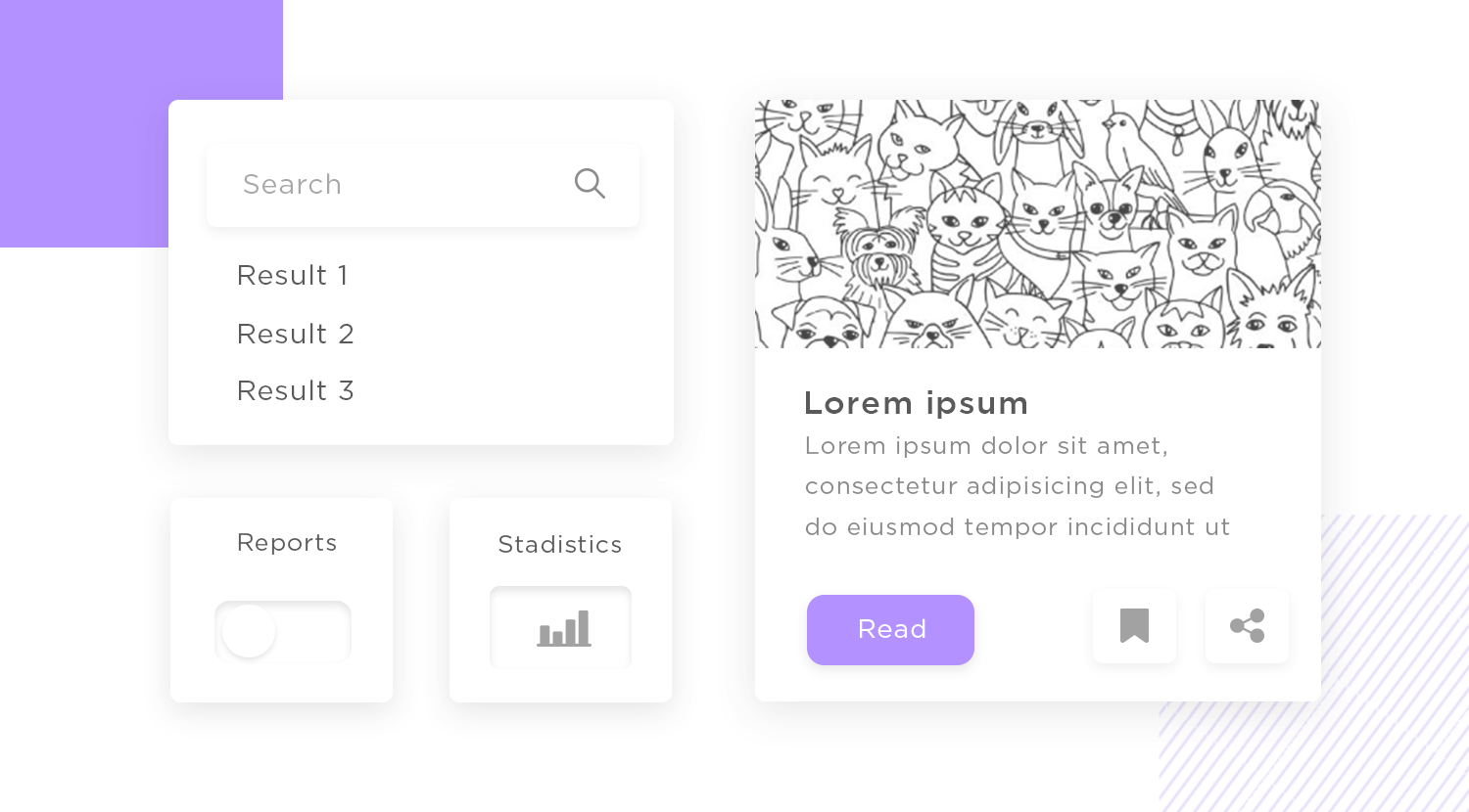
The way to achieve this is by taking the light and dark shadow you’ve established that will accompany the background, and using them on opposite sides of the cards. You can play with the positioning of these two shadows, so it feels as if the cards are seen in certain angles by the user.
Design flat or neumorphic prototypes with Justinmind!

It’s true that like all trendy design styles, neumorphism comes with both good and bad sides. On the good side, we have all the excitement and freshness of something new and unique. It’s appealing as a visual style, that much can be said objectively. But if neumorphism is all-around great, how come we don’t see it in real products?
For all the great visuals it brings to the table, neumorphism has a huge weak spot: usability.
The problem is that there is a very small margin of colors and contrast in which neumorphism works. The slightest deviation in saturation can render the entire raised effect, on which neumorphism is built, to simply fail to deliver. Like a domino effect, this has plenty of shady consequences for neumorphism in UI design.
Neumorphism is all about subtle changes in contrast and discreet UI components. But no matter how much importance you place on the visual side of your prototype or general work, all designers know to put usability at a higher priority than the mere aesthetics. And nowhere is this issue felt more strongly, than in neumorphic buttons.
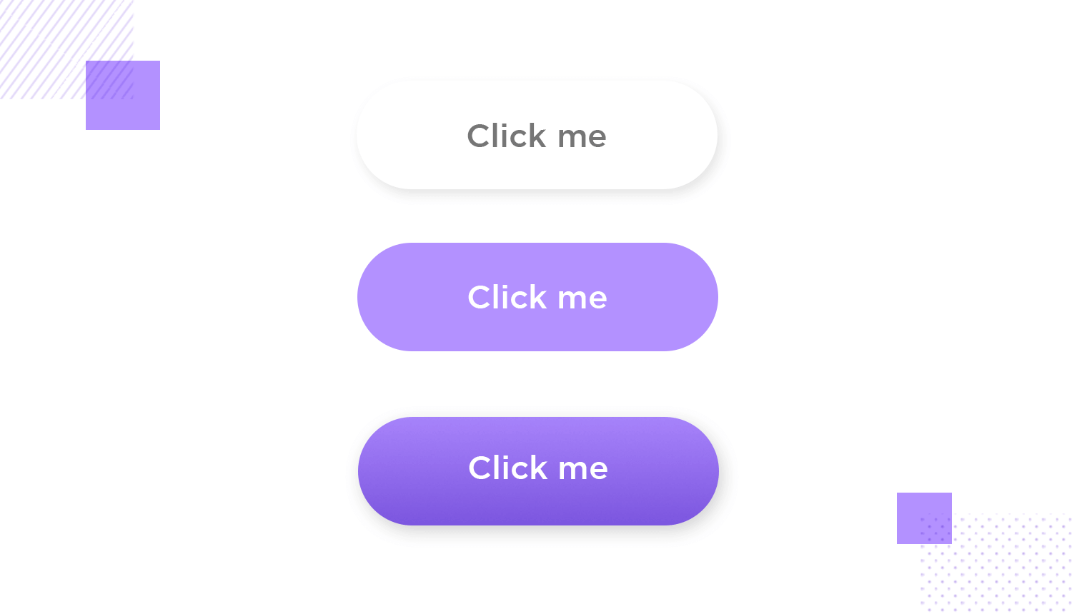
Buttons are a key UI component in any interface. They need to be very noticeable, and need to change button states as users interact with them. Users need to be able to not just notice buttons in less than a split second, but they need to change colors – in a way, they communicate with users via the UI design.
However, this simple characteristic of buttons in neumorphism becomes problematic. Michal Malewicz, co-creator of neumorphism, saw the issue immediately. You have a very defined style that is based on a slim margin in shadow effects. It’s a narrow window into neumorphism, and it can be difficult to fit button states through that tiny window.
Neumorphism is meant to be soft on the eyes. It calls for minimal color contrast and very few pops of color. Logically, designers are free to apply neumorphism in any degree they see fit – not having to implement the style in its entirety. Many choose to apply neumorphism to their cards, but keep classic buttons.
However, if we were to create a screen that consists exclusively of neumorphic UI design, how would the CTA look like?
This style calls for colors that all but blend with each other, going against what we all know about CTAs: they need to be flashy. The very last thing you want after investing so much time and effort into a product, is to see it perform poorly over something silly, like users not managing to find the CTA.
And on to another potentially huge issue for neumorphic UI designs. This style looks great, but how would it appear to visually impaired users? Chances are that it would be a real problem, with crucial things disappearing into the background, becoming unusable.
And users that need big contrasts to see the interface clearly aren’t the only ones who might suffer. Neumorphism is all about a soft UI… perhaps, too soft. The differences in shade that set elements and components apart are oh-so-subtle. It’s perfectly possible that users with low-quality screens will miss these small details that make the UI design.
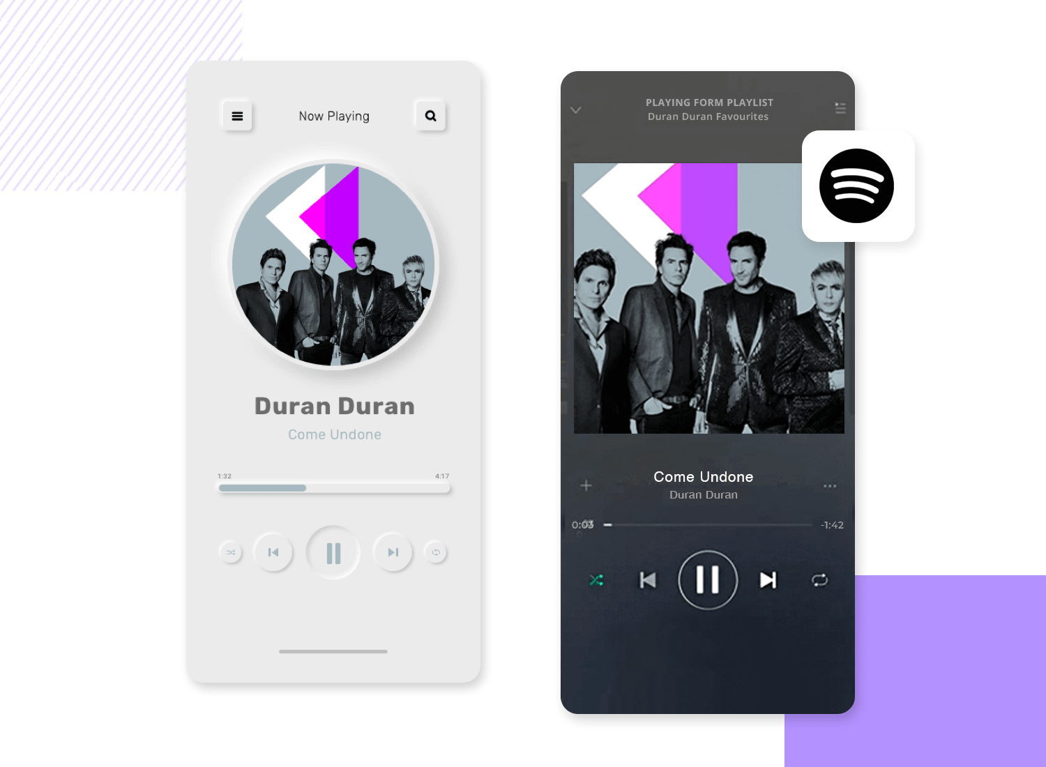
From Antonio Hristovski.
If you want to get a more realistic feel if you could apply neumorphism to your product and still tick the right accessibility boxes, try reading our guide to accessibility testing. Try to imagine if a neumorphic UI design would pass the tests and standards described!
These are all free groups of UI components that follow a neumorphic style. We found these in the depths of the internet, but the true heroes are the designers who posted them in the first place! Let’s check them out.
This freebie consists of a mobile app created by Sans Famillie. You’re offered both light and dark versions of the design, following neumorphic lines all the way.
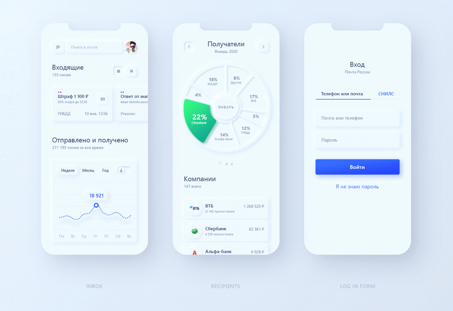
Russian Post App comes with 3 screens of the app UI design: dashboard, login form and a recipient screen where we can see financial information. UI elements go from cards to graphs.
Design flat or neumorphic prototypes with Justinmind!

This UI kit comes with some of the greatest components in neumorphic style, those we are all used to. These include radio buttons, regular buttons, tabs, a search bar, a volume bar as well as a few others.
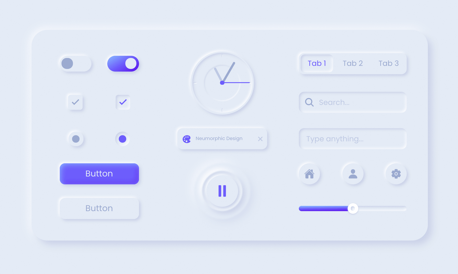
The cool thing about neumorphic elements is that it doesn’t come in PSD or Sketch files. The entire kit is available in HTML right on the spot.
Another great UI kit that makes life easy, by offering the components directly in code. In Neumorph UI kit, the components already come with some basic interaction such as the expanding dropdown menu.
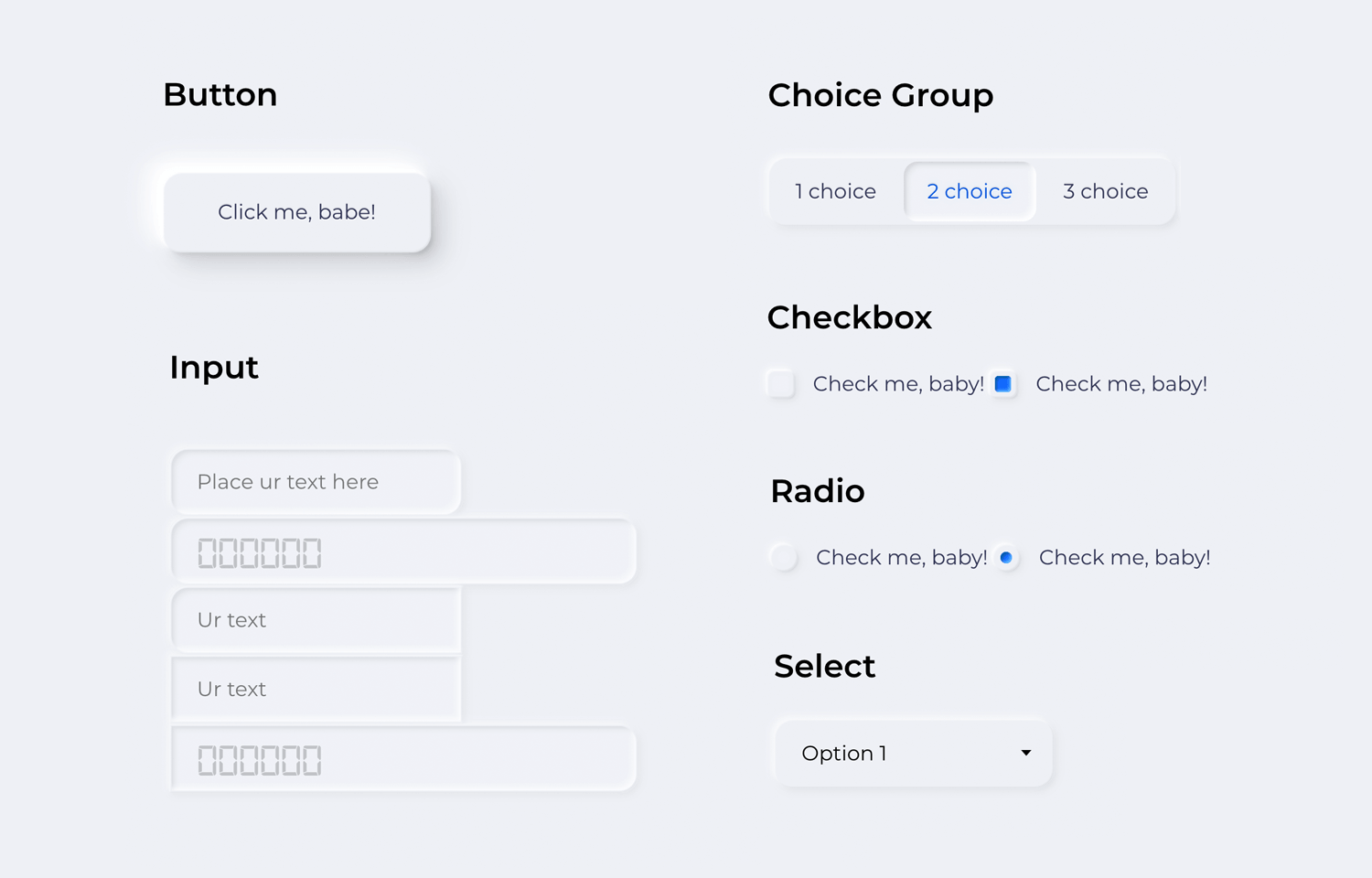
We like that the general UI design feels simple, resulting in a classic neumorphic design. UI components include things like radio and toggle buttons, as well as input fields and buttons. All the basics, covered!
Neumorphic UI elements is simple but sometimes, simple works best. The entire UI kit surrounds the concept of a music player UI design, including components like play and fast forward buttons, as well as progression bars, radio buttons and checkboxes.
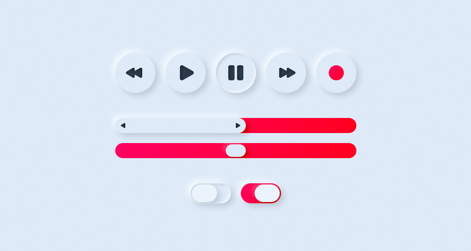
We love that the color scheme focuses on a light, grey color with flashes of red. It captures the idea that neumorphism can also make room for flashy color in the midst of all that solid background color!
UI/UX elements is another UI kit that enjoys a great color palette. It’s all about the light background, using blue to highlight and guide the eye. We love that the kit comes with both skeuomorphic (like a real-life compass!) and neumorphic elements.
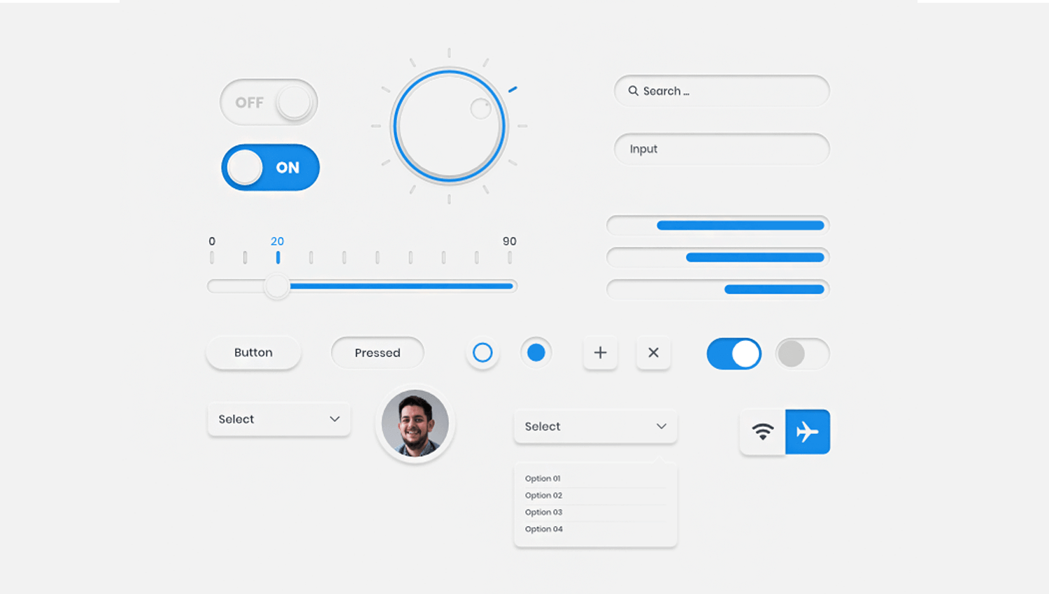
Among the UI elements, you’ll find buttons, radio buttons, search bars, input fields, toggle buttons, dropdowns and more.
These are interesting times indeed, and neumorphism reflects that fact perfectly. It was born out of skeuomorphism and minimalism, but aims to deliver an experience users have never been through.
Will we see more of this style in upcoming products? Is this the new Material Design? The truth is that neumorphism comes with a set of flaws that represent a real problem. As it is now, the usability issues it brings about are too great for any product to risk it.
But here is the great thing about UX design: neumorphism, like many other styles, is but a simple building block of the future. Here at Justinmind, we’re excited to see just where the road of neumorphism leads, and what changes are made to this particular style along the way.
PROTOTYPE · COMMUNICATE · VALIDATE
ALL-IN-ONE PROTOTYPING TOOL FOR WEB AND MOBILE APPS
Related Content
 Calendar app design can be simple or complex. In this post, we show you 10 of our favorites and how you can make a start on your own9 min Read
 Splash screens give UI designers the chance to make a bold first impression and reinforce brand identity7 min Read
 Finding the right icons to use in your app prototypes can be difficult given the vast array of choices out there. That's why we've narrowed down 50 of the best places to find free app icons!10 min Read
