The perfect web design portfolio is all about presenting yourself in the best light. Check out these guidelines, examples and practical templates!
How do designers go about creating their web design portfolio? What are the crucial details you can’t overlook? Some designers out there have created truly unique and unforgettable portfolios that win awards and gigs. It’s no secret that a powerful portfolio can change everything.
So, let’s take a look at some of the basics of what portfolios have to include and why these details matter. We also have some wonderfully inspiring web design portfolio examples as well as some practical portfolio templates that can help you get started.
Creating your own web design portfolio is all about transmitting who you are and the skills you bring to the table. This refers to your design skills but also any other skills you think can be valuable, like good communication skills or an understanding of psychology.
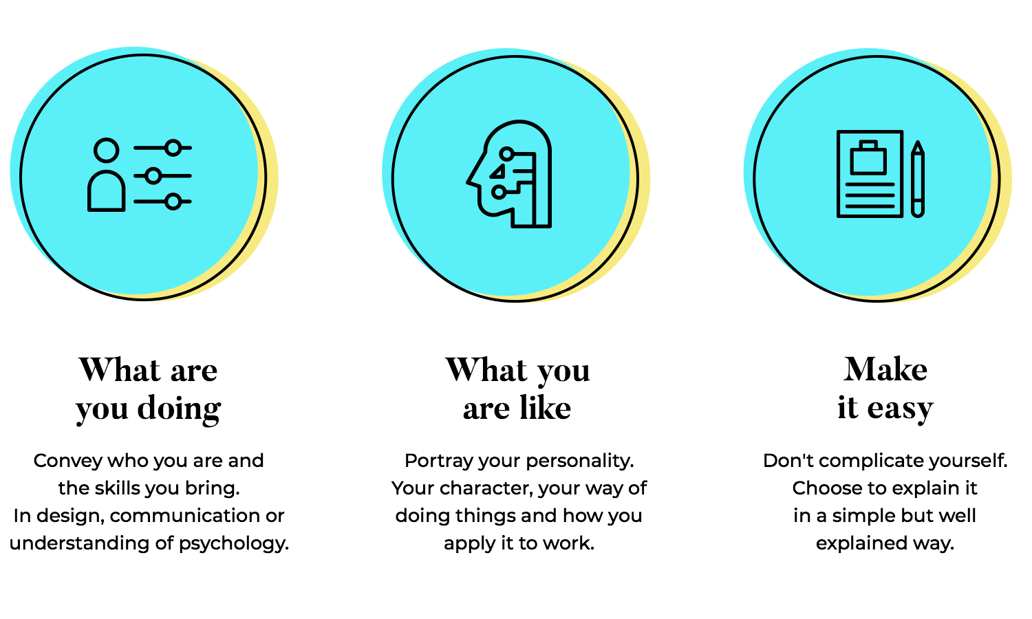
It’s also a great opportunity to portray your personality, like a small glimpse into who you are as a person. Are you formal or casual? Do you prefer to take things seriously or prefer light humor? Are you a team person?
The struggle is how to portray all of this in a single portfolio, without making it a conceptual mess. Luckily, the portfolio itself doesn’t have to be highly complex. It can be a small website that only has a few pages, not venturing into lots of content or categories and low/high level pages.
Let’s take it from the top. The concept of a web design portfolio is all about showcasing your best work. This means that you want to look at past projects and choose only the best, the ones you’re most proud of.
If you’re struggling with how to choose the best, try to think of their value to you and to the client. Did that project change the game for the client? Did it represent a milestone for that company? What about you? Did it teach you something? Did it present you with a tough challenge that you managed to overcome?
The true value of a project can be a bit abstract. That’s why you want to have an objective view of the projects individually. Sometimes, showcasing a difficult problem that you solved can have a huge value to the employer – web design is, in a certain way, an exercise in problem-solving. Other times, you want to make it all about the hard results that the project rendered, without focusing too much on what it meant for you.
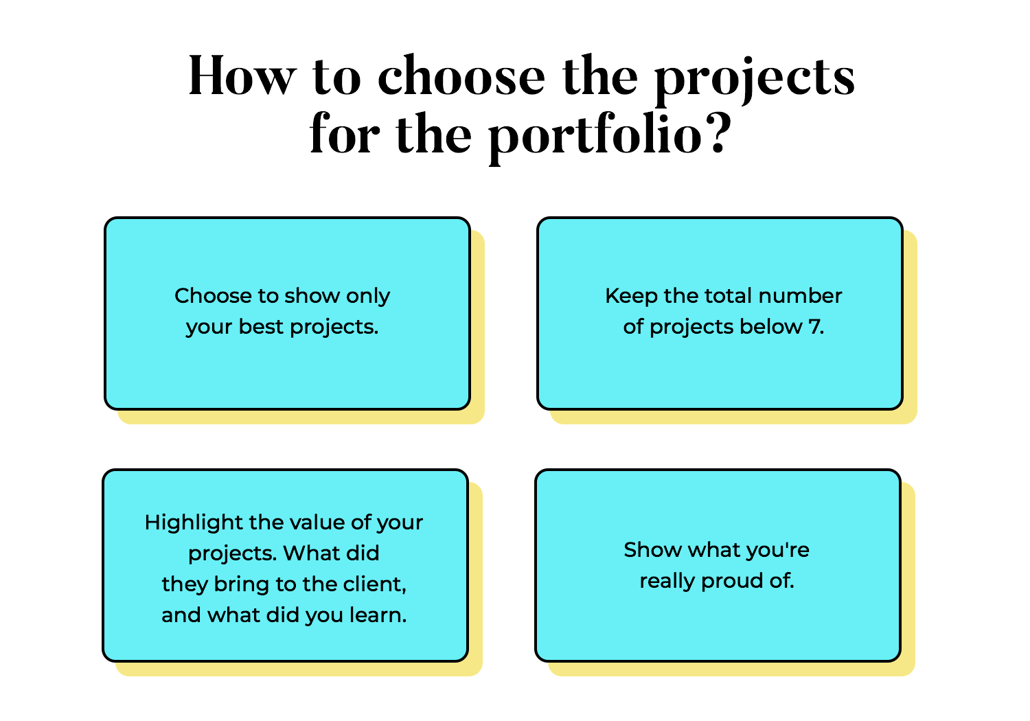
In the end, this is a highly subjective topic. You want to think about how you see these past projects and what they meant. There isn’t one right answer that will suit everybody. Ultimately, you want to take the things you’re proud of and present them in the best possible light.
The ideal web design portfolio is one that has a healthy balance between the visuals and the text. Why text, you may ask? If this is all about web design, why not focus on the powerful visuals and let that speak for itself?
There are many factors to consider here. The first, and perhaps, most important of which is that design, in general, isn’t just about pretty visuals. Truly good design is about problem-solving, understanding the context of a problem, and using design to solve it.
This process can often be lost on those who simply enjoy a beautiful color palette or focus on an intricate illustration. There’s a huge amount of work invested in those visuals, which aren’t obvious to an outsider.
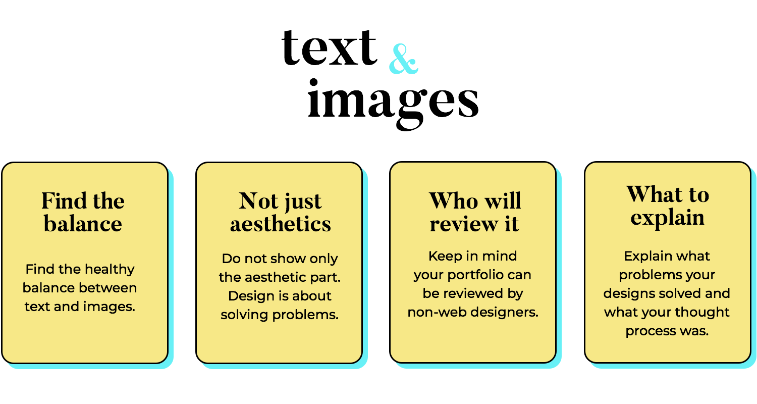
You want to present your work with some context. Why was this a good project? Why do you love it? How difficult was it for you? What was your thinking process? These are pieces of information that show readers how you approach project definitions, how you deal with challenges.
The second factor at play is the reader himself. It’s possible that the person reading your portfolio is a web designer who will appreciate all the effort that went into those creations. However, it’s much more likely that it will be a recruiter, a marketing manager, a CEO, or even someone from human resources. The bottom line here is that if the reader has no design experience, all the extra work you invested will be lost on them.
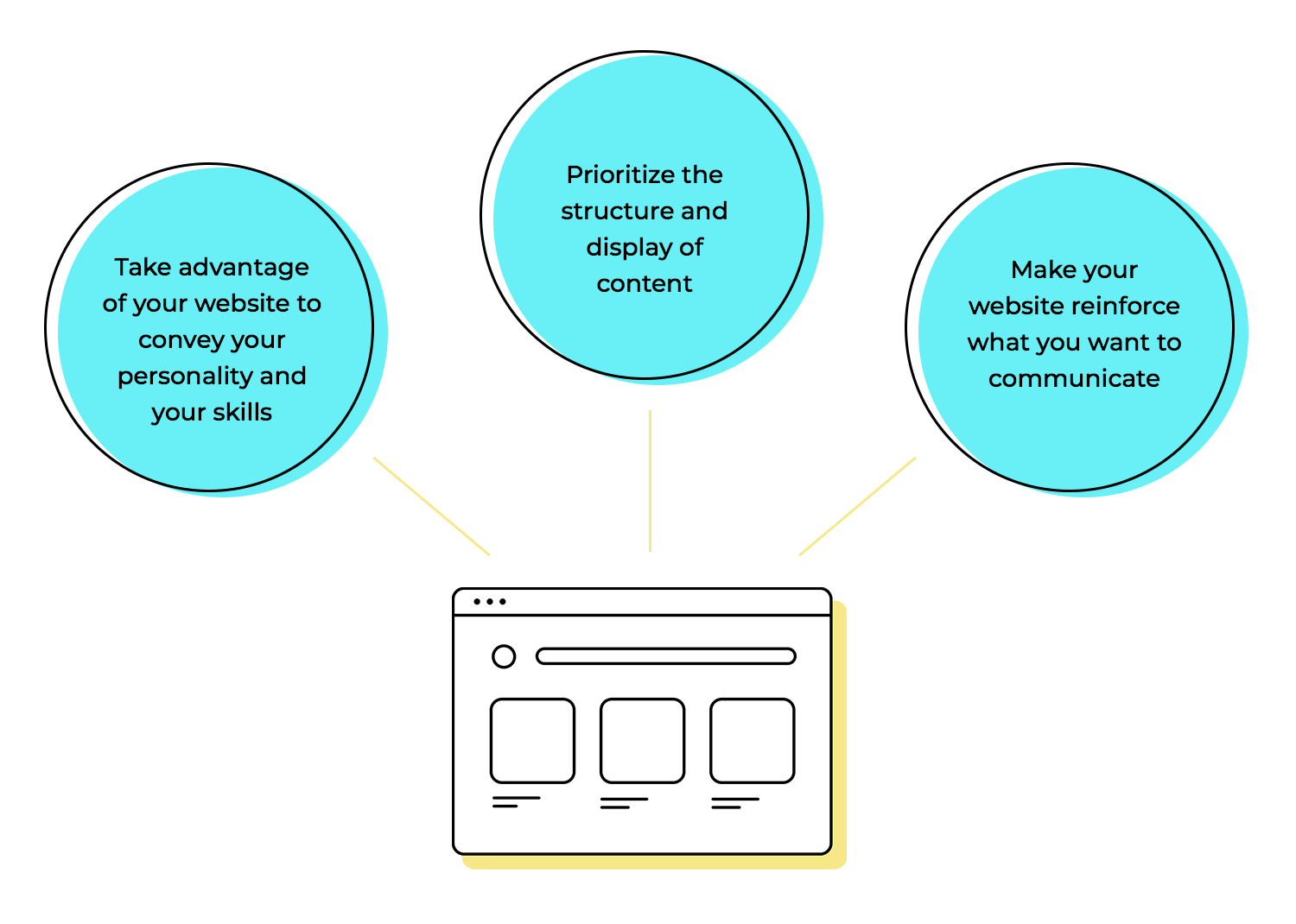
Since we’re talking about web design portfolios, how important is the design of the portfolio website? We’d say: very. The website itself can be a great opportunity to convey your skill and your personality. Designers are highly skilled at communicating without words, which is why this can come easy to most experienced people in the industry.
There are all sorts of portfolio websites out there. Some are edgy and loud, using flashing colors and bold fonts. Others are unique because they work like a game, making the reader interact with the design in order to see the projects on display. There are also simple portfolios that opt for a minimalist approach, letting the reader focus entirely on the content itself and not the design of the website.
All of these are great. There’s a huge margin here to capture who you are, to reflect part of you with the look and feel of the portfolio itself. All we can say is that you want to prioritize the content structure and display, making it as easy to find and read as possible.
As we mentioned before, there’s a huge margin when it comes to creating your web design portfolio. We listed a few of the examples we thought were the most intriguing, creative and memorable. With that said, remember: your portfolio doesn’t have to have fancy animations in order to be good. Something simple and classic can deliver just as much of an impact.
Granted, this website isn’t strictly a portfolio in the pure sense of the word. It’s a website that showcases the previous work and presents the services rendered by a design agency – but it’s close enough. The website itself brings us a bold use of animation, with eye-catching visuals and microinteractions that offer great usability.
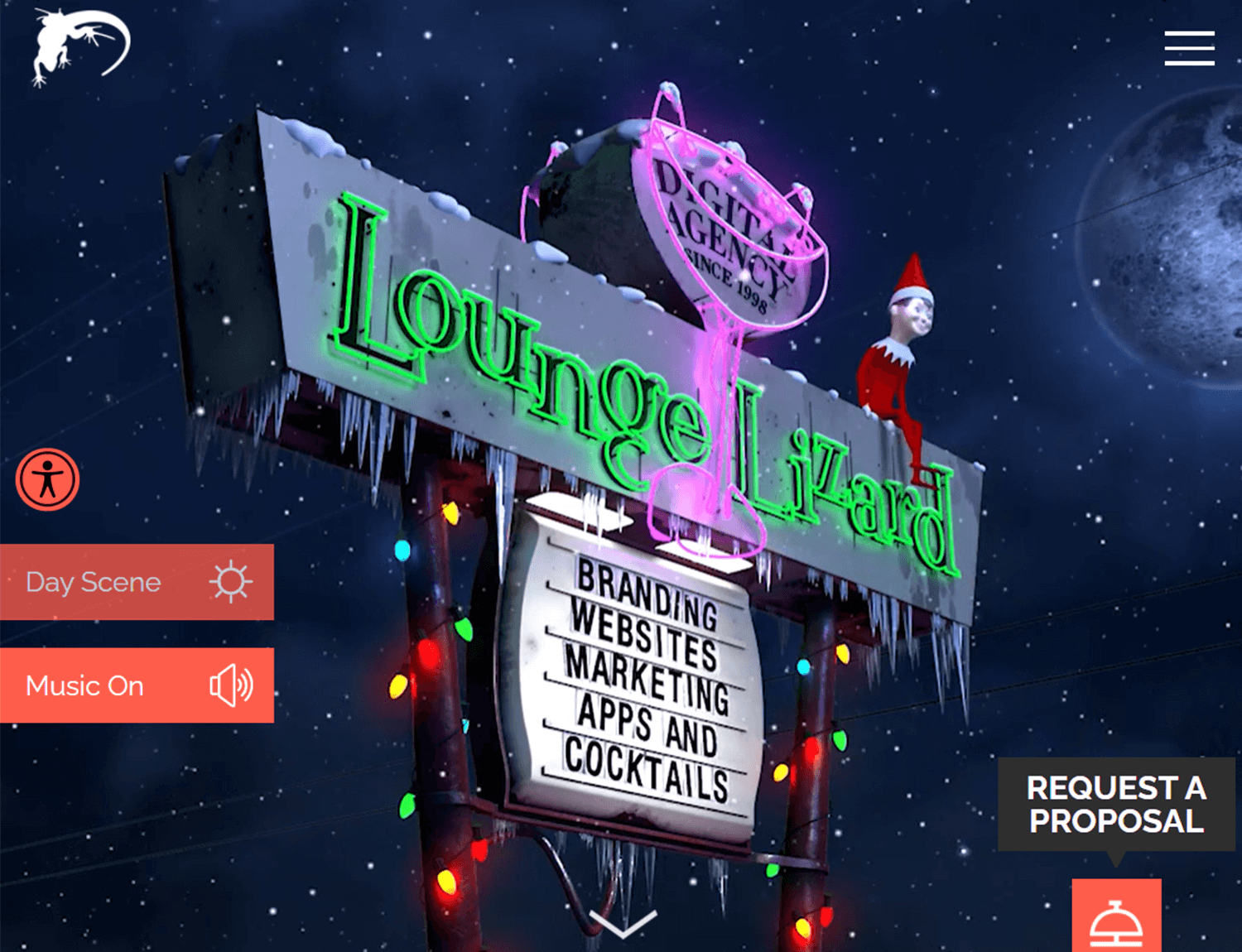
We love the vibe of the Lounge Lizard website. It perfectly captures the spirit of the agency, making it a young, vibrant and fun experience for readers and potential clients. The case studies are wonderfully presented also, breaking down the context surrounding the project as well as the design process that was implemented. It’s true that there’s a large number of case studies, but given that this is a portfolio for an entire agency as opposed to a single designer, it works.
Vito Salvatore created a website that offers a wow effect. The homepage lists his past projects with a beautiful parallax effect, showing off some serious design skills. The navigation of the website is simple and easy, letting the content be the center of attention. We love the way each case study is presented, offering a great balance between the written text and more visual ways to display information. A very impressive web design portfolio!
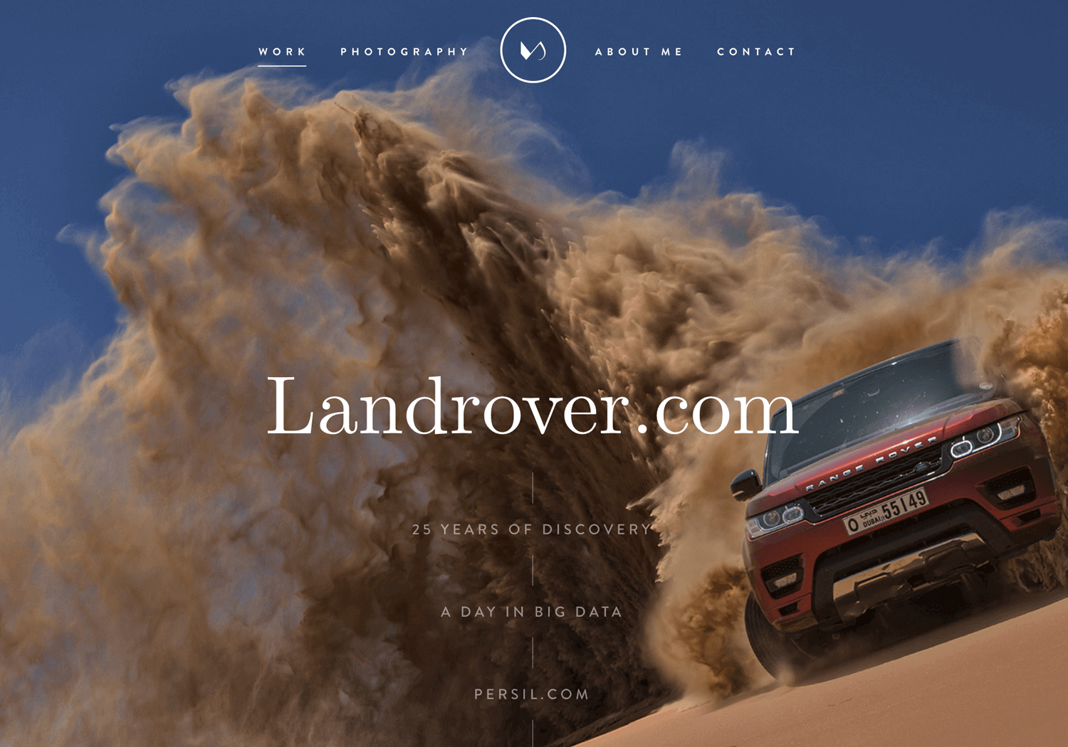
John Henry Muller created a truly unique web design portfolio. His focus wasn’t so much on the case studies of previous work, but transmitting who he is and what he’s about. As a reader, we get his history of work, learning the path he took and why he did it. It’s a true lesson in communicating personality through website design, both in the UI itself and the content he included in it (especially his mom’s testimonial).
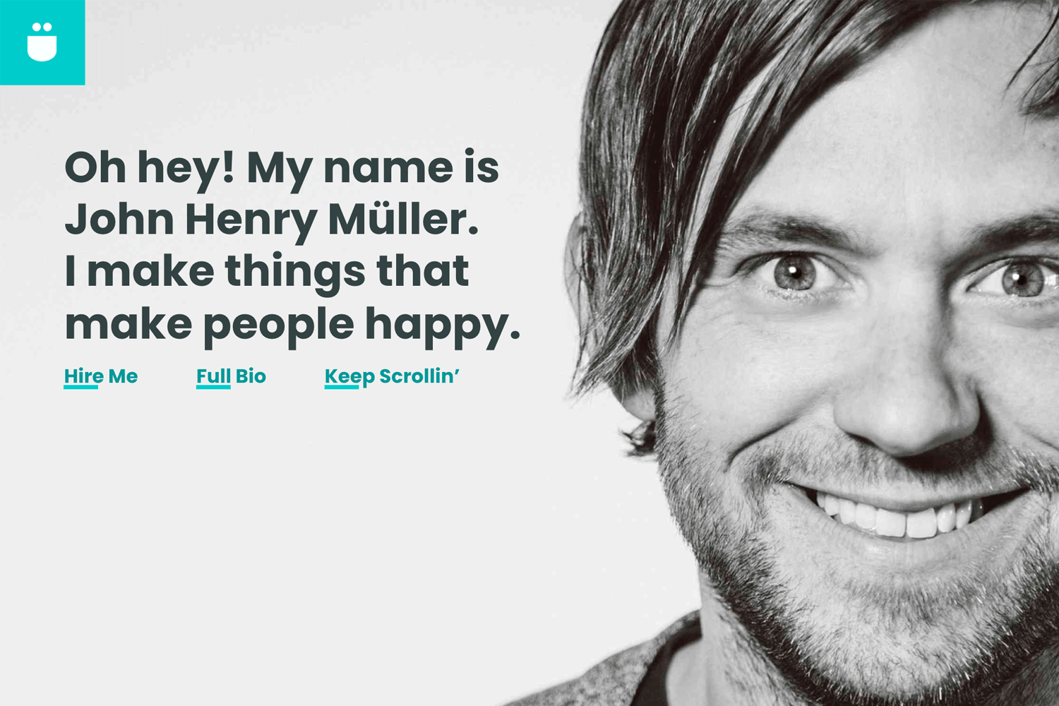
We love how personal his portfolio is. In the end, that’s what it’s all about. None of us here at Justinmind have met John, but we like him already. That in itself is a major success when it comes to creating a web portfolio.
Jarrod Drysdale created a web design portfolio that is highly reactive and concise. For us, one of the greatest things about this portfolio is that Jarrod achieved a wonderful balance between strong visuals and relatable copy.
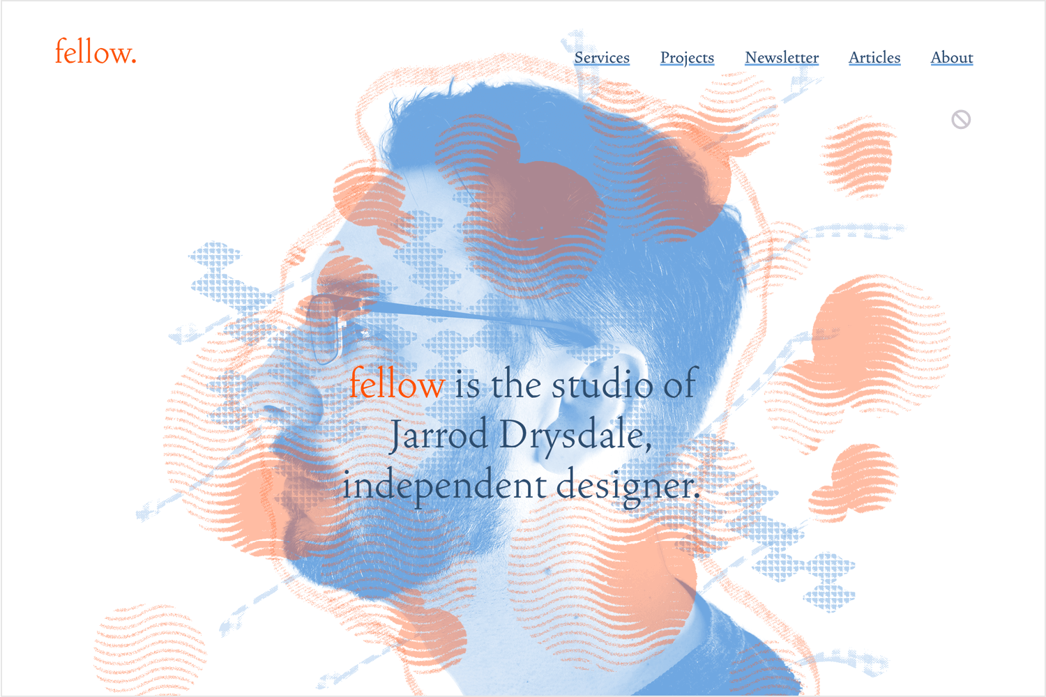
From the visuals side, we find that the reactive images and shapes make the entire experience super dynamic. Even more impressive is that this reactive design doesn’t overwhelm the reader, which can happen sometimes with visuals that respond and relocate according to cursor movement. In this sense, Jarrod actually showed a lot of restraint – which absolutely paid off.
From the copy side, we find that Jarrod used few words but they were all the right ones. It’s a brief kind of copy that also transmits personality. It doesn’t feel like a formal read, making Jarrod seem like a real person who is carrying a conversation. It’s easy, enjoyable. His past projects are presented without case studies, opting for a line or two describing the project.
Barcelona-based Ramon Gilabert created a wonderful web design portfolio. It’s calm, friendly and casual. Using clean lines and plenty of empty space, Ramon shows off some true skills when it comes to visual hierarchy and information architecture.
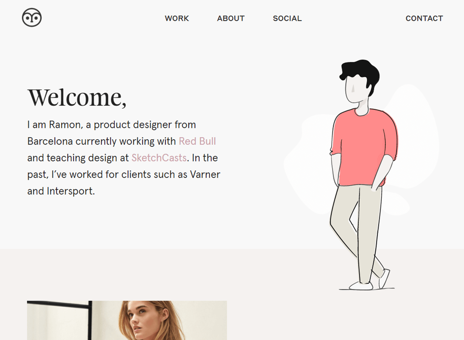
The portfolio presents four case studies, each of which break down the project down to the bottom line. Ramon gives us the full story without long and boring paragraphs, breaking down the crucial bits of information.
Things like the original problem, the final results such as conversion, and the factors that played a part. It’s all given to us in little bits, with plenty of visuals of the real project to make it dynamic and easy to read.
Granted, these templates weren’t made specifically for web design portfolios. They are, however, a wonderful base that captures a small website that works well.
The basic structure, navigation, and feel of these templates are a perfect starting point for a web design portfolio. Instead of starting from zero, you can simply work from these and adapt them to showcase your work and reflect your personality. Keep your favorite UI design tool at hand!
All these website templates are made for Justinmind and can be downloaded for free. Simply open them on Justinmind and start making the design your own! Check out our design templates for many more options, including for mobile-based web apps.
This homepage offers a great visual hierarchy and can work as a wonderful homepage to a web design portfolio. Made with smooth lines and a modern feel, designers can simply create more pages in order to display their previous work, connecting it all to this homepage.
The structure itself can be adapted to just about any type of portfolio, even if the template was created with a featured image in mind.
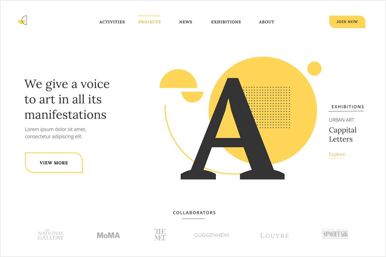
The split-screen UI pattern is wildly popular in web design. It creates a visual impact that still guarantees a good usability, which makes it a great option for a web design portfolio homepage. Each side of the screen is made to hold content, making it a great opportunity to showcase your strong points together.
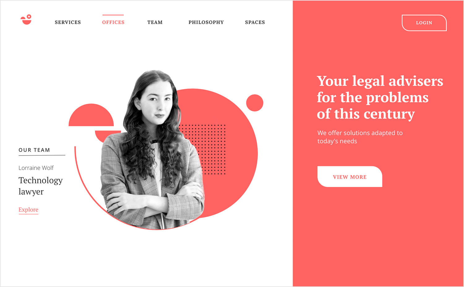
Alternatively, you can simply introduce yourself and use the right side to land a sales pitch – something that captures who you are or what you do.
This template is a wonderful option for freelance web designers, offering a wonderful structure for the homepage of a portfolio. Despite being created for a travel website, designers will find that the content structure can easily be adapted to showcase previous work, display testimonials and lay down the services offered.
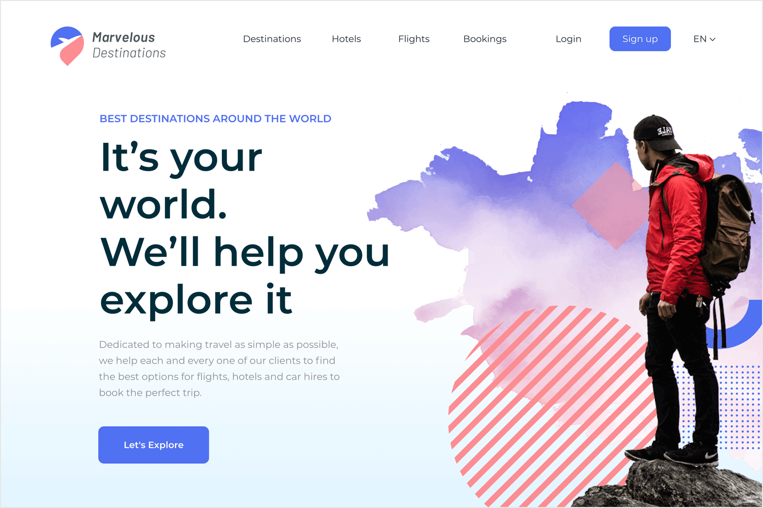
Below the header area, we have a grid structure that can display previous work, working as a central station where the reader can find all the case studies and visuals. Below the grid, there’s a testimonial section where you can display clients, managers, or co-workers’ quotes, transmitting their experience with you.
The homepage offers basic but practical navigation, with a top menu and a footer where you can link up all your platforms such as Dribbble, Twitter, Linkedin, and so on.
This template brings us the header area of a classic homepage. The style is simple and highly adaptable, with written content to the left and a vector illustration to the right. The navigation follows a menu at the top of the screen, with a call-to-action to the right. From here, you can take the portfolio design in any direction you want: flashy interactions and animations, intricate custom illustrations and so on.
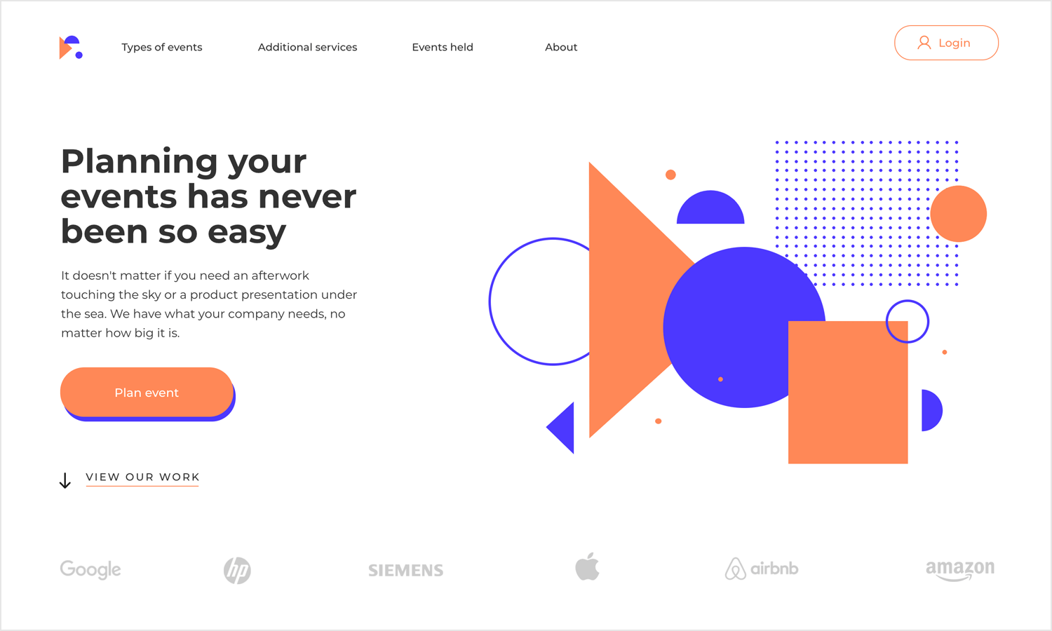
We like that despite the template itself being limited to part of the homepage, it’s very applicable to web design portfolios. Simply create the other pages where you’ll be displaying your visuals and your case studies, using the template to get the homepage out of the way.
Another wonderfully practical homepage where you can display your visual skills, with a clean look and casual vibe. This is a great starting point for a web design portfolio homepage. The navigation at the top of the screen is perfect for the crucial parts of your web design portfolio, making it a simple task to find the right content.
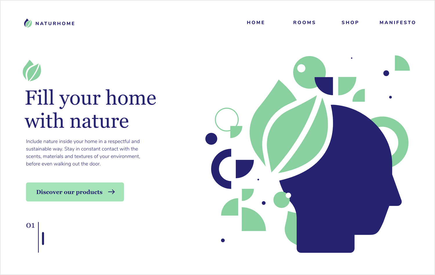
We like the numbered featured content at the bottom, which can be easily expanded to showcase your services or your design process.
It’s not easy to tell people how to create their portfolios. So much of it depends on personality, taste and personal experience. Each designer has their own story to tell, their own accomplishments to share. At the end of the day, a good portfolio is the one that truly transmits who you are.
PROTOTYPE · COMMUNICATE · VALIDATE
ALL-IN-ONE PROTOTYPING TOOL FOR WEB AND MOBILE APPS
Related Content
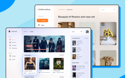 There really is no faster way to get started than using a pre-designed web app template that you can tailor to your taste.6 min Read
 Looking for a quick start in a new project? Discover these 37 free practical app templates made by the Justinmind team just for you.13 min Read
 Looking for a quick start in a new project? Explore these 30 practical 100% Free website app templates designed by the Justinmind team just for you.14 min Read

