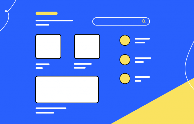
Layouts can make or break a website. They guide the eye, allocate space and dictate performance. Let's see how to create efficient and functional layouts!
Web design layout is often compared to the blueprints of a house or the bones of a website – and in a way, it is. The layout is carefully planned by web designers in order to not only achieve a goal but to showcase the content in the best possible way.
So how do designers create the layout plans? What are the different elements that they need to consider? Does the layout have anything to do with the usability of the product? Is that reflected in the layout while it’s still in the UI design tool?
Let’s take a moment to go over some of the basics for creating a web design layout that can be a pillar to your product!
The layout is a crucial stepping stone of any web design. It’s the framework that allocated the space, ensuring functionality and usability for the entire product. If the layout misses the mark, it sets the entire design on the road to disaster. It’s the equivalent of laying the foundations to a house completely wrong, which is bound to result in a house that simply won’t stand the test of time.
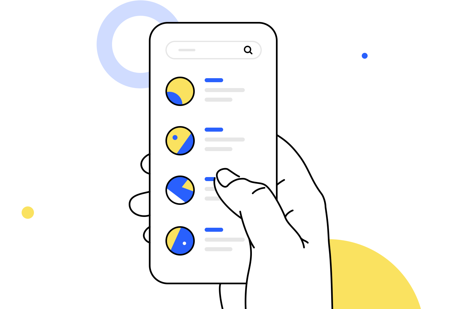
Web design layout is all about reaching goals and making efficient use of the space. You want to allocate more space to the important stuff, making sure that the content on display can reach its full potential. The correct arrangement of content can depend on many different factors, such as the nature of the content, the device it will be on, the people who are meant to use it or the main goal of the project itself.
One thing remains true, no matter the type of product or content. The layout needs to make good use of the space, creating the visual balance and setting a certain hierarchy of importance of the elements. It’s a crucial step in web design and it has huge consequences for the final product.
Web design layout is, in many ways, simply a debate on how to best display the content we need to. Once we know what the product needs to do, what it needs to show, we can start to understand what is important. The content itself needs to be presented in a way that isn’t just visually beautiful – it needs to be persuasive, efficient and easy to understand.
A few web design concepts play a big part here. Content structuring is closely related to the information architecture and the visual hierarchy of the product. On the one hand, the information architecture will dictate the most important pieces of content and define how the different pieces relate to each other. From there, web designers can start to create a layout that upholds the visual hierarchy of the content.
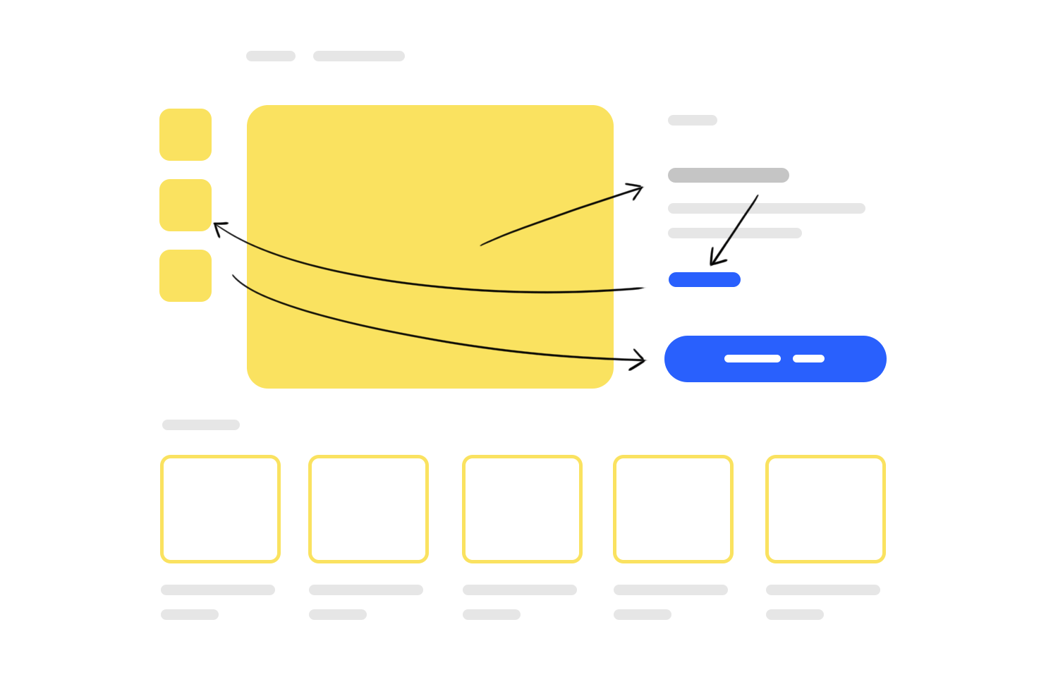
The layout is indeed very closely related to the visual hierarchy. This hierarchy is important because it will tell users what they need to focus their attention on, making the entire page easy to read and understand. If all the elements were exactly the same size and color, it’d be extremely confusing and difficult to find anything. Designers use the hierarchy to guide the eye, making the crucial bits the center of attention.
This is why the concept of web design layout doesn’t deal exclusively in the visually pleasing. There’s a real science to understanding the human eye and how people react when faced with the content. You want to have them first see the important bits, then proceed to guide them through the rest of the content. It should be easy for users, who ideally wouldn’t even notice that there is a carefully planned structure to what they see.
Web design layout must always be visually balanced – but what does that mean, in practice? In the design world, it’s known that everything we see on the screen has a certain weight. This weight could be because an element is large, or a bright and colorful button, or some intricate font that dominates the header area. All of these are valid roads for web designers to take, but there are rules to this game.
The balance that designers seek comes from knowing how to distribute the visual weight, so the screen is both easy to read and to avoid something that is overwhelming to people. Some designers use analogies like furniture in a room or plants in a garden – simply throwing it all in the same corner just won’t do. You want to spread it out, create a certain harmony that people can appreciate. Web design layout does the same to digital products.
There are a few factors that designers should always consider when trying to define a layout that maintains the visual balance.
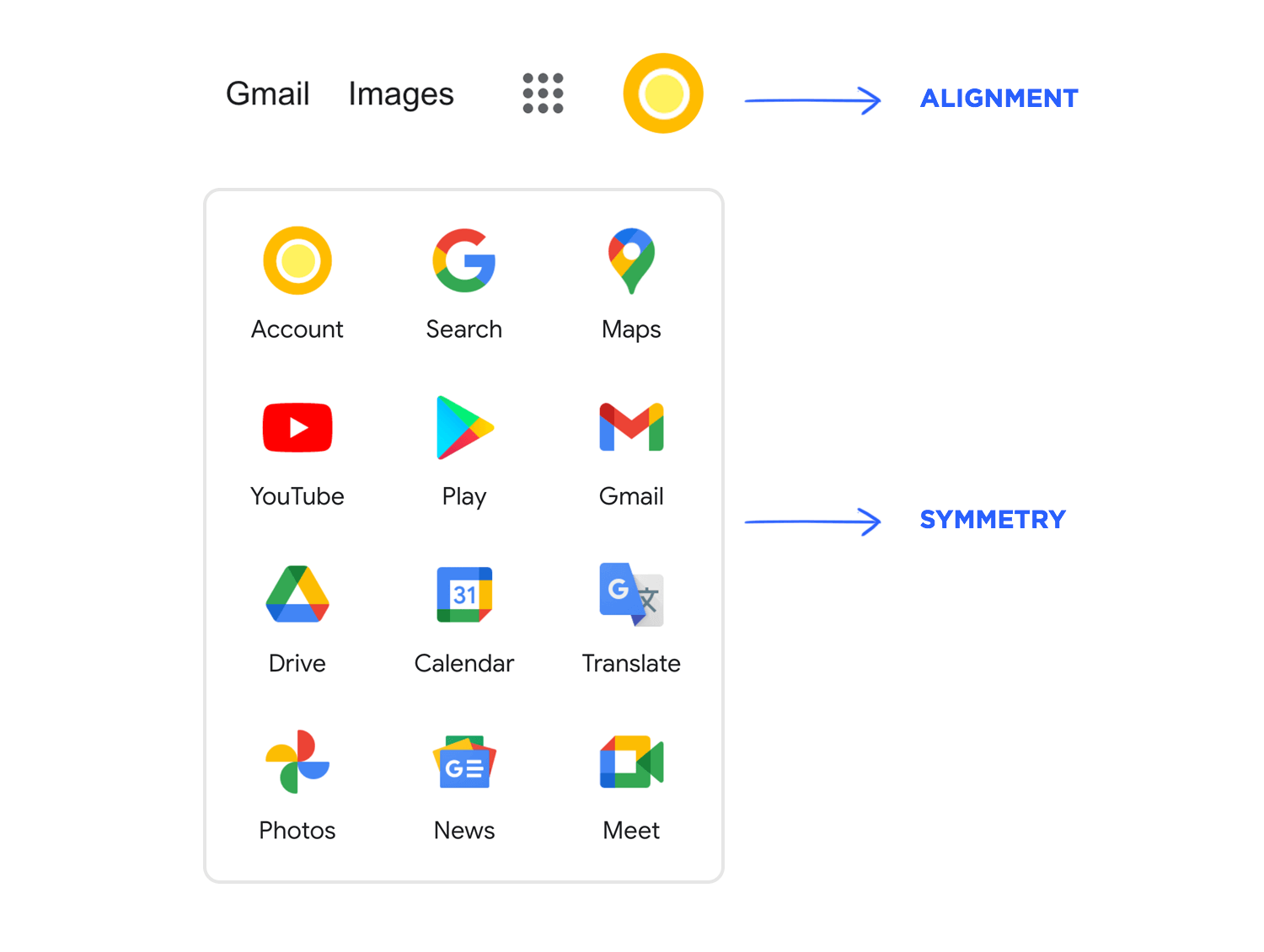
First, we have alignment. This refers to the position of the elements in the layout, which designers can use to create balance by spreading heavy-weight elements in different corners. Web designers can get really creative here and use elements that are intentionally aligned (or not) to communicate with users. For example, many small elements that are all closely located with perfect alignment signal to users that these elements are closely connected in nature.
Secondly, we have symmetry. Web designers can use symmetry to create a well-balanced design, with aligned elements of equal weight creates a relaxing effect on the eye. In a similar note, designers can also use this rule in order to create something edgy and powerful – by rebelling against it. Asymmetric designs can have a modern feel to them, resulting in more dramatic and impactful designs. The trick, of course, is still delivering a visually balanced asymmetric product.
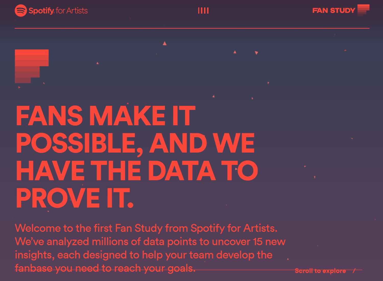
As we mentioned before, web design layout deals with focusing the user’s attention to the really important content. With the allocation of space, designers can place a huge emphasis on what matters. Designers can convey to users the primarily important element of the page in many ways. Things like the choice of colors, the empty space around the elements or the contrast between the element and the background.
A silly example is a comparison between primary buttons like “SEND” and secondary ones, like “CANCEL”. The brightest color, the one that grabs the eye, tends to be the primary button. The secondary button one will have a color with less contrast so that users see it but don’t focus on it.
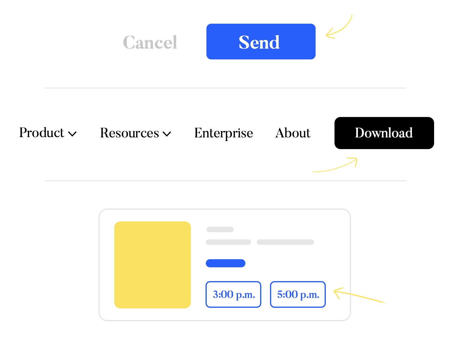
However, one of the main ways in which designers tell users what truly matters on the page is the proportion. As a general rule, important things are displayed in a larger size and take up a lot more room in the design. This is especially true when we consider the proportions of the important elements in comparison to the secondary ones.
Web design layout requires that designers narrow down the main elements or most important pieces of information on each page. Having the priorities straight is crucial because it will dictate what designers place the emphasis on. Once designers know exactly what matters the most and what the final goal of the page is, they can focus on creating a truly persuasive web design layout.
Whitespace is absolutely important in web design layout. There’s no way around it. Designers grow to appreciate how powerful empty space can really be in web design layout.
One of the most important roles of whitespace is allowing the visual hierarchy to be obvious. People seeing the design can intuitively tell if pieces of information are connected or if two elements share some characteristics, all by how much empty space, there is between them or around them.
Having the right amount of empty space also allows for better readability, because users don’t have a million small details bombarding them all at once. They are free to focus on the path that web designers laid down for them.
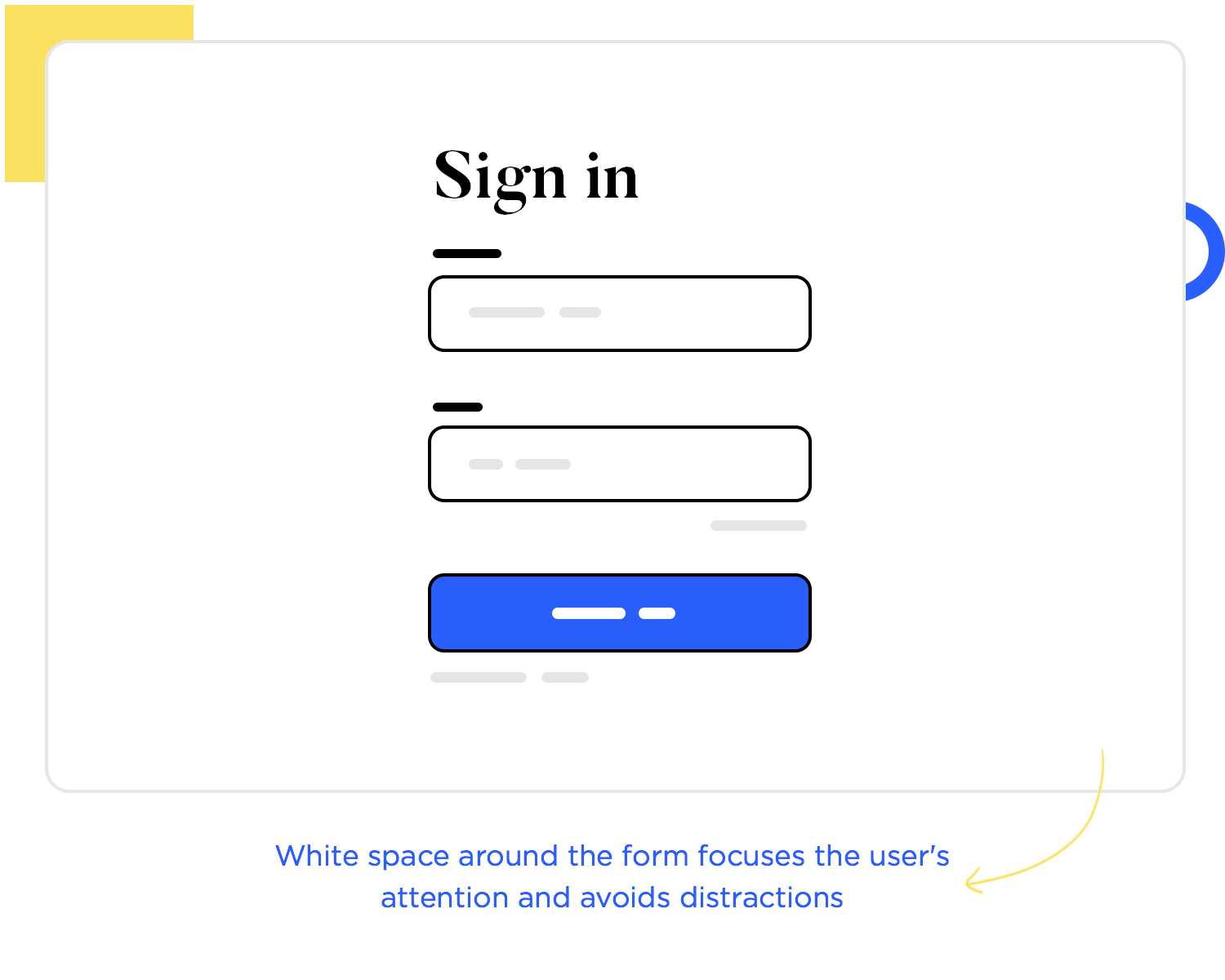
Another important reason why designers have a lot of whitespace in web design layout is that humans can only take so much. There’s a certain mental effort that comes with reading something for the first time, understanding what it’s saying and what it means. This is a concept that goes by the name of cognitive effort. It refers to how much effort users need to invest into the design in order to use it.
Whitespace can be a wonderful way to keep that cognitive effort low. By prioritizing elements and information and allowing plenty of empty space around them, we make sure that the page doesn’t overwhelm users. If there are too many elements, flashing colors, moving graphics and no empty space, most users will simply walk away. The experience would be too demanding, too confusing.
Experienced designers know that repeating elements and arrangements in web design layout isn’t always a problem. Sometimes, it’s a strength. This is especially true for big products that need to hold a lot of content, a lot of page designs. By repeating certain things in a strategic way, we can pull the entire design together and give it a sense of coherence.
A few concepts come into play here. First, all designers know that there’s a limit to how many unique elements and styles you can include in the same design. After a certain point, it becomes visually tiring and increases the cognitive effort necessary to use the product. And so, repetition is simply a part of web design in general.
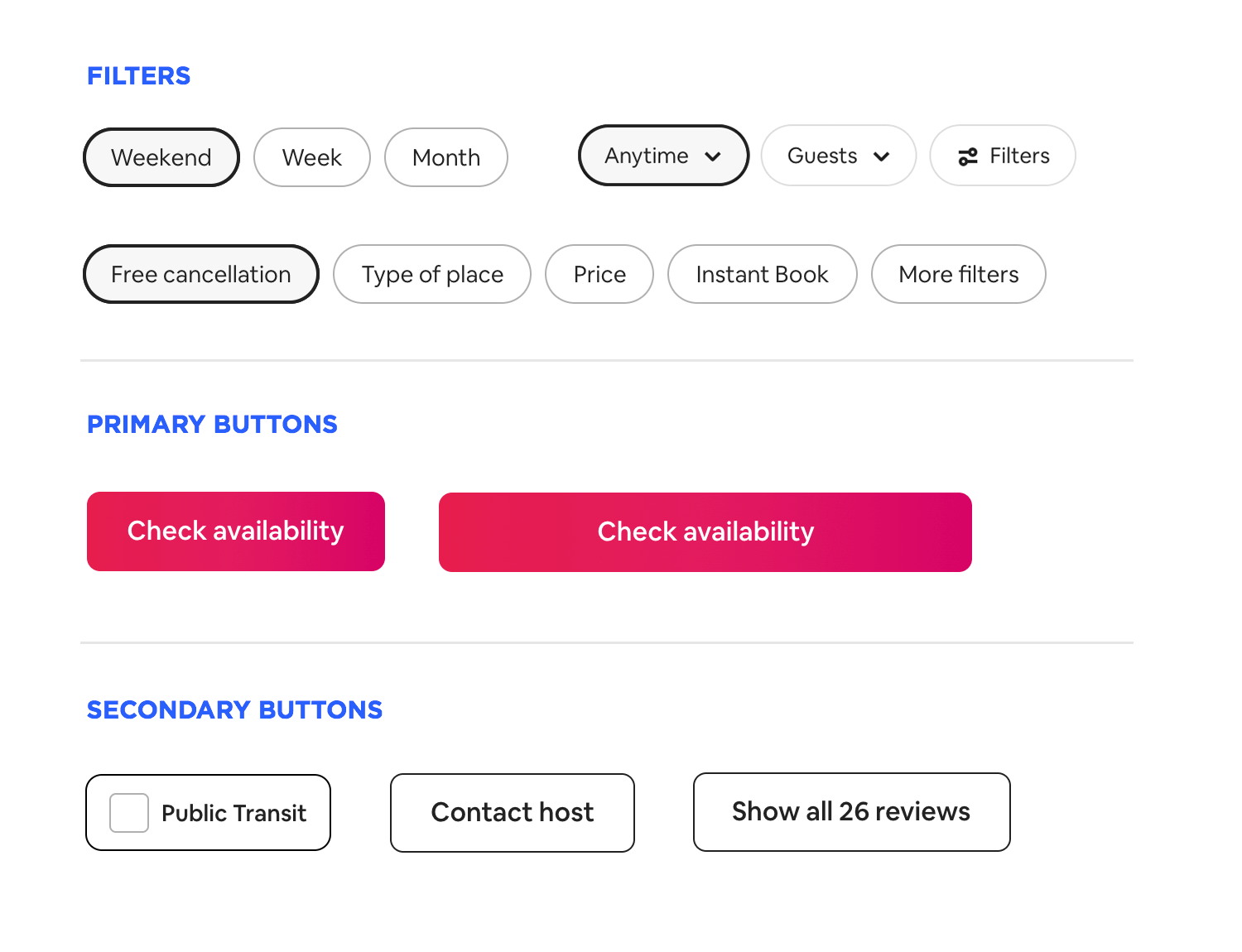
Secondly, we have the idea of brand identity and design systems. The web design layout can most certainly take part in the brand identity of the product, adding to the personality of the design. As the product grows, it can be hard to maintain that same identity in a coherent way. That’s why many design teams out there have design systems that include not just a color palette but entire layouts.
That means that any design team member can take these base web design layouts and use them to create a page that maintains the visual identity of the product. It’s about cutting back on design time and establishing a certain pattern of repetition that designers can rely on.
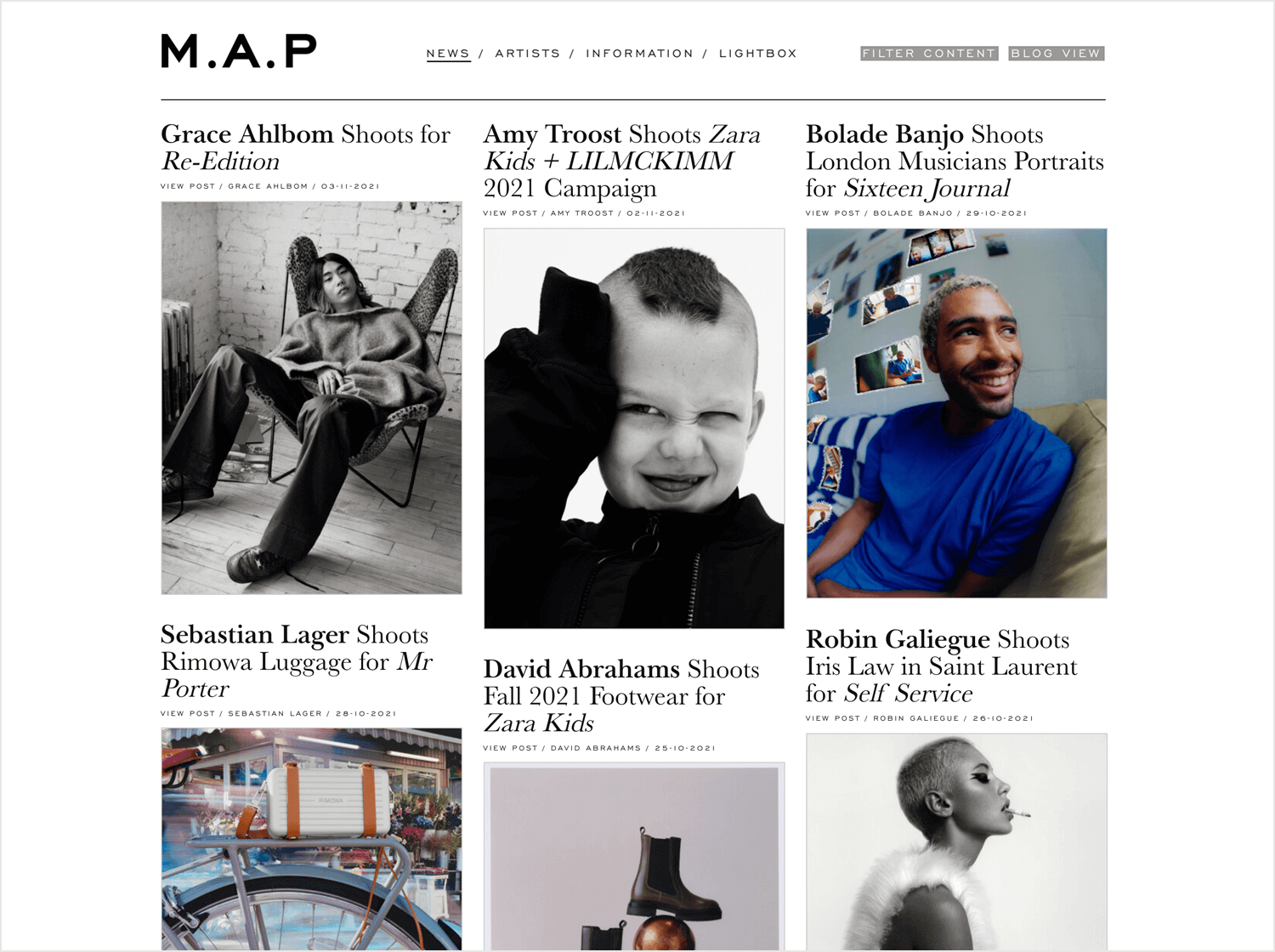
Website design tends to deal with a lot of content, sometimes even with the need to display all that content at once. That’s why many design teams lean on the grid layout, using modular cards to present a lot of content in an organized manner.
One of the best things about using a grid website layout is the freedom it brings. Content is often organic and tends to grow, to change. With a card UI system, designers can create something flexible that can be adapted without too much work. With its modular nature, the grid system can be symmetrical or asymmetrical, minimal or full of details. There’s a huge margin here to design a website layout that can survive in the long term.
The trick here is to understand that even cards can still represent too much cognitive effort. You want to leave plenty of empty space between cards and limit the amount of text or visuals that each card holds. That way, users can take their time and take the grid system in, instead of being bombarded with 12 squares that are all flashing with different colors.
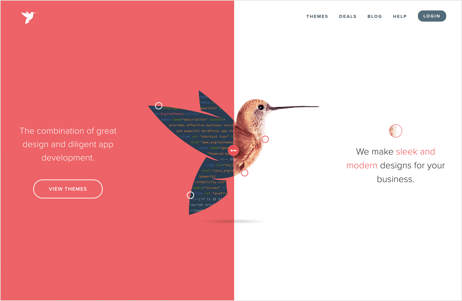
Dividing the top part of the screen in half is a popular way to offer dramatic visuals and still keep the efficiency of the website tip-top. Some websites use this layout to try and encourage users to make a quick choice between two equally important options. This can be a persuasive way to push the user to decide on something, while also being visually pleasing with its symmetrical layout.
Other websites use the split-screen layout simply to deliver a strong sales pitch. Instead of choosing between two options, users have one side with a powerful visual while the other has a text-based pitch. The whole layout can be modern or classic, being highly adaptable to any style or trend out there.
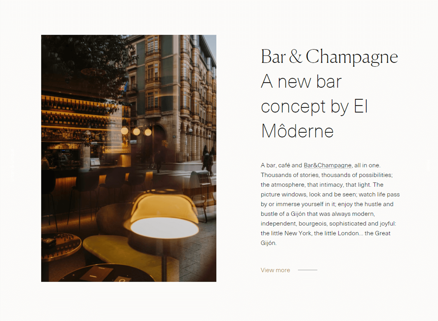
The featured image layout for websites plays a lot with the concept of emphasis that we mentioned before. With a large image being the focal point of the top of the page, designers make sure that users will pay attention to the image and what it says or means.
One of the greatest things about using a featured image is that it can be used to set the tone. Being the first thing users will focus on, designers can create the perfect image that captures the entire web page. Commonly used to editorial style websites, like newspapers and blogs.
The zig-zag website layout is basically creating the entire layout based on a reading pattern. The idea is that while most users don’t actually invest the time needed to read a web page from top to bottom, they do scan the content. This scanning is usually done with a pattern, with the Z pattern being one of the most common ones.
Because it’s so common for users to scan content with the Z pattern, it’s logical that creating a website layout with that same structure could be useful. You ensure that users will indeed see the content, increasing the chances of them finding what they’re looking for.
This website layout also deals a lot with the concept of repetition. It’s usual for websites to create a zig-zag pattern by repeating the same layout in alternating sides of the screen. There’s nothing wrong with this approach to website layout design – repetition can be good!
Similarly to the Z reading pattern, the F reading pattern is also commonly used in web design. This basically means that users, when scanning content, will focus on the left-side and then venture into the right depending on the content that they see.
When it comes to website layout design, this usually means that important information or elements need to go in the left side. That makes it more likely for users to interact with them, in case of shopping item filters for example. If we’re dealing with a more text-focused design, you want to make sure that the writing is on point, so users can find the important parts of the text to the left.
Creating the right layout for website design is both art and science, with many factors having a big impact on the best approach. There’s a certain need to account for more practical things, like the business goal and target users of the product. You want to use the space in an efficient way that allows the product to shine and present the content in the best possible light.
PROTOTYPE · COMMUNICATE · VALIDATE
ALL-IN-ONE PROTOTYPING TOOL FOR WEB AND MOBILE APPS
Related Content
 There really is no faster way to get started than using a pre-designed web app template that you can tailor to your taste.6 min Read
 Looking for a quick start in a new project? Discover these 37 free practical app templates made by the Justinmind team just for you.13 min Read
 Looking for a quick start in a new project? Explore these 30 practical 100% Free website app templates designed by the Justinmind team just for you.14 min Read
