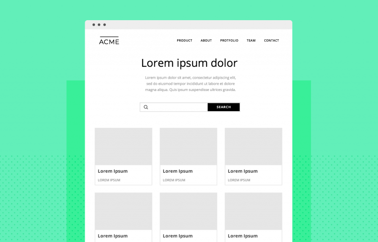
Wireframes are a powerful way to spot issues before they become expensive problems. But what’s the right approach?
Create interactive wireframes with Justinmind

- What is a website wireframe?
- Why and when do you need to design a website wireframe?
- What’s the difference between wireframes, mockups and prototypes?
- Materials you need before wireframing a website
- Information architecture
- Wireframing the navigation in a website
- Lorem ipsum or real content in your wireframe design?
- The right amount of visual design
- The right amount of interaction
- Wireframe UI kit for a website
- Wireframing tools
- Website wireframes: examples
Website wireframes tend to be compared to the classic blueprints for any construction project – a clear picture of how things are going to look, in broad strokes.
They are meant to be a practical map, so everyone can see exactly what goes where inside the project. They can be incredibly handy in terms of both product development and communication – aside from being relatively cheap to build.
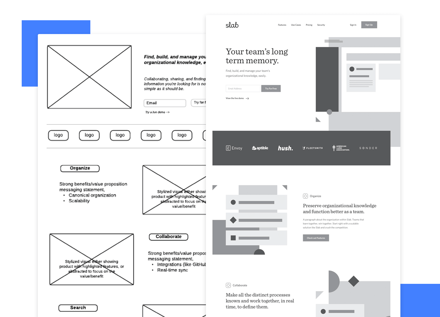
Design by Shabnam Gideon.
Just like your good old blueprint, your wireframe has the potential to become your dream-house with the right interactions and components that make an experience great. The wireframe is meant to show your website’s structure, and show the main components of each screen.
Any given wireframe can be split up into 3 different components:
- Information architecture: organize every piece of content and visual components to ensure a logical and enjoyable user experience.
- Navigation /structure: show global and secondary navigation elements to make sure users can move freely around the product with ease.
- Layout design: includes a few visual elements of the interface before the heavy lifting of visual design begins.
A wireframe is basically a map to your website. They are meant to be simple, making wireframes a fast tool to get the design going. But there is another concept at play here, which relates to the degree of detail you apply to your website wireframe: the level of fidelity.
The level of fidelity relates to how close the website wireframe will be to the real, finished product. Like most things in UX design, there isn’t a black and white, right or wrong answer. It’s all about finding the right balance between the time it would take to add those details and your need to have these details early on in the project.
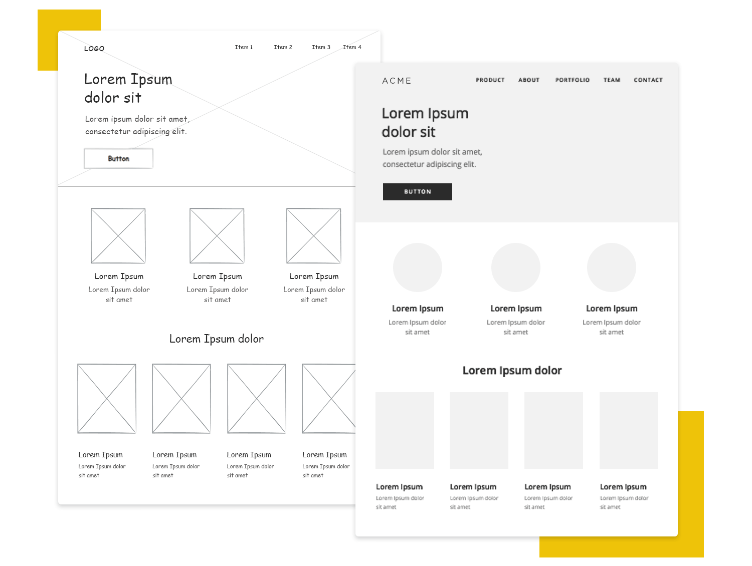
Low-fidelity wireframes tend to have rough layout schemes that show the general localization of each element on the screen, but don’t show us details of what those elements will look like.
Instead, the screen is likely to be divided into zones or blocks, with little attention being paid to scale or accuracy. It’s better to go with a low-fi website wireframe if you have several concepts you want to play with and compare within a tight time-frame.
On the other hand, high-fidelity wireframes tend to vary a lot depending on the company and design team.
Some use real images and real content, even including many of the interactions the design will have. But this comes at the cost of investing lots of time into creating and adding all these details, making them better suited for later stages of the creative process.
The line between a high-fi website wireframe design and a prototype can be blurry, as both aim to represent the finished outcome, but we will get into the difference between those two later on.
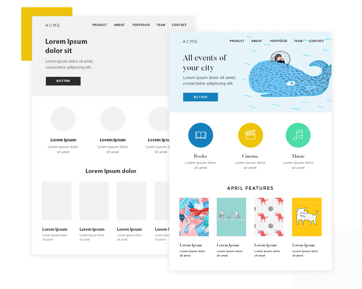
It’s important to note that one should never start off straight with a high-fidelity website wireframe.
Ideally, you want to start with a low-fi version in which you can define the basics and build on that, so you can ensure you pay due attention to the structural side of your project. This is particularly important when it comes to your information architecture.
We know that wireframes keep things organized and lay everything out in plain sight. They’re about arranging the elements you need in order to have a clear view of what works and what needs work. Here are the key goals of any wireframe:
- To show the positioning of content and visual elements of your design
- To help with internal communication between designers about the concepts at play
Like most things in life, however, the real use behind wireframes may vary depending on who you ask.
Developers, for example, tend to use the website wireframe as a map of the core functionality of each screen and element. UX designers, in contrast, find wireframes very handy in portraying the navigation flow between screens.
Regardless, it’s crucial to have a website wireframe show you where everything goes, because this forces you to define and work on the information architecture of your product. The way you present possible actions and content to users is key when it comes to ensuring good usability.
You will find clients or other fellow designers who claim that you can just skip the wireframe design stage of the product development. Usually, the main argument for that is that wireframes take too long to create and don’t add enough value, since they don’t include most of the visual design that brings branding into the game. That is utterly wrong.
Wireframes should always be created at the early stages of any product, because they will make errors in judgement and design stick out like a sore thumb.
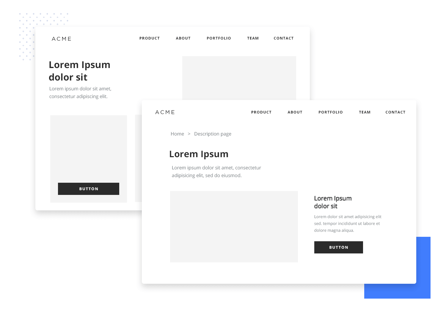
You will be able to clearly see if the structure of this screen doesn’t make sense, or if the navigation to that screen is a usability nightmare. You need to create the website wireframe if you want to catch these mistakes early, before making any adjustments or changes becomes time-consuming and quite expensive.
If you consider the whole product development process, your wireframe design will save you time and lots of frustration. They are quick to build since they don’t have small details like a hi-fidelity prototype, and are quite cheap.
When it comes to the communication aspect of wireframes, it’s a common mistake to think that wireframes will help you communicate your ideas to the client. Sending a rough website wireframe will more likely cause harm than good, as clients often can’t see past the black and white squares and placeholders.
Side note: Wireframes are helpful, however, when it comes to the internal communication of the design team. They provide a solid base on which the whole team can work.
Some designers do make use of wireframes in order to communicate concepts to clients, but they never rely on wireframes alone. Ideally, you want to present a polished design in the form of a prototype or mockup to the client – so the client can clearly see the main visual design of the product.
Once they’ve gone over the prototype or mockup, the designer will then show the wireframe in order to talk over the key structure and navigation. But one should never rely exclusively on a wireframe due to the fact that it can underwhelm the client.
Create interactive wireframes with Justinmind

There is always a bit of confusion surrounding the line that separates wireframes from mockups and prototypes. Let’s start with mockups.
Wireframes are the first step in getting your ideas down to the physical plane, bringing them to a form that stakeholders can see and understand. Wireframe design concerns the structure and positioning of elements in the product – mockups go just a step further.
Mockups, like wireframes, include the main components and illustrate how the product will be by the end of development. Here is the difference: mockups include more visual details. In your mockup, you are likely to include things such as color, logos or typography.
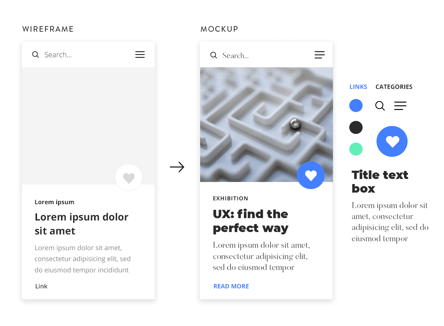
This is when things such as branding and visual hierarchy come into play, as these visual details will allow for a close representation of the final product.
Both wireframes and mockups are a necessary step in creating a product that users can love, because they are both opportunities to identify flaws in your design and iterate for cheap – as neither of them involves actual coding.
If mockups are the next step from wireframes, you should think of prototypes as the following phase in product development.
Some designers prefer to incorporate some basic interaction design in their clickable website wireframes, which is great for validating basic navigation and interface elements. But wireframes are meant to be simple and straightforward – they shouldn’t include all the small interactions that your product will come to have.
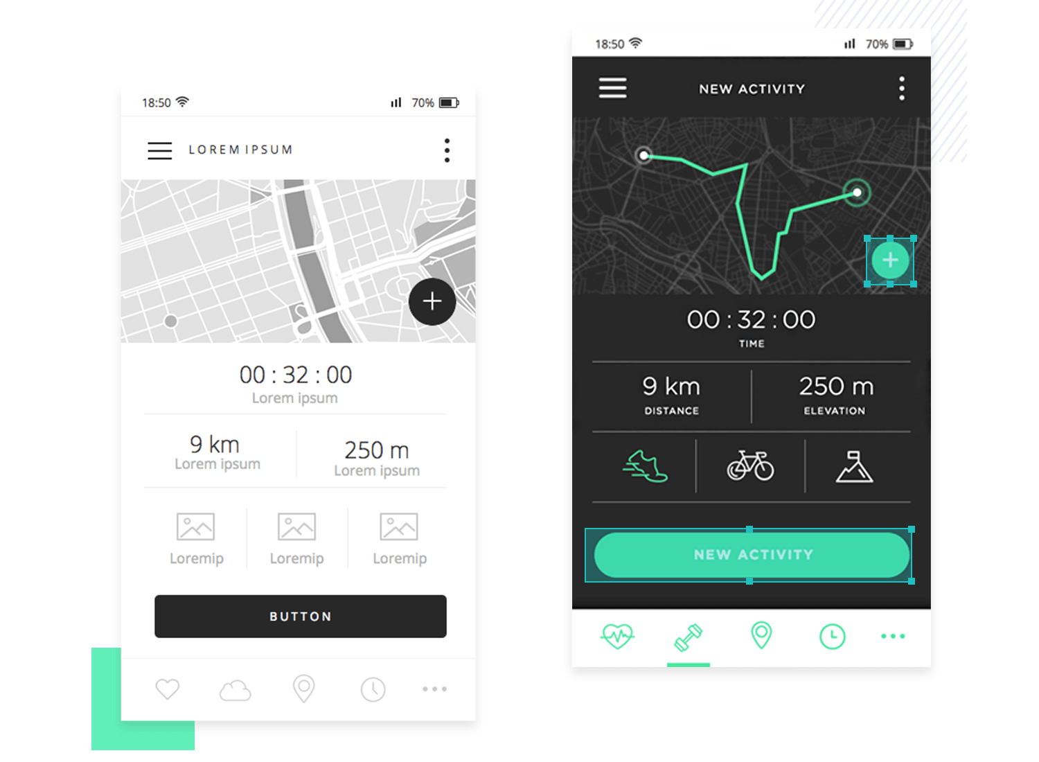
Prototypes, on the other hand, are mid-to-high-fidelity models of what the finished website will look and feel like – which means they tend to go to a much more detailed level of the design.
The benefits of prototyping include that with a high-fidelity prototype, you can carry out your user testing and go over every aspect of the design. It’s true you can still carry out user testing with a simple wireframe design – but you can only get so much feedback from users, as they won’t have the whole design in their hands.
It’s all about having a realistic idea of the final product.
Another key advantage of prototypes is that they can be shared and worked on by several people at the same time. This teamwork functionality can be very valuable for designers – be it so that other designers can tackle a new feature together, or to show to other departments to make sure everyone is on the same page.
People who have only recently gotten into wireframing and design, in general, can get overly excited about the act of wireframing a website. The truth is that before that can even happen, there’s a whole preparation effort that comes into play. Generally, this is because you want to create your website wireframe with direction, knowing the basics of the project. Otherwise, the wireframe you create will never truly capture what it needs to.
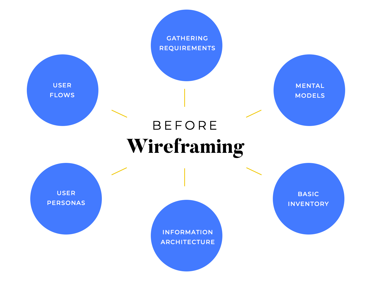
But what are these materials? There’s a list of things you want to have a clear understanding of. They include user flows, user personas, mental models, gathering requirements, and a general map of the information architecture. This may sound like a pointless effort – after all, we want to sketch out as many wireframe options as possible and then simply choose the best one, right? Well… wrong.
Part of the art of UX design is to walk the thin line between free-flowing creativity and controlled decisions. These materials are necessary for designers, so they can understand what the main goal is and who the users are. Creating the right website wireframe will heavily depend on what the user persona is, what the requirements are, and so on. Let’s briefly go over what these materials are and why we need them.
The requirements are often handed to designers, sometimes in the form of a list or even a checklist. These tell designers what the product’s final goal is. Is it selling something? Is it getting people to sign up for something? Is it helping employees manage inventory? The very soul of the product is captured here, along with all the design requirements, business requirements, and so on.
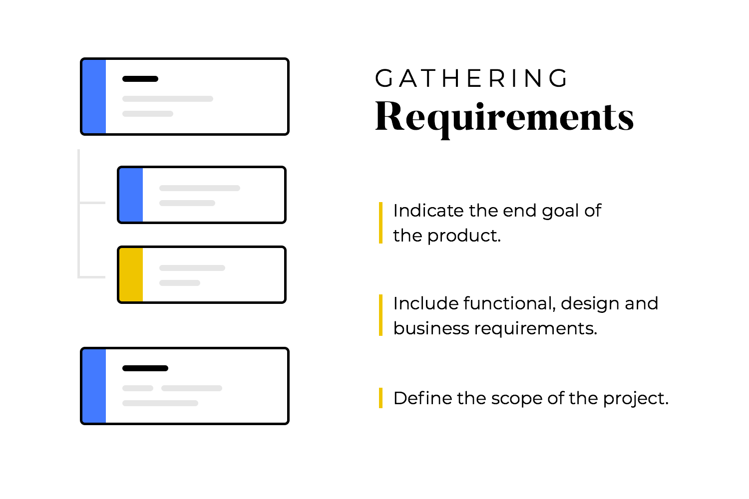
The reason why these requirements are so crucial is that they define the project scope. They tell designers what the market is, what the product needs to be sustainable, and what the project asks from designers. This list will give designers a clearly defined path, showing them what truly matters in product design. Without the requirements, designers would be running around creating wireframes that literally have no real application in business.
A user persona is a hypothetical person that does not exist in real life. It’s basically a profile that is created to capture what the typical user looks, behaves and needs in life. There’s a certain margin here of how much detail design teams will include in each persona, but the basic information needs to represent their life, their struggles, needs, and wants.
This profile will work as a point of reference for designers when creating the website wireframe. Sometimes, you just need a real face and a name in order to think of the users as real, complex people. The user persona will help the design team stay on course, to engage in empathy, and try to understand what the user feels, what they need from the product.
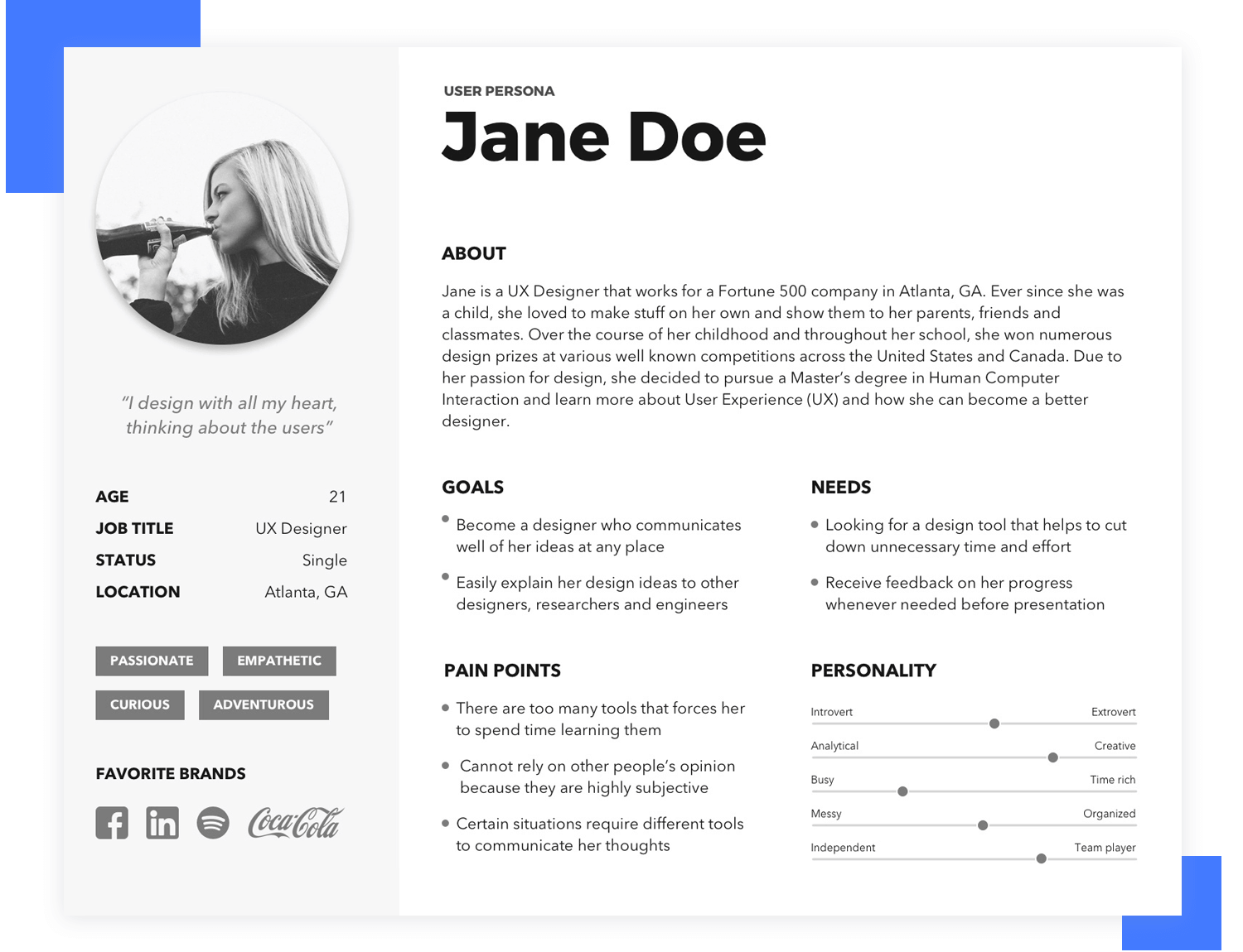
Having a good user persona can also help design teams to create a website that is more convincing, more efficient at communicating with the user. This means that by tailoring the design at every turn in the process, designers can create a truly persuasive website that says all the right things, that behaves just right.
Ultimately, the user persona is only one of many materials that derive from user research. Much like big companies have a whole department that studies their market and customers, designers also dedicate a lot of time to creating materials that capture their market.
This can be a somewhat debated deliverable, because not all design teams do this step. Generally, you want to look at the requirements and make a detailed list of all the design elements that need to be in the product in order for it to function properly. In some teams, they even include key pieces of information, making one list per page.
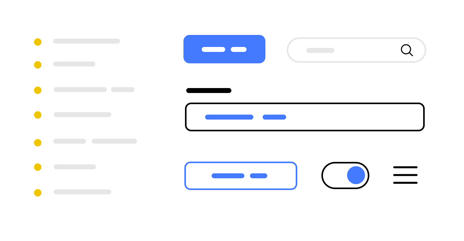
This may seem like a silly step at first glance. However, this is meant so that nothing gets left behind. If the ultimate goal of the product is to help employees manage inventory, the design team will have a series of components that are necessary in order to make that happen. The buttons, the navigation elements, everything that derives from the tasks that users need to complete.
Information architecture is its own world. In large companies, there’s likely to be a single person whose entire job is creating, managing, and adapting the information structure of the website. We’ll dive a bit deeper into IA in the next section, but for now, let’s just take a moment to consider the role it plays before there is even a wireframe.
When creating your website wireframe, you’ll want to have at least the general structure of the information contained in the product. You want to get this work done before you start creating the bones of the website wireframe because the IA will reflect what your navigation design should look like.
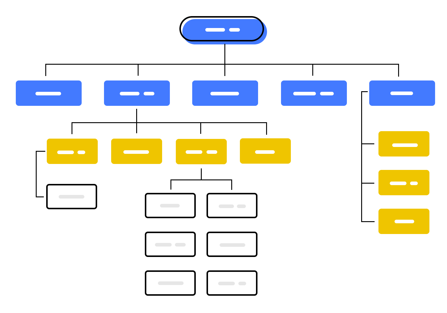
Think about it. Categorizing and organizing all the information contained in the product will, unavoidably, dictate what levels of content there are, where the crucial stuff is, and so on. Understanding this connection can help designers save a huge amount of time and effort in creating the navigation. If you have the IA structure, you only need to adapt it in order to have the main structure of your navigation.
Information architecture dictates how you structure and present content to the user. It concerns everything you have in your product, and how all of that can be organized so that it makes sense and can be easily found during use.
Information architecture becomes particularly important for products that have a lot of different features, complex aspects to the use of the product or just a lot of content to organize.
If you don’t invest time in creating a logical structure for all those different components in your website wireframe, you’ll end up with a sea of icons, links and features that users can’t find or make sense of.
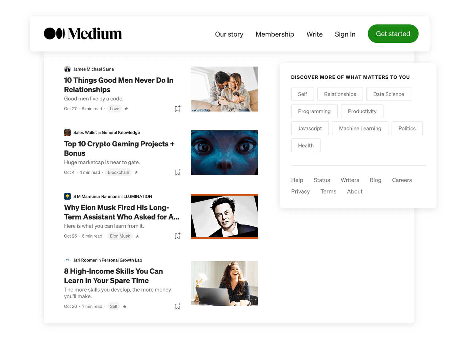
Consider Medium – a platform that has a vast amount of content that just keeps increasing everyday. The designers behind Medium needed to consider not just how to present categories to users but also how this content would grow over time.
Here are the main components of information architecture that will manifest themselves in your website wireframe:
- Organization systems: creates a structural framework that lays down the connection between different pieces of content so it can be understood in a logical way.
- Hierarchical structures: places broad and most important categories at the top, presenting other smaller categories in a trickle down-effect. Also known as tree structures.
- Sequential structures: creates a more narrow path that restricts the choices available to user, making navigation much simpler.
- Matrix structures: creates connections between most features and content, and leave the user to navigate the way that suits them best. It’s complex to design, and can lead to overwhelmed users if you’re not careful.
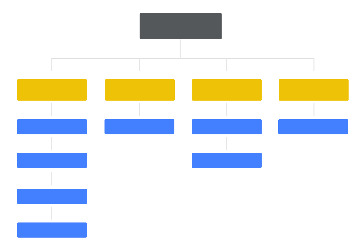
Visualization of a hierarchical structure.
- Labelling systems: Adding labels to your content will help convey the broad meaning behind all that content in a single word. That word can be a top category, for example, that your users will click on in order to keep looking for the specific content they want.
- Navigation systems: your navigation is the highway that will lead users to their final goal inside your product. It’s not so much about having a visually pleasant interface and more about helping users get to where they want without going in circles.
Your website wireframe design needs to include things such as navigation flow and content placement – both of which are closely related to the information architecture in your product.
Create interactive wireframes with Justinmind

If you’ve defined the information architecture of your design, you have probably already touched the navigation system design.
In order to organize your content, you’re forced to consider things such as the labels of each piece of content and how it fits within the website wireframe. And you have to present that content is a certain way if you want the product to have good usability.
This is very challenging, as navigation for its own sake isn’t something users wish for.
When was the last time you enjoyed surfing around an app, looking for that one piece of information you wanted? Looking for things in the product is never fun, and can get really frustrating within seconds.
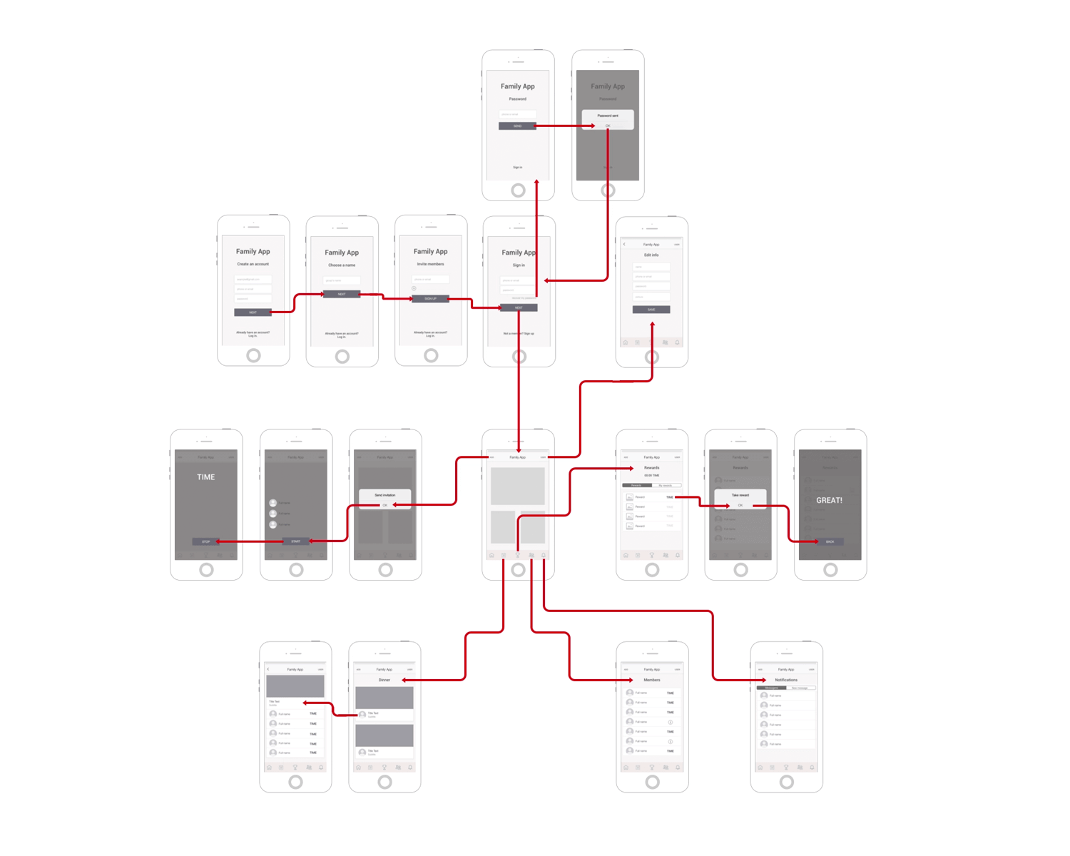
Design by Michele Strohschein.
Even though there is no one-size-fits-all recipe for what makes for good navigation in your website wireframe, the general rule is that your navigation needs to promote good usability. This has a few consequences that should be reflected on your navigation flow:
People can feel lost in a virtual product. You want to let users know where they are at all times, even if you just let them know the general branch of the product they are in.
You want the navigation to be consistent and coherent, to the point where users can predict where certain things are based on the general interface design. This will help your product be more learnable and discoverable for new users.
You want clear goals: you don’t want to get from point A to point B on the least possible amount of clicks. You want to get there in the most fluid, logical way possible – that is what marks a truly good navigation system.
This should make it clear that your homepage or home screen, for example, shouldn’t have a link to every possible page in your product. Make roads that users can follow and don’t focus so much on shortcuts.
Have primary and secondary navigation menus. Navigation design is complicated and it must take the user to every corner of the product – which means that extensive products will likely require two menus.
The primary should be the main road for most users, touching all the key features and important areas. Secondary menus can lead to other, less central part of the product. Card sorting can be quite handy in defining these menus.
Some of the most commonly used patterns have helped countless UX designers create good navigation systems for their designs. These can be seen as handy tools that can help users make sense of the product, allowing them to make the most of it. Here are the classics:
Try leaving breadcrumbs for users. Not quite as literally as Hansel and Gretel, but still a way for users to find their home, or any of the previous stops they made along the way to their current screen.
These are used mostly by large websites that have a big amount of content in a hierarchical system. These should be seen as a secondary navigation system, so you shouldn’t rely on these for the whole means of transportation of users.

Feed users hamburgers. Hamburger menus are quite popular in mobile apps, even though they have been on the receiving end of quite a bit of criticism from the design community.
Among the arguments against hamburger menus is the fact that many of the features listed there can be easily overlooked and left unused by the user. While that may be true, burger menus are still a practical way to lay options at the user’s feet without eating away too much screen space (something crucial for mobile apps).
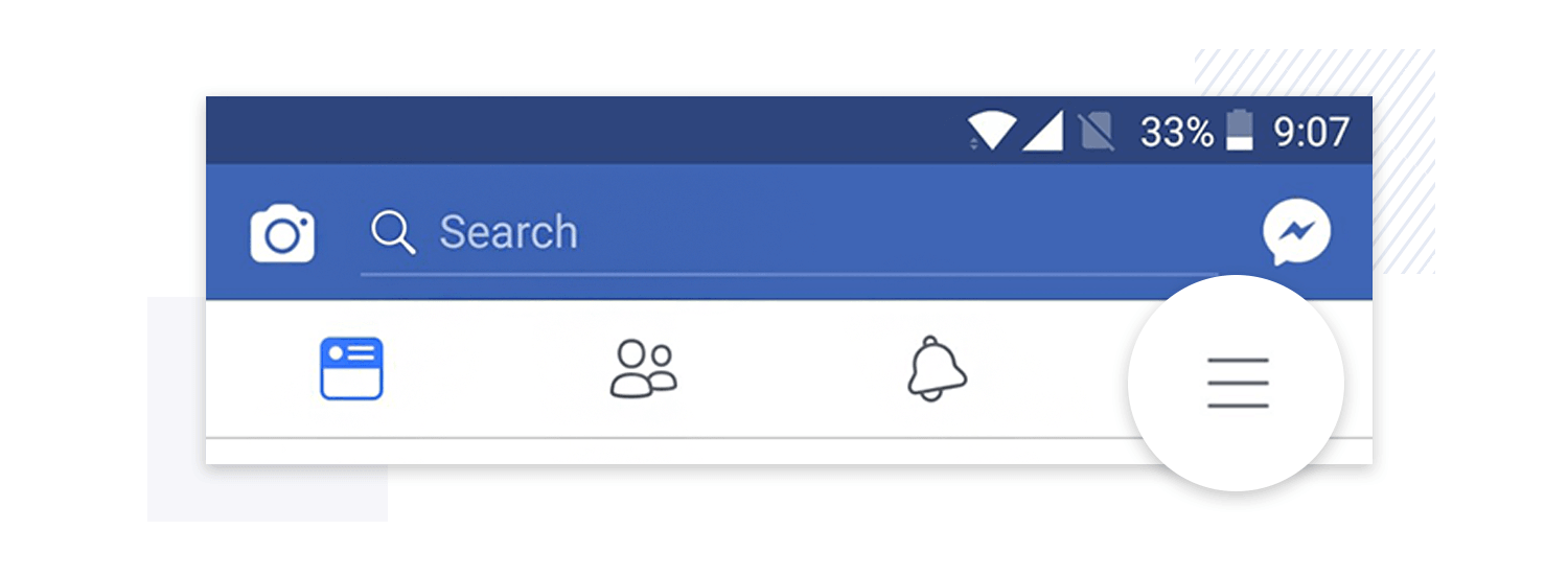
If hamburger menus aren’t for you, the biggest alternative are tab bars. Usually placed at the top or the bottom of the screen, these are classic bars with icons which sometimes include microcopy.
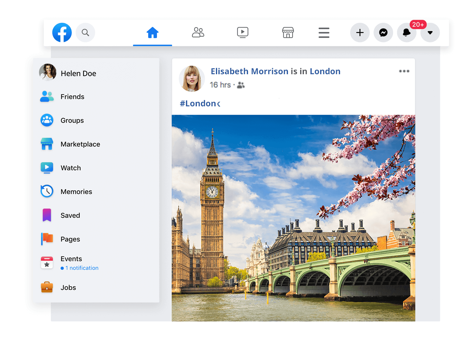
These are scalable, especially when we consider vertical navigation. Tabs can help the user have a better understanding of where they are or where they want to get to – Facebook combines both tab bar and hamburger menu by making the burger one of the icons on the bar. Smart, eh?
One thing that UX designers everywhere still debate is the old question: which came first, the chicken (the content) or the egg (the layout)? Well, you can make an argument for both sides.
Placeholders and lorem ipsum speed up the design process as you won’t have to wait for the real design and copy to be created by other members of the team.
The problem with lorem ipsum is that while it does give us a better idea of what the design will look like once the real content is included, it can also be misleading. Once designers start to depend on lorem ipsum in their design, they can be tricked into having unrealistic expectations of the product when real content comes into play.
If you copy and paste the same lorem ipsum into all slots – they will all line up, they will be the same length and the effect will be of a tidy and clean design. But you can’t expect that to remain the case once you start to insert the real text in those slots.
Here are some crucial concepts to bear in mind when building your website wireframe regarding lorem ipsum:
Text overflow and alignment: Writing copy doesn’t always lead to a perfect match in terms of space required for text or text alignment . It’s also incredibly challenging to account for this variable without the real content.
Sometimes, your designated slot for text in that one particular screen ends up empty of content – which leaves you with the question: do we delete that slot entirely or do we find some superficial content to fill in that space?
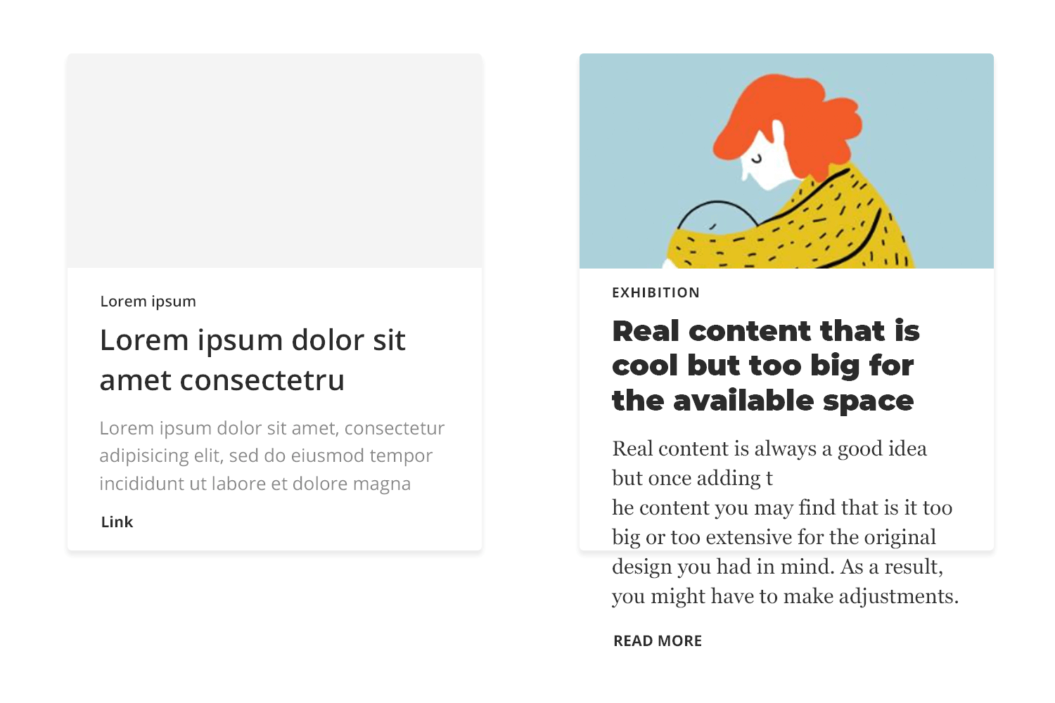
The effect of content on UI layout: Creating a screen in which there are 4 boxes with the same amount of text seems straightforward. But what happens if one of the boxes has a lot more text than the others? Ensuring symmetry and consistency isn’t always easy when it comes to written content.
Hence, the real setback of using lorem ipsum in your website wireframe: once you have the real content, you’re bound to have to make adjustments in your design at a later stage – when those adjustments will likely be troublesome, expensive and complicated to orchestrate.
Some designers aren’t confronted with these issues until most of the design is done and presented to the respective stakeholders.
In this debate, there is a clear winner: real content. Content plays a central part in the product, and this needs to be reflected in your website wireframe design process. It’s much better to spot these troubled areas of your design as early as possible, so you can iterate when the project is still easily adaptable.
Unfortunately, things aren’t always that straightforward. Obtaining the real content can be tricky, particularly if your project includes large teams or if you work for a design agency – making it nearly impossible to obtain the content ahead of the wireframing stage.
There’s always a debate surrounding the visual aspect of wireframes. You see, if they are meant to help you visualize things such as navigation and information architecture, they can’t be focused on issues like colors and typography.
Especially when it comes to the initial design stages, low-fidelity wireframes need to focus on the key structural frame of the product and little more.
Your wireframe is a tool that helps in navigation, in making your design coherent and testing the rough usability of your design. Things such as what treatment or filter to use on the images are issues for your high-fidelity prototype.
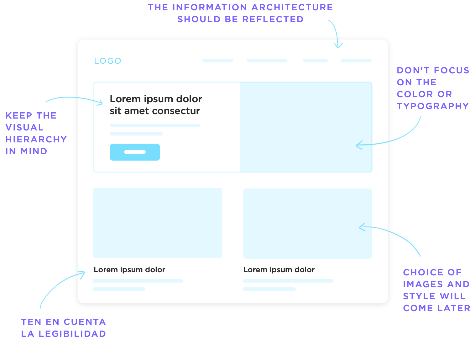
Regardless of if you would rather use a real image for you wireframe as opposed to a square placeholder – there is one side of visual design that needs to be applied to wireframes from the get-go. That is the layout. It will have a massive impact on the readability and general usability for the interface design and needs to be carefully thought out.
Design by Winnie Lim.
You can draw from your visual hierarchy in your information architecture to specify which elements will be displayed where, making sure you don’t contradict the original plan of content display. Consider other visual design concepts such as:
The Gestalt theory: dictates that the proximity between elements will lead users to believe those elements are somehow connected. Use the proximity to create sub-hierarchies of icons and other elements in the website wireframe, making navigation easier for the user.
Whitespace/negative space: can be a powerful tool in guiding the eye of the user to the content or element that really matters, such as CTA. Use the white space between elements to de-clutter the screen and make sure you don’t overload the user at any point in time.
Sizing of each element: Logically, when you create your low-fidelity wireframe you still need to account for how you can reflect the visual hierarchy of your content, or how you can improve the readability of that one screen by rearranging the elements in both size and placement.
Repetition/predictability: having a consistent design can be tricky, which is althemore reason to start checking that your design is consistent from the very start. In your website wireframe design, try to create a certain pattern of how elements are displayed and lay the foundations for a uniform design – you can build on that as you advance.
Apply your design guidelines or system: if you work for a large company you may already have a guide or set of rules that will help you in creating a product that is compatible with the company. This can take some of the pressure away, as you won’t be starting from scratch but rather on a foundation passed to you from the design system.
Design by Pawel Kwasnik.
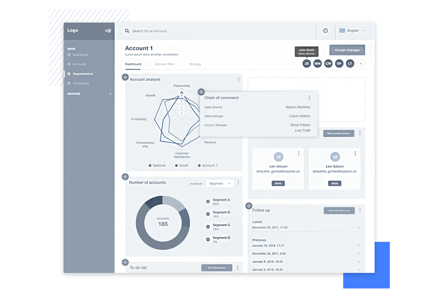
These are some basic design rules that you are probably already familiar with, but keeping these in mind will spare you the trouble of making large changes and adjustments to your design at a later stage in the game. That is because it can be easy to forget what those boxes in your website wireframe design represent, and how it will all come together in the end.
Another side of wireframe design that tends to stir up debate among the UX community, and for a similar reason as visual design. Just like there is no clear-cut answer as to rather your wireframe design should be high-fidelity or low-fidelity, the right level of interactiveness will depend on several factors.
One argument that has been gaining popularity is the case for interactive website wireframes as a way to progress rapidly.
Many designers make the mistake of labeling wireframes as extra fat, as they don’t add much and represent an extra step. But you can completely mitigate that misled assumption by creating wireframes that are more than just another static file – that’s when designing interactions comes into play.
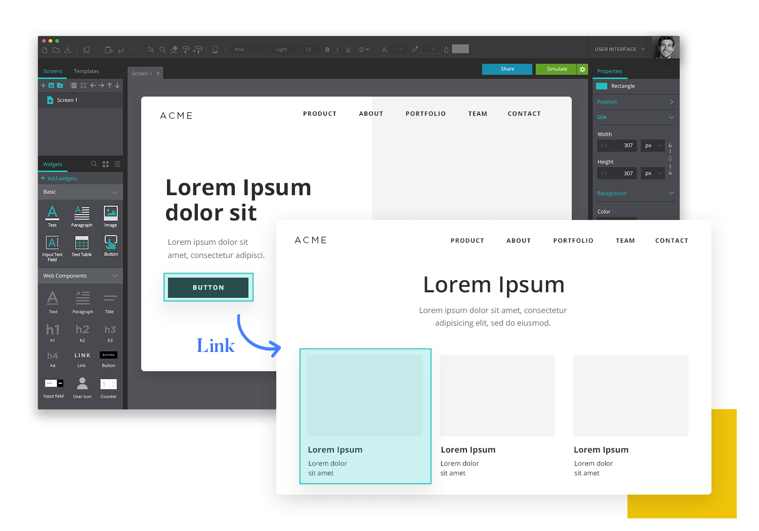
Even with a low-fidelity website wireframe, including the most basic interactions will help you verify their usefulness by testing at the early stages. By leaving most details for later, your wireframe will still be relatively easy and quick to create – but will allow you to reiterate on elements that can be improved from the start.
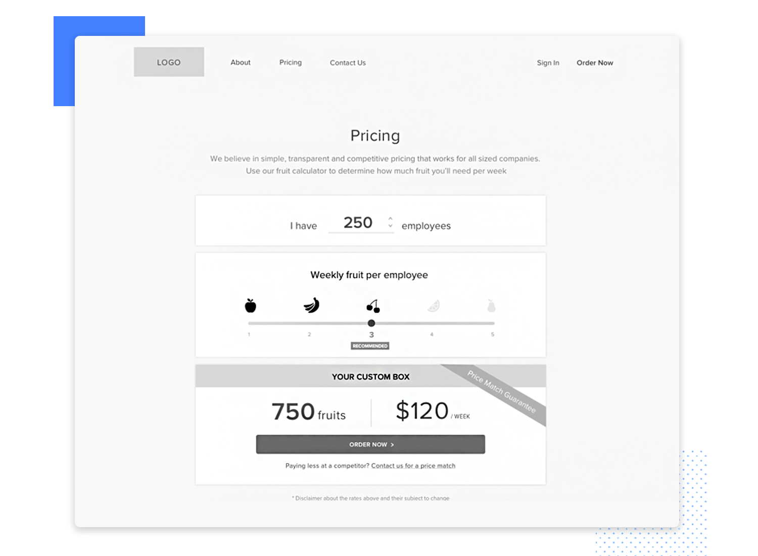
If you’re confronted with having to decide between a few navigational options, you can create separate interactive website wireframes for each one and test them with real users.
That way, you ensure that you choose the best possible direction when it comes to the usability of your product – before you come to a point in the project where any changes to navigation would represent a massive additional cost.
Design by Rachee Jacobs.
With all that said, you must draw a line when it comes to the interactions you’ll include in your wireframe design. Wireframes are meant to be a practical and quick tool, not a full-on high-fidelity prototype.
You want to focus on the interactions that are crucial to the product and leave all the others for a later time. Things such as microinteractions are added later, when you already have a solid base upon which you can build.
Create interactive wireframes with Justinmind

A UI kit is basically a group of interface elements that are ready for you to use in your wireframe design. The kit can be narrow and deal with a specific kind of element, such as buttons, or be broad and work as a one-stop shop for any of your initial wireframes.
A UI kit can save you hours and hours of time in the long run. Remember the last time you moved to a new place? Go back to the first time you went to your new supermarket.
A visit to a brand new market will be much longer than to your usual market, given that you will need to search for every single item as opposed to just getting it and moving on. That familiar supermarket that you’ve been a loyal client of for the past few years is your favorite wireframing UI kit.
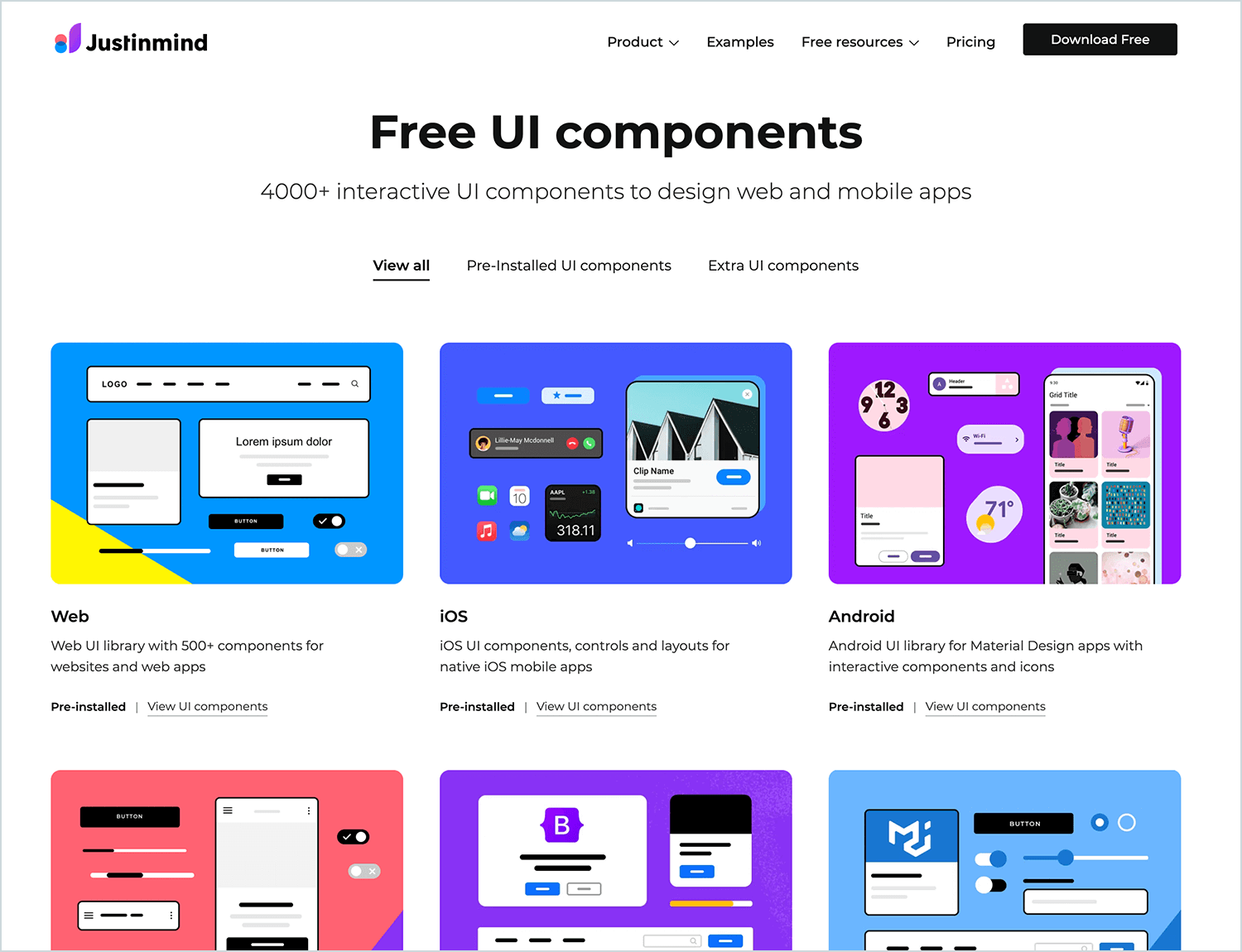
A UI kit will help you use real elements in your wireframe from the start, making it easier to develop on them as the project evolves. With pre-designed blocks, placeholders and icons, your UI kit will act as a base for the website wireframe, allowing you to design any screen in a quick fashion.
Another reason why you should invest in a quality UI kit is that it will work as your ally in making sure you have a consistent design – assuming you don’t work with design systems that will already have a pre-selected UI kit for the project.
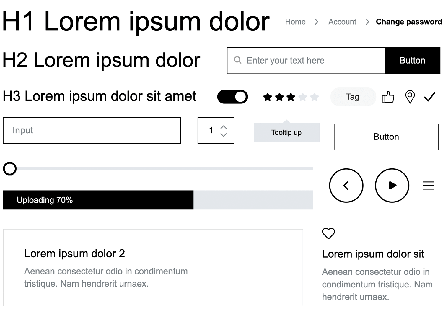
It’s the perfect starter pack for getting your website wireframe to lift off. Armed with over 500 different components, you’re bound to find an element fit for your every need.
The kit includes everything from your regular buttons, social media sharing buttons, pricing tables to pre-arranged ways to display content. It’s all at your fingertips!
The main reason this wireframing UI kit is likely a great ally is that it’s so versatile, even if you plan on changing the style later on in your design process. We’ve mentioned before that your website wireframe isn’t the stage to worry about styles of buttons or focus on the color scheme of the product.
You want to keep a close eye on the structure and functionality of the product at every level, and you don’t necessarily need a fancy UI kit for that – you do need, however, a complete one!
Spare yourself the trouble of looking for individual components and speed up the creation process by having a single library that offers every component you’ll ever need for your wireframe design.
Check out Justinmind’s Wireframing UI kit – it’s completely free.
Just like you can’t build a house with your bare hands, you’ll also need the proper tools and resources to create a truly useful website wireframe. The market includes several tools that vary among themselves – but you’re likely to find the one for you right here.
Justinmind is a prototyping and wireframe tool that is also simple and quick to use with its intuitive UI. The tool is complete with several pre-installed UI kits and widgets that will allow for your product development to be much faster and more efficient.
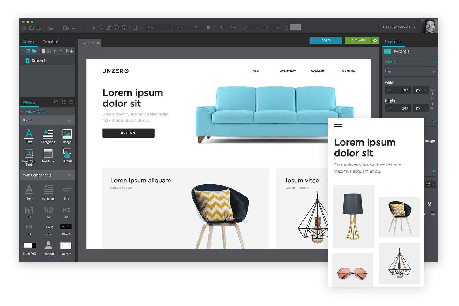
Work by yourself or have several team members working on the website wireframe simultaneously with the teamwork functionality. All your designs are stored in the cloud and can be easily shared with other colleagues or clients. The tool has a free version that never expires, allowing users to continue creating with no charge whatsoever.
Pricing: Free version that lasts forever or professional packs at 19 USD/month.
This tool focuses on the simple to allow for more focus on the structural design of your wireframe. Wireframe.cc is made to echo other drawing tools out there, and has a limited amount of UI elements which pop up at different moments during the use of the tool.
Pricing: Free version available or starting off at 16 USD/month (solo package) for one user.
Brought to you by Microsoft, those among you that use Word or Excel frequently should be instantly familiar with the interface. In truth, Visio is more commonly used for creating diagrams or flow chart rather than wireframes – and is not highly recommended for prototyping.
You can still export HTML code from the designs you create with Visio with the help of other additional tools, such as Swipr. We believe that this tool is particularly handy when it comes to creating and working on the navigational flow of the product, rather than wireframe design as a whole.
Pricing: 5 USD/month (simple plan) or 15 USD/month (pro plan).
Brought to you by the OmniGroup, this tool is made specifically for Mac and iOS systems. Similar to Visio, this tool shines bright when it comes to working on the flowchart side of your product.
Watch out for the small distinction that Omnigraffle comes in separate versions for Mac and iOS. Pricing varies depending on educational or business needs.
Pricing (for Mac): Starts at 99.99 USD/year with the standard pack.
Create interactive wireframes with Justinmind

We know that sometimes getting things started can be the hardest part. After all, where do we even begin? Here at Justinmind, we like to give users plenty of inspiration to get those ideas flowing.
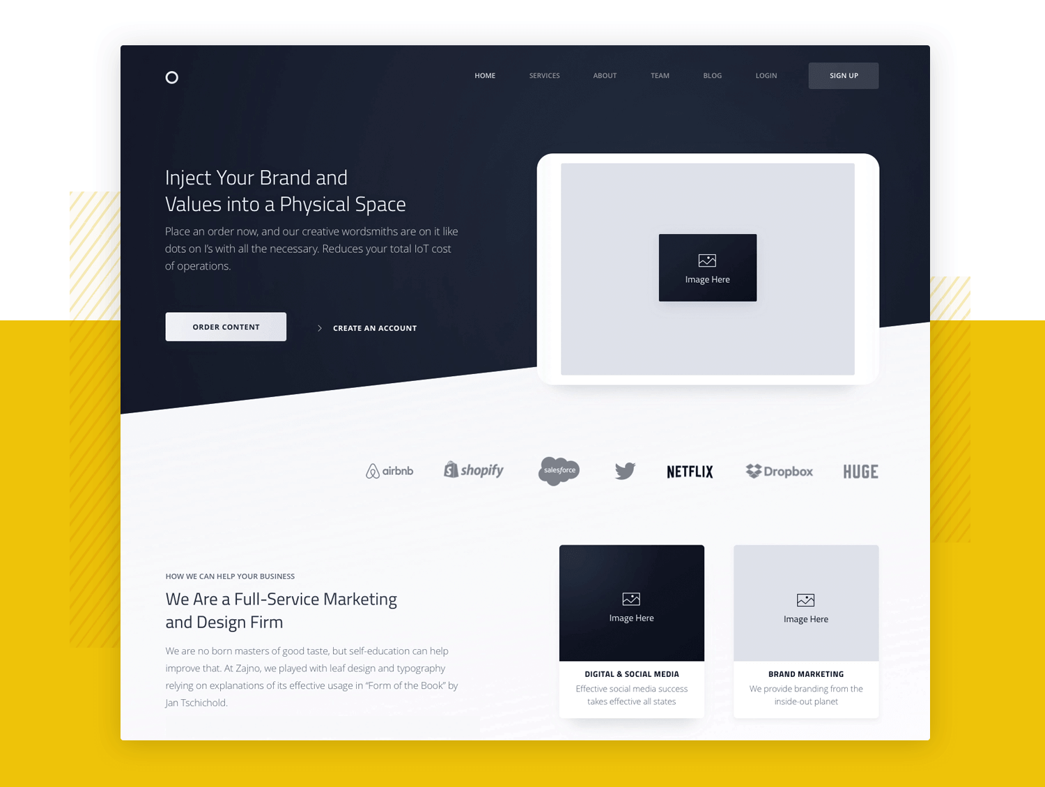
Original design by Sergei Pikin.
We have 40 wireframe examples that show you what your wireframes should be like, illustrating the inner workings of the grand design. These can work as a point of reference of what wireframes should include, with emphasis on the navigation flow.
Wireframe design is a crucial step in your product. It has the power to make you see potential flaws in your design, and pave the way for a future prototype that has a solid base, with a sound structure.
They can help you communicate with other designers, and lessen the margin of error in the design within large teams.
Ignoring the need for a wireframe leaves you open to the possibility of finding nasty surprises further down the road, bringing in extra expenses and frustration. Sounds awful, eh?
Don’t worry, even if you don’t have the time to put together your own wireframe, take a moment to choose a template and build from there! You’ll be glad you did it in the end, trust us.
