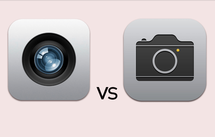
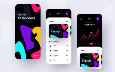
Skeuomorphic design helped an entire generation find their footing with technology, but is it really past its prime? Read on to find out!
Even though it’s no longer as relied upon as it was, there is a case to be made for skeuomorphic design’s impact on usability thanks to its instant comprehensibility. No matter which UI design trends you follow or use when prototyping, it’s clear that skeuomorphism did great things back when we were getting started with apps and digital products.
But how does this style measure up to today’s standards and preferences? What exactly is skeuomorphic design to begin with?
Don’t worry! In this post, we’ll define what skeuomorphism is, what made it popular and why it seems to have disappeared from popular products. But keep your favorite UI design tool at hand, in case you feel inspired!
Before we understand just what skeuomorphic design is, let’s just unpack what a skeuomorph is. Essentially, a skeuomorph is a copy of something else, an imitation, intended to represent the original. The greatest example is the classic calculator app in most phones, which seek to imitate real life calculators.
A well-known example is a maple syrup bottle. Maple syrup bottles often have a tiny little handle on their side. This novelty feature isn’t for people with tiny hands. In fact, traditionally, maple syrup would come in an old earthenware bottle – a type of ceramic – and so the glass bottles of today are attempting to mimic this old type of pottery which was used to store maple syrup.

These are examples of skeuomorphs. And so, it makes sense that we’d try to use this same concept when it came to our technology – especially at the beginning. When smartphones and portable computers were only starting to take off, users were faced with a challenge: learning to use something completely new to them.
When technology and user experience design started to gain momentum, skeuomorphic design was used to help users better understand and use their technology. Cast your mind back to when you played pinball or paint on Windows in the early 2000s.
It wasn’t just Windows that used skeuomorphic design either. Apple really took skeuomorphic design to the limit and used it liberally throughout their renaissance in the early to mid-2000s. When the iPhone launched, it was a skeuomorphic graphic user interface that made the phone so easy and intuitive to use for newbies.

The calendar, for example, looks like a real-life calendar that you might have placed on your desk. The same went with the calculator, both easy examples of skeuomorphism that persist today.
Since skeuomorphic design is a derivative or an imitation of something else, it made sense for emerging technology and designers to use it in their designs. Users would feel more comfortable using applications, products and services that imitated objects which they were already familiar with.
For example, a user would easily interpret what dragging a file into a trash can on the desktop would do: it would delete the file. Because in real life when you put something in the trash can, you’re eliminating it from your workspace or your life.
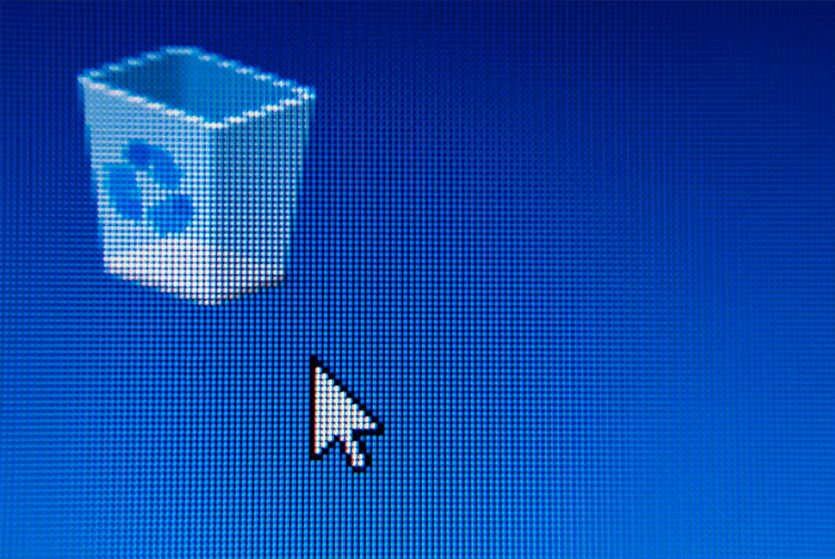
Skeuomorphic design transformed technology from something considered niche into something easily digested by the mass public. It facilitated the transition from physical to virtual at a time when people weren’t sure what the virtual world even was – or what it could do for them.
It isn’t just graphics that are skeuomorphic. Even though skeuomorphic design did much for graphical user interfaces, sound plays a role too. Just try taking a picture on your camera phone. That click sound is an example of skeuomorphic design. Just like the crumbling of paper sound when you empty the trash can.
This type of design offers the user affordances, a way of explaining how things work. This is the key benefit of skeuomorphic design: you bypass the learning curve by using things users already know.
A graphic representation of a calculator will be readily understood by even the most technophobic among us. These designs mimic reality. This instant comprehension is enabled by our experiences of the physical world, and plays an important role in those crucial first moments of use.
Not everyone loved skeuomorphic design. Some designers out there quickly found that while this was a way to make the product easy to learn, it also made it impossible to scale. After all, basing the design on things that already existed implied using proportions and ratios that were already defined.

Most designers will immediately see why that makes life more difficult. Today, delivering a product that can be easily used in different devices is key.
Another common criticism regarding skeuomorphic design is that it made designers over confident in translating the real world, resulting in unnecessary elements and components in the final design. This, in turn, often made the screen feel cluttered and even overwhelming.
No matter your thoughts on the aesthetics and usability of it all, we can all agree that Skeuomorphism helped users find their footing with technology. But while we can appreciate that factor, is skeuomorphic design still relevant? Can it still help users who are all too familiar with technology by now?
If you’re looking for a different type of inspiration, check out this full guide to dashboard design.
We’ve come a long way since the prime of skeuomorphic design. It dominated the design world when we were still making the first few strides in the technological race to the future.
However, as time went on and technology took a more prominent role in our lives, there was little need to design in a way that imitated reality. Users are broadly familiar with technological products, which means they don’t need help in understanding the product or most of the components on their screens.
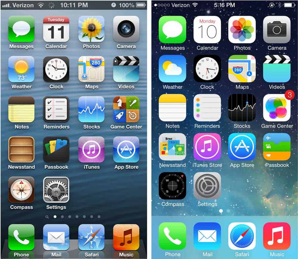
There were more factors that also contributed to the decline in popularity of skeuomorphic design. There was the rise of new devices, as was the case with touch-screens – which made the issue of scalable design more prominent. Aside from that, there were also new trends that took the spotlight.
Minimalism, flat design and later on material design all differ from skeuomorphism and distanced themselves from simple copies of real life. Suddenly, it wasn’t about mimicking the real world, but rather creating something altogether new.
This opened up a lot of possibilities when it came to design, and gave designers more margin to find new ways to represent functions and features.
Take material design or flat design – two similar UI design systems which are flat and not 3D like much of skeuomorphic design. They use bold color choices in lieu of relying heavily on gradients, textures, shadows and highlights. Or minimalism which is all about keeping a clean UI with each little component needing to be perfect.
As our ability to understand technology progressed so did design language. But was skeuomorphic design’s swan song premature?
It is true that today, the average user doesn’t need any real-world reference in order to understand and use a digital product. A reflection of that is, perhaps, that most of the professionals that create digital products are also young.
Stack Overflow found in their annual developer survey (2018) that about half of developers are between 25 and 35 years of age. Only 5% of all participants were over 55 years old.
This points to the fact that most people who get a say in digital products are all young. They were born and raised in the technological era and find using their smartphones almost as natural as breathing. But what about the older crowd?
Older people tend to struggle with digital products, because they are still adapting. They lived before things were done digitally, and doing things on a screen may not come naturally. That is what Aaron Ellis and Mark T. Marshall thought regarding online banking. In their academic article, Can Skeuomorphic Design provide a better online UX for older adults? They found some interesting answers.

Banking is a great example of something that can be challenging to do online for the elderly crowd. The UIs are often complex, and offer so many different features and options that users can feel lost and confused. Mark and Aaron wondered if using real world references in design would help the older users get a better understanding of the product, making the users’ lives better.
Their findings were very reflective of both the good and bad side of skeuomorphism. Their study concluded that while older users preferred the visuals of flat design – but that skeuomorphic design did help them use the product. It also confirmed that skeuomorphic design resonated more with the older participants of the study.
More of us are now familiar, even if to a small degree, with technology so there’s less reliance on skeuomorphic design. But just like previous generations had to transition into new technologies, so will we. New technologies and trends are popping up everywhere, and they all will require some adapting on our part.
For example, virtual and augmented reality. While that opens up a whole world of possibilities on what we could design and bring to users, it does mean skeuomorphism isn’t dead. Recreating the real world in virtual form is as skeuomorphic as it gets!
Virtual reality brings a fresh perspective to skeuomorphic design. We interact with things which are virtual – that is to say, we can touch and move objects when we wear a headset which aren’t there but are an imitation of things that exist. It remains to be seen how this interaction will develop as these technologies begin to mature. One thing is certain: these are exciting times!
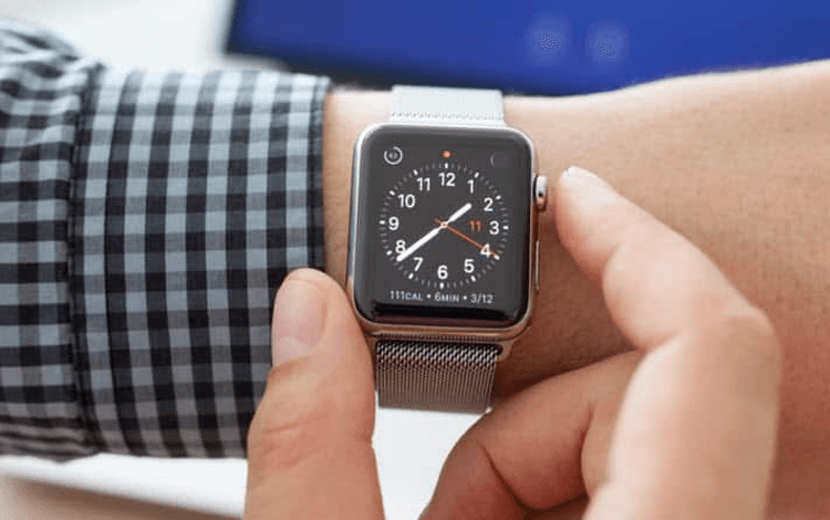
Another way in which we find skeuomorphic design making a comeback is the digitalization of things – like a classic wrist watch. Items like the Apple Watch aren’t really watches at all – those are small computers we can wrap on our bodies. But while they could represent anything on their screens, most offer the classic view of a watch we all know and love.
In the future, we may find that things move in the direction of skeuomorphic design as wearables and VR products become more and more mainstream. Will we find that years from now, the Apple Watch won’t look or feel like a watch at all, but something entirely new? We might.
But for now, people all over the world enjoy a small piece of skeuomorphic design on their sleeve – making it very much alive.
Skeuomorphic design was a useful stepping stone as we ventured into unchartered territory. It acted as a useful guide as we became accustomed to unfamiliar UI components and design patterns.
As we matured, so has our understanding of UX design and user interfaces. What remains to be seen, at least in the case of skeuomorphic design, is whether we’ll evolve beyond ever needing it or whether it’s something that we can rely on as new technologies emerge to help us come to grasp their inner workings.
One thing is certain, at least, is that skeuomorphic design has its place within UX design and should be something all designers are familiar with – even if they feel like it’s beyond its sell by date.
PROTOTYPE · COMMUNICATE · VALIDATE
ALL-IN-ONE PROTOTYPING TOOL FOR WEB AND MOBILE APPS
Related Content
 Communicating UI design ideas isn't easy. Mood boards project your creativity in a visual way, letting you get back to what you do best: designing. They also serve as a useful style guide as you work. Here are some great examples and tools for your next brainstorming session!10 min Read
 Find the best free and paid SVG editors available online and desktop, including Mac, Windows and Linux.21 min Read
 The growing importance of mobile banking app design brings with it the need for more engaging UIs so that financial institutions can stay competitive. If you’re wondering what constitutes a great banking app UI design, check out these 10 great examples.10 min Read
