Less is more, especially with minimal UI design. Our guide to whitespace design tells you everything you need to know, from wireframing to information architecture.
Let’s be honest right from the jump – moderation and minimalism are probably the last things on your mind when you’ve got tonnes of content to show. But when it comes to UI design, minimalism doesn’t even take a break for Christmas. Minimalist web design, whitespace design, and elegant UIs are as popular as ever. So Justinmind has put together a guide to minimal UI design and whitespace design.
What is minimal UI design?
Minimal UI design traces its roots back to minimal design in general, a 20th-century design philosophy of “less is more” regardless of the product in question. In web design, minimalism is achieved by including only the elements that are absolutely necessary to the functioning of a given design, while still maintaining usability and a good user experience.
“Minimalism is not the lack of something. It is just the perfect amount of every essential thing.” (Sumit Jaiswal, UI/UX Designer at Inkoniq Design)
Sounds simple, right? But hold up there, you can’t achieve minimalism by simply removing elements from an existing website design; you have to rethink the design from square one. The concepts of minimalism and simplicity have tricked us into thinking that it’s always about less, but we at Justinmind think it’s really about having just enough. After all, functional minimalism relies on the notion of emptiness, but not nothingness. That’s where website wireframes come in handy, allowing designers to wireframe interfaces with just the right amount of information and then test those interfaces on users before moving on to code. But more on website wireframes later.

Whitespace Design: minimalist web design’s invisible weapon
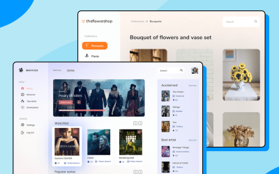
One of the pillars of minimalist web design is negative, or “white”, space. White space is the area between elements in a user interface, serving to guide the user’s visual flow. As a general rule, the more negative space around an element, the more the eye is drawn to it. White space is a controversial design element – in fact, one of the greatest design myths is that white space is simply a waste of space. As many designers overdo it with the white stuff, we’re here to show you how it can be used for maximum impact.
When we talk about white space, we often picture endless fields of white. But it’s not so much about uninterrupted space as it is about creating balance and harmony between elements, in various forms:
- Active white space is space that is intentionally left blank for a better structure and layout. It also emphasizes the content area and leads the reader from one element to another.
- Passive white space is empty space around the outside of the webpage or blank areas inside the content which forms part of the layout process. It helps to create harmony and visual comfort between elements.
- Macro white space is the space between major elements in a composition.
- Micro white space is the space between smaller elements: between list items, between a caption and an image, or between words and letters.
Then there’s the difference between visual, layout, text and content white space to think about. Oh, and remember, whitespace doesn’t have to be white!
The principal goal of whitespace design is to draw attention to the content itself. After all, what is design if not a means to communicate?
The benefits of whitespace design
Minimal UI design with the right amount of white space between elements has several benefits for users:
Readability: An uncluttered, minimal UI design with room for the eye to rest allows for better readability and scannability. Studies have shown that users don’t read online in the same way as they might read on paper – scanning, space and headlines are key players in an online reading experience. White space design makes copy less intimidating and more readable. By displaying the right balance between content and white space, you are providing the user with digestible, bite-size chunks of information that are much more manageable for the user than streams of text, with no gaps in between – making it easier for the reader to come up for air.
Intuitive information architecture: The less a UI contains, the more important each element becomes, and the more pressure there is on the designer to find the perfect information hierarchy. White space design demands judicious use of grids, typography, spacing, proportion, and colors. Avoid frills, noise, and redundancy, and you can improve user comprehension and retention of your webpage or mobile application.
To this end, establishing a hierarchy between elements, placing labels next to relevant fields, and grouping related topics together in input fields can make for a more intuitive UI.
Reduced cognitive load: We all have our limitations, and as complex, as the human brain is, it does have its shortcomings. For instance, the way we read content on a screen versus in a book is vastly different. In his study on the Magical Number Seven, George Miller declared that “there seems to be some limitation built into us either by learning or by the design of our nervous systems, a limit that keeps our channel capacities in this general range.” That is to say, we are limited in our capacity to process information, and after a certain point, our ability to focus becomes inefficient and passive.

Miller explains that by organizing, and reducing the cognitive load that our brains have to manage, we will have more luck in keeping focused. He goes on to talk about how “chunking”, or grouping relevant information together that can be located and scanned quickly, has had a positive effect on our ability to retain focus on a given task, such as memorization and processing large amounts of information.
“By organizing the stimulus input simultaneously into several dimensions and successively into a sequence of chunks, we manage to break (or at least stretch) this informational bottleneck.” (George Miller)
User flow: The way you place elements on a webpage can determine how well they’re seen, so find a suitable framework for your website or app. We believe it’s a lot to do with directing the right people to the right places, and white space can help to centralize user focus. The foundation of a minimalist web design is a solid backbone: a strong grid, visual balance, and scrutiny of alignment. And with smart use of white space, you can arrange elements in a way that communicates and defines the purpose to the user. For example, generous amounts of negative space can create a sophisticated look and draw attention to the most important items on the page.
“It’s all about removing the unnecessary.” (Jonathan Ive, Design Vice President at Apple Inc.)
With the sheer volume of content and competition on the Web nowadays, hierarchical organization or “chunking” seems like a good solution. The typical web visitor’s activity begins with the most general overview of the site – the home page – and continues down through progressively more explicit sub-menus. But chunking isn’t just a case of sub-categorizing large amounts of information. It requires the use of white space to break up text into small, self-contained modules, each of which generally reflects one user task – focusing information on user tasks, not products.

With all that said, a minimal UI design needs to be carefully planned in order to deliver the main functionality, maintaining the usability of the product. A minimal design might not always be the most indicated style for certain products, such as game UIs. Other products that deal with a lot of data might need a lot of elements on the screen, making it more difficult to maintain a clean style – a good example of this is dashboard design.
How to build minimal UI designs
Using a wireframing tool, you can mockup minimalist web designs quickly and easily, iterate on those initial designs and build them up into interactive prototypes, then webs. With a good UI design tool, you’ll have a range of features that make a minimalist web design a little bit simpler.
Pre-built website examples
If you’re building website wireframes with Justinmind, you’ll find a range of pre-built website examples which you can adapt to particular projects. As soon as you open the tool, select the type of device you’re designing for, click the Examples tab and choose your template interface. As we’re big fans of minimalism, each example is designed with white space in mind. Just adapt it to your needs and avoid adding a load of unnecessary whistles and bells.
Smart guides and grids
Smart guides and grids will help you make minimalist website wireframes faster, because they help you to arrange and align UI elements with pixel-perfect accuracy. Justinmind has rulers, horizontal or vertical guides, and grids that snap elements into place in perfect white space design harmony. For instance you can increase or decrease the white space between the cells in Justinmind Data Grids to define their structure and style in a more minimalist manner.
Scenarios
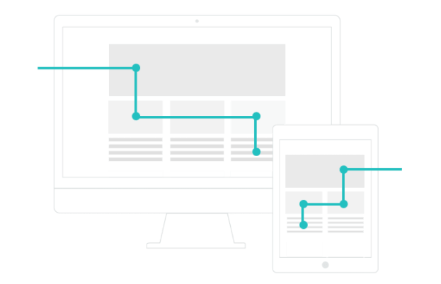
As mentioned above, minimalist design depends upon strong, intuitive navigation flows. But designing a navigation flow that feels natural to the user and simultaneously boosts your product’s goals can be complex. With Justinmind, you can design user scenarios and navigation flows inside our Scenario tab – just drag the relevant components – Screens, Decisions and Actions – into the scenario canvas and, when you’re done designing, simulate the navigation flow. If you create the scenario before creating the website wireframe, the scenario screens will turn into icons of the wireframe screens. Find out more about making website wireframes with scenarios here.
User testing tool integration
Qualities such as readability, reduced cognitive load and intuitive navigation can only be verified by testing a web wireframe on actual users. Most wireframing tools are integrated with a range of user testing tools: even if you have little to no experience of testing a minimalist web design on users, a user testing tool can help you select target users, build surveys or tasks and then record virtual tests for later usability analysis. This way, you can be sure your design is full of white space and not wasted space before moving on to coding.
Wireframing whitespace – the takeaway
So there you have it, our guide to a minimalist website wireframing! Try creating websites with a “less is more” philosophy and the features in your wireframing tool, and you’ll be well on the way to successful white space design. Looking to discover a new style? Check out our post on neumorphism and explore something trendy and new.

Related Content
 There really is no faster way to get started than using a pre-designed web app template that you can tailor to your taste.6 min Read
 Looking for a quick start in a new project? Discover these 37 free practical app templates made by the Justinmind team just for you.13 min Read
 Looking for a quick start in a new project? Explore these 30 practical 100% Free website app templates designed by the Justinmind team just for you.14 min Read


