Dropbox took its UX research to new highs with their new product - but getting there was a journey worth telling.
Dropbox is a file-hosting platform that is used by millions of people worldwide. Founded in 2007 by two MIT students, it has evolved into a big name in the tech industry. In 2016, it launched a new service called Paper, a new collaborative tool for note-taking.
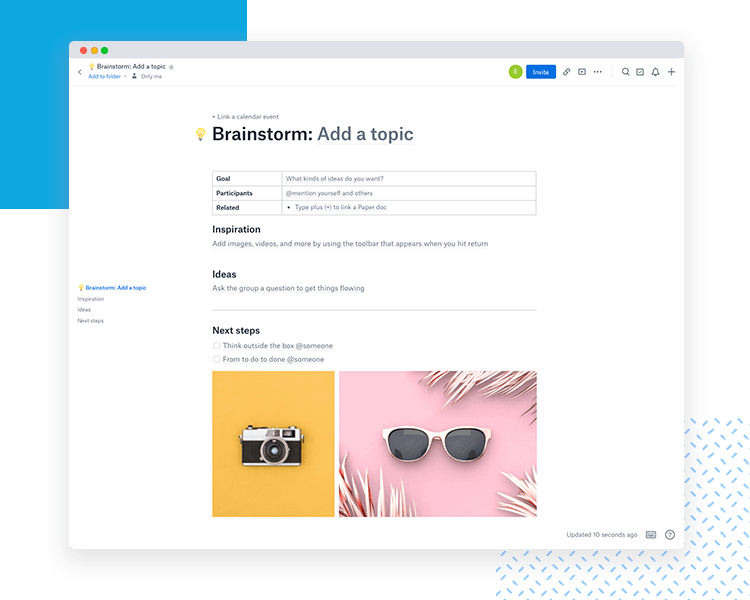
Paper is aimed at businesses exactly due to its collaborative nature, and can combine files of many different formats into a single sheet of paper that never ends. It allows for the importing and editing of several file types from Microsoft Office to Google Drive. It can be described as an online collaboration document or content management tool.
But with so many different features, how did the team at Dropbox carry out the UX research behind the product? How did they know what file types to include? A diversified product is good – but how can we know how far we can go before we venture into the dangerous waters of random features?
We were excited to hear all about this journey with Mira Rao and Joseph Grillo, Senior Design Researcher and Product Designer from Dropbox, who were in charge of the expedition to turn this idea into a full on product users can benefit from.
(Audio starts at minute 18, sorry!)How product and UX design work together at Dropbox
Posted by Justinmind Prototyping Tool on Wednesday, 12 September 2018
The idea was great. To create a sheet of paper that could hold just about everything people needed in their work, so they could collaborate with other team members as smoothly as possible. But logically, that posed quite the list of questions as to what Dropbox needed in terms of UX research to formulate the product.
What kind of tools do people need in their daily work? How could Mira and Joe try to narrow down the kind of features that could help people boost communication in their team? They decided to start out by understanding their user’s needs with a diary study.
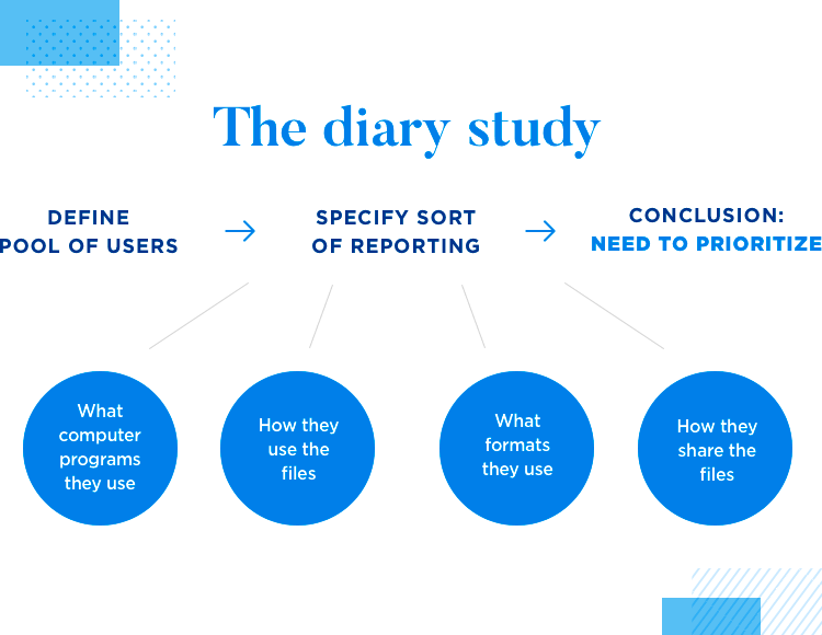
The format of their UX research was in the form of diaries, with entry logs at a pre-defined periodicity on how people lived their daily lives. The entries could be regarding anything to do with their work and how they went about getting it done.
Dropbox had some important preparations needed to orchestrate a study that would really help the team. In order for this diary study to be of true use, the team needed to ensure that the users who participated in the study were truly representative of their audience – and with such a large audience, that is no mean feat.
The disparity between different user groups within the audience can be great. As great as the difference between people from San Francisco and those from other places across the country, such as Dallas, Orlando or Boston. The whole point of the study was, after all, to gain perspective.
Once they were confident that the pool of users they had was representative of the whole target audience, they could specify to those users what sort of reporting they needed to do in their diary logs. For the UX research team at Dropbox, it was crucial to understand what programs users used on a daily basis – to know what file formats they could incorporate into Paper.
For the team over at Dropbox, the key was not just to get a list of programs and file formats. They were also interested in learning how people shared those files, and used different files to complete the same task. Basically, encouraging users to share what computer programs they had opened during their work-day.
Combining different file formats for a single task is challenging, as it means people will often have to double and triple-check things across different programs, screens or computers. Sharing files generally involves some confusion as to what’s been shared and what hasn’t, and to files being misplaced or lost entirely. These were the two main problems Dropbox set out to solve with Paper.
Investigation into the file formats opened the door to a whole different set of questions. With quite the extensive list of programs and files that people relied on for their work, it became clear that they couldn’t include everything. They soon came to realize, they needed to decide on what to prioritize. What’s the real goal with this product? Where should they even start?
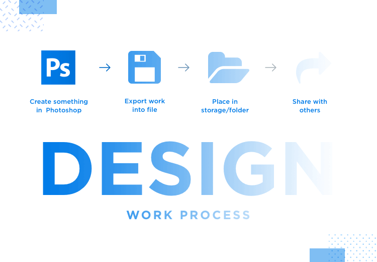
The whole team understood that in order to create a tool that would truly make a difference in the user’s work life, they needed to understand the user’s workflow as they went about completing tasks for their job. When it comes to designers specifically, they illustrated how a common workflow would look like:
- Design and create something in Photoshop
- Export work into file
- Place in storage/folder
- Share work (email, Slack or face-to-face conversations)
Dropbox came to identify the main reason why this workflow left much room for improvement: a key concept called context fragmentation. With each step in the workflow described above, a little more context is lost – creating confusion on issues such as who said what, who has seen what or who decided what. This process is time-consuming, not only damaging the efficiency of teams but also causing annoyance among workers.
At the time, they wondered: what if Dropbox could solve the situation? What if people had a product that could smooth all the grievances from context fragmentation? What if people had a single space for their work that was also accessible to their peers?
They knew what Paper needed to be for users. After that, it was time to specify exactly what features would be included and how the product would actually feel.
That’s when the scenarios come in: a way to come up with several solutions in a quick manner, without getting too descriptive about each one. Our readers will probably recognize this familiar tactic, as it’s closely related to rapid prototyping. In broad strokes, the team creates several low-fidelity prototypes, which are then validated with users.
The whole study was organized into 2 parts:
- Exploring how and why people use computer programs
- Presenting user scenarios: taking note of users’ emotions and reasoning
The important thing about these scenarios is that they aren’t about validating the looks or even the details of the prototype. In fact, they’re about validating the features and functionality – and assessing how that Scenario would impact users’ lives.
The team had several different Scenarios, each made for a different kind of workflow, as opposed to creating a different Scenario per feature. Joe gives us the example of a user who felt very positively regarding the presence of tabs in the product – which were crucial for her workflow.
Workflows were closely related to the types of files that users needed. Joey gives us the example of Photoshop and Excel – both important file formats for their target users.
When asked why these two formats were deemed key for the product, our speakers explained that both programs are massively popular for a wide variety of goals and professions. In fact, just by looking at the files already in the Dropbox platform, it became apparent that both formats were commonly used by Dropbox’s audience. For the team, it was important to have each move based on real data!
Dropbox’s team briefly contemplated creating their own version of those key pieces of software – but were quickly discouraged after getting some insight: people, it seems, aren’t interested in switching work programs. There’s too much of a learning curve, too much time invested and too much at stake with disrupted workflows.
This second part of the UX research at Dropbox was all about watching the user’s reactions, seeking to have the user talk and explain more.
Remember: It’s important to try to pin down exactly what the user’s perception of the scenario is - and that only comes from listening to the user, never from explaining.
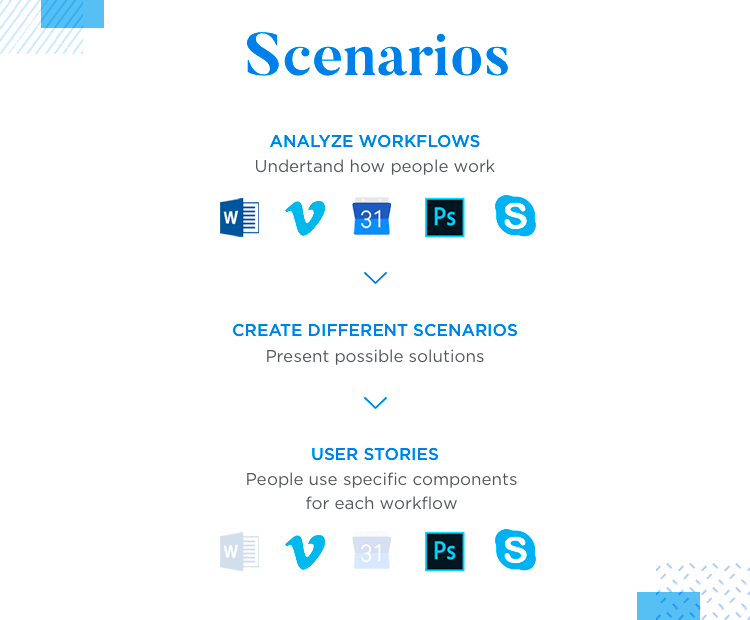
When it comes to the design requirements that arose from all the research and studies, Joe explains that these requirements include a certain hierarchy of information. Firstly, workflows that illustrate how people work.
Secondly, scenarios that present possible solutions to improve said workflows. Lastly, come user stories – which are specific components that people need in their workflows.
While the scenario is the big and broad idea, user stories are much more detailed.
After going over the specific structure of the research behind the design process of Paper, our speakers shared some truly interesting things regarding the permanent UX research in place in Dropbox. The diary study was carefully calculated to explore the most important unknown areas for product design – but what happened after Paper was launched?
Well, UX research continued even after the product went live. Improvement, it turns out, is a permanent endeavour. Yes, Paper was released to the market – but the team never stops looking for usability improvements for newer versions.
This search for room for improvement differed from the previous UX research in a crucial way: they were no longer exploring new horizons but instead checking their own backyard.
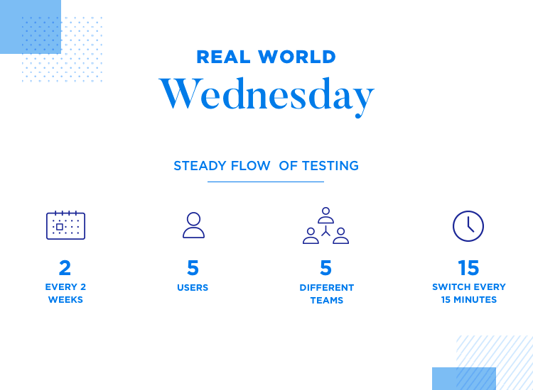
And so, the Paper team came up with a brilliant way to keep the usability game in constant movement: real-world Wednesday.
Within the Paper design team, they found that a steady flow of testing could provide more direction towards little changes in the product – as opposed to organizing a long and detailed study. In order to achieve that, they established that every 2 weeks, 5 users would come into the office and carry out some light user testing.
With 5 different teams, each of which tests different things, teams and users switch every 15 minutes.
This creates a fast-paced testing structure that allows designers to quickly get feedback on whatever they happen to be working on. With the 15 minute margin, each team has to stick to the absolute necessary in terms of questions or more in-depth investigating. For the 15-minute session to result in real learning, Joey has a template for their teams.
Instead of trying to test all aspects of what the team is working on, Joe advises designers to find the true essence of what they are currently working on – and aim to test the idea behind it. As teams don’t have time to spare, they are encouraged to test only what they unquestionably need in order to continue.
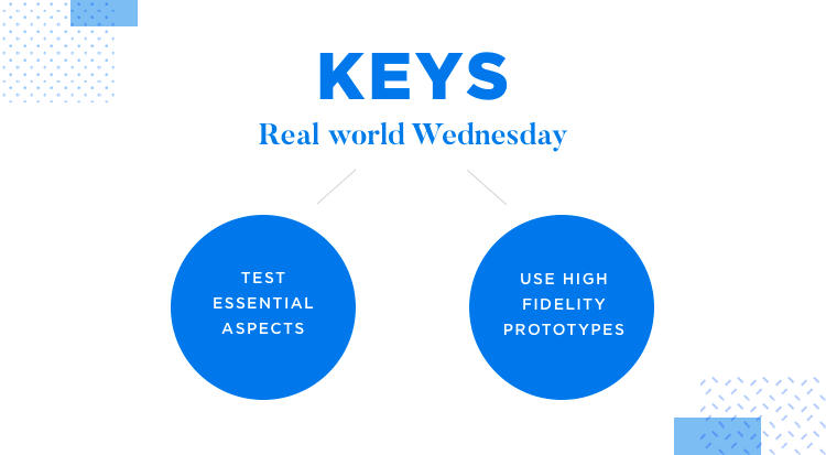
Some of the team members at Paper prefer to use low-fidelity prototypes for these quick tests, but Joey warns of a common downside to that.
Testing high-fidelity prototypes of your ideas opens the possibility that users will openly comment on elements and components simply because they are there. In broad strokes, the fact that all the details are there allows users to at least notice them, even if none of those elements are the center of that usability test session.
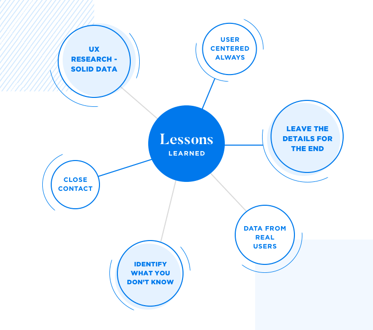
The first lesson learned, according to both speakers, was that the first step is always about gathering insight. As Vera explains, starting out with UX research is crucial when you don’t know much about what you’re dealing with. Taking the first step without solid data to guide you represents a real danger that could have a devastating impact on the final outcome.
General rule: It’s important that the design team gathers data from real users and maintain that close contact throughout the entire design process. Decisions should always have a solid base.
On a separate note, we are warned that while all teams have design goals and business goals – team members ought to be careful to not mix the two. Yes, business values are important. Usability, however, is a value that cannot be dimmed by the brightness of profits and marketing.
The real philosophy in UX research is always to lean on the user for direction, not business objectives.
Joey also had a word of warning for all UX designers out there: don’t get caught up in details too early. Ruling out certain details that are tested too early can send the entire project in the wrong direction, and derail the product. Take your time to build the base on which details can be made – until then, let users fill in the gaps.
General rule: For both designers and users, focusing on that small part of the design can cause everyone involved to miss the big picture.
The most interesting lesson, perhaps, was brought up by Vera: identify what you don’t know. Yes, this may sound obvious at a first glance, but it does have massive implications for your UX research. Don’t set out to look for the wrong answers – first, assess what you do know and see those gaps for the research questions they are.
Vera also explained that sometimes, their team at Dropbox found that there were crucial things they didn’t know – and they couldn’t continue without knowing. Other times, they found that there was information missing, but it wasn’t deemed absolutely crucial.
In those times is when it’s important to sit down with the team and discuss how comfortable the team is in moving on without knowing that specific information.
Our dynamic duo of speakers presented a nice bit of extra information to our audience: the unforeseen benefits of the way they carried out the UX research. Each speaker was in charge of one part of the study, and had to produce documentation from what they’d learned.
“We both got to hold ourselves and each other accountable in the process because we were both engaged in the work.”
Joseph Grillo - Product Designer at Dropbox
The good thing that came from working in a team with transparency and communication is that they each helped each other spot things they might have overlooked, or forgot to include in the documentation.
This created a safety net that didn’t allow for mistakes or failures in representing their findings accurately – and serves as an example of why keeping communication alive is crucial for UX teams everywhere.
Additionally, we also learned that Dropbox PMs are deeply involved in all aspects of the design – more involved than the average Product Manager of the tech industry. As a result, the team enjoys a smoother workflow and process, with the PM presiding over it all like a gracious maestro and his well-trained orchestra.
Side note: Dropbox design team consists mostly of product designers - you won’t find visual, interaction or navigation designers there. Talk about keeping it versatile!
Both speakers also assured the audience that even though this system worked really well for the Paper product design team, the structure and method of UX research changes with each new project.
UX research is meant to lay down the foundations of product design. As we learned from both Vera and Joey, the UX research aims to show the team how users live, the things they want and how the design team could make a difference. By keeping users close, Dropbox managed to reflect real users’ work habits in their product – which is no easy task.
We particularly love the idea of continuous testing in small batches, so that everyone gets to test everything – it makes gradual improvement something everyone can contribute to. This testing structure had a positive influence over the entire company, turning an initial idea into a company-wide philosophy.
Today, Paper has evolved into a carefully planned product that has changed the way people work – an all-round winner!
PROTOTYPE · COMMUNICATE · VALIDATE
ALL-IN-ONE PROTOTYPING TOOL FOR WEB AND MOBILE APPS
Related Content
 Why should you use user personas and how do you create them? Get all the steps to build one, as well as a great example and a list of user persona generators!15 min Read
 UX design books that cover everything from layout design to the theory of user testing. Want to expand your horizons? Check out this awesome list!9 min Read
 UX design portfolios are your chance to showcase your top skills and best work. Check out this post for awesome portfolio examples and websites!10 min Read


