What is the parallax effect in website design? Is it worth the time and investment? Find out with these examples!
We can trace the parallax effect back to ancient Greece. Or at least the word “parallax”. In Greek, “Parallaxis” means “alteration” and that’s the backbone of the parallax effect. But altering what? In Physics, the parallax effect refers to how the position of objects that you look at change their position according to whatever position you, the observer, are in.
Design and prototype parallax websites with Justinmind. It's Free. Unlimited projects!

For a real life example, imagine you’re driving through the countryside – no, more relaxing – you’re a passenger, sitting back and gazing at the fences by the side of the road whizzing past at lightning speed. A few fields away, in the horizon, you notice a forest. The position of the forest changes more slowly than that of the fence, which is closer to the car. This is the parallax effect in real life!
In this post, we’ll look at the parallax effect in action in web design as a scrolling feature as well as some best practices and some radical examples. Never forget you can prototype your own incredible parallax products with Justinmind’s prototyping tool. Enjoy!
It was only a question of time before humans started to digitally mimic the parallax effect with games like Super Mario Bros, using a static background and moving foreground elements to create a fake 3D effect.

A few decades after it was first introduced in video games, the parallax effect made its way into web design, using static or slow-moving background images against faster moving foreground images to create a multi-layered 3D scrolling feature. This made for a much more immersive user experience, captivating users and keeping them on the site longer.
The advent of parallax scrolling certainly added a new layer of dimensionality to web design. To show what parallax scrolling adds to the user experience, W3Schools provides two great examples of the same landing page of a website: a web page with parallax scrolling and a static web page.
Users’ attention spans are getting shorter. With the vast amount of content on the web nowadays, can you really blame them? As a result, companies are turning increasingly towards visual storytelling.
Visual storytelling holds users’ attention for longer and fosters a deeper connection with your brand as it connects with them on an emotional level. And guess what? The parallax effect is an excellent way to integrate visual storytelling into your website design. It’s a natural and engaging way of progressively developing an on-screen narrative that can be controlled at the user’s pace.
Building on the above point of establishing an emotional connection with your users, the parallax effect in turn reduces bounce rate (if executed properly). Bounce rate refers to the rate at which users navigate away from your website instead of navigating to other pages of your website.
Parallax scrolling naturally encourages users to continue scrolling and scanning the page down below the fold.
Is the parallax effect an effective way of getting the user’s attention? Yes. Will it always work? The answer is a resounding “no” if you don’t follow some basic ground rules. Here are some tips from our in-house UX/UI expert, Sergi:
- Don’t put style before content: content should always be your priority
- Keep it user-friendly: Make the experience as enjoyable and as clear as possible
- Navigation flow should be kept simple
- Keep important information readily available at all times—try putting valuable information on the upper half of the page
- Combine parallax with other design elements. Parallax scrolling is no longer new, in fact, it’s almost a requirement for websites, especially for one-page web designs. Going beyond parallax helps making the user experience unique
- Always keep in mind your web design’s goal — Parallax scrolling should make reading and navigating easier and consequently should make it easier for a user to accomplish a task
Read about UI patterns and see how you can combine them with parallax elements!
Sleek animation, a clean interface, contrasting nude and dark colors and a blend of ornate and heavy script typefaces make Fluttuo stand out from the eCommerce crowd. Adding a parallax effect to the bag makes for a unique and complete online shopping experience.
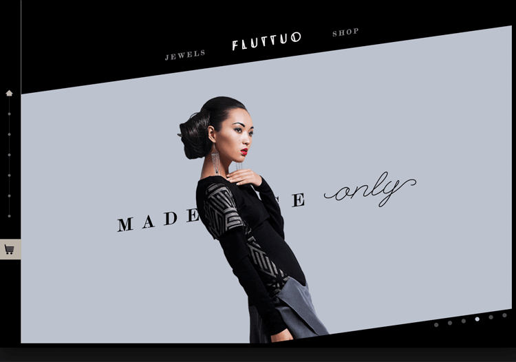
With a background layer and another on top within a pre-loaded screen, the parallax effect is for the top layer to slide over the background. As the viewer scrolls, they take in the context and style of the jewelry site via the background aesthetics, whilst the top layer provides the product details and the main story.
The smooth scroll parallax effect is accompanied by hovering section heads and mini carousels. This is a highly interactive UI and complements the brand that is always ‘experimenting with new materials and innovative designs’.
This clever design uses parallax effect in order to step up the visual storytelling of the article. ESPN with their feature about Dock Ellis did a great job at giving us a sense of depth with their layered elements, such as the large illustration of Dock and the body of text to the right.
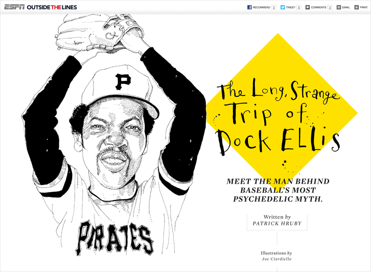
Once the user starts scrolling, there are different elements that separate the screen areas into normal text and quotations. The design in transition areas offer us a feeling of being close and personal with Dock himself, with an extra drama provided by the black and white photos of the baseball player.
Dave Gamache’s parallax website demo is great for anyone just getting into parallax effects. When you scroll down Dave’s site demo, he shows us how to fade elements in and out upon scroll, how to pin layers, and how to rotate a mobile device with a horizontal slide effect on the mobile screen. Awesome!
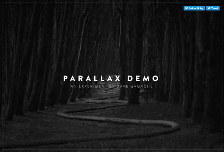
Dave’s top tips for parallax scrolling:
Make it easy for all browsers to animate your parallax effect website. Focus on the most important properties of parallax effect animation, including scale, rotation and opacity.
Only animate fixed position elements, and do it sparingly.
Don’t go nuts on resizing images – browsers don’t always handle this very well
Design and prototype parallax websites with Justinmind. It's Free. Unlimited projects!

NASA Prospect is an interactive experience that describes a story of planetary prospectors. NASA has sent them out to rediscover what mankind has left scattered across the solar-system after a global disaster.
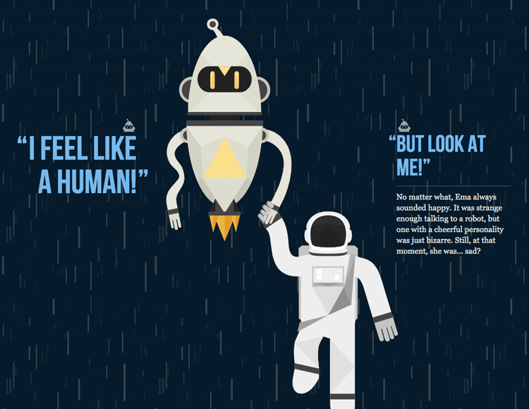
Simple, interactive, delightful use of the parallax effect. The audio really helps to set the scene and is an enchanting addition to the design.
Hot Dot’s parallax effect is a little different: it’s horizontal. As the user scrolls, the page moves from left to right. Hot Dot’s site has a smooth scrolling easing effect, which is an ideal horizontal navigation scroll. The background image isn’t fixed either, which is easier on the design team (and developers!).
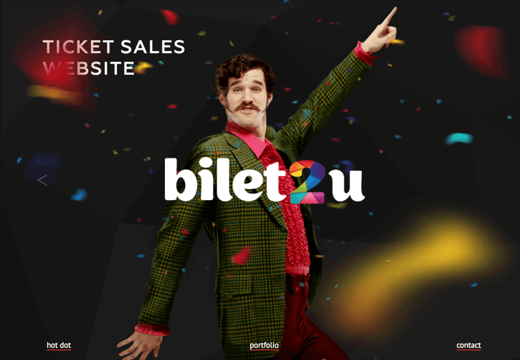
This site works well with touch devices and is ready for iOS and Android platforms. The horizontal parallax effect is ideal for responsive mobile-first design, where the user switches orientation from portrait to landscape on their mobile device in order to visualize all the screen’s content.
Hello Monday sports a split-screen 3D parallax effect, featuring design cases down one side of the screen and their accompanying description and case details on the other. Each design case has its own look and feel.
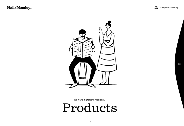
The website design uses a selection of engaging transition effects which contribute to a seamless user flow along with a clean grid. This is accompanied by a mix of bright colors, beautiful images and bold typography.
Pitchfork created something truly inspiring in their presentation of their article on Bat for Lashes lead singer, Natasha Khan. The design is brought to us in black and white, giving a dramatic effect that agrees with the subject of the interview in her rock-star status.
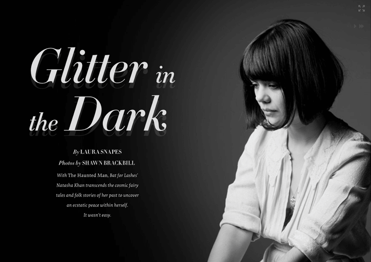
The music site uses parallax effect to separate the screen into sections, and uses a smart design as we scroll down: the large pictures of Natasha Khan change with subtlety. It brings us in, as if we were there participating in the photo shoot with the singer. Beautiful and functional.
We just love Bearideas’s parallax effect website – it’s so cool! A charming selection of UI background elements – some with navigation links – subtle transition effects and a simple long parallax scrolling effect make for a delightful interactive experience.
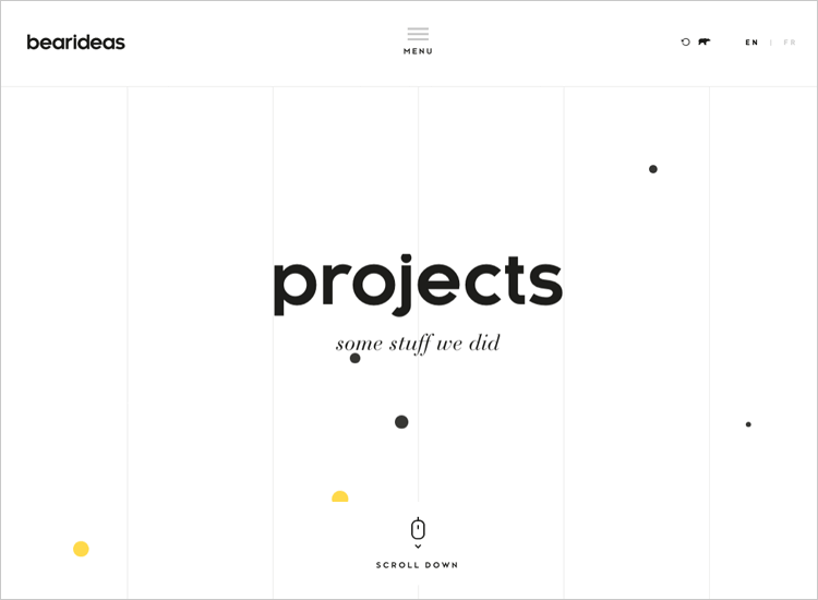
The design team has used cards in a grid structure to visualize each of the company’s projects. Bold colors help to provide contrast between the cards. A dropdown menu with just one navigation item adds to the simplicity of the design.
Outdoor lifestyle magazine Another Escape has a great website. It uses the parallax effect to both separate the different sections of the website, but to also present us the main topics that the latest edition touches – getting the reader involved in the current volume of the magazine before we even get the magazine.
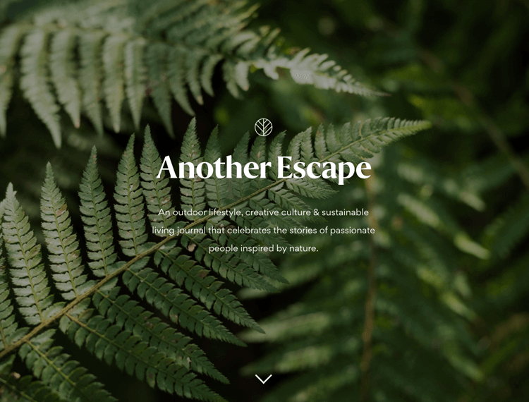
The clean design leaves the user free to focus on the powerful images that speak to everyone who craves the freedom of isolated nature. It’s almost enough to make us all pack up the office and move to a forest in Bavaria!
“We really like telling stories that touch people to appeal to emotion.”
Using the parallax effect and rotations, Immersive Garden’s website gives the illusion of depth, 3D and immersion in the scenes without actually using 3D technology. Even though the interface is minimal, it is also visual and intuitive.
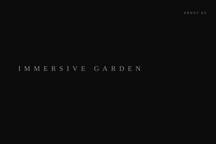
The website is made of lots of short video sequences that once loaded, can be played, paused and restarted by the user.
One of the most interesting things in this site is the organic cursor. Immersive Garden has used a variety of speed, scale and magnification effects to make it reactive and lively.
Valaire is a great example of an immersive website. To launch their updated branding as well as their new album, they’ve gone all out on the user experience. It’s not just a vertical scroll, it’s a story full-on story.
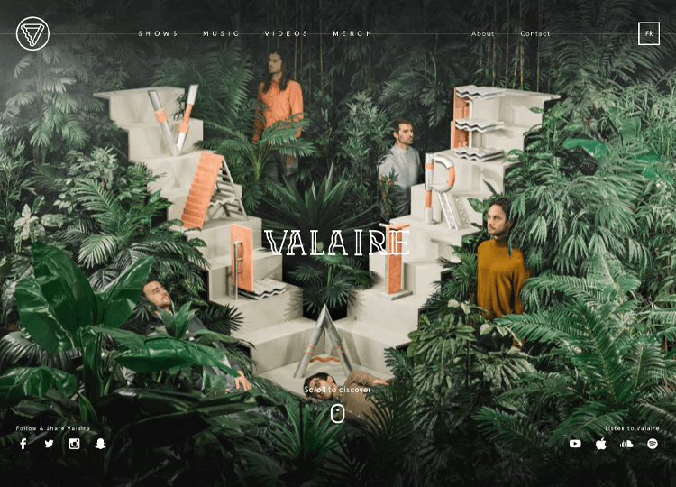
Their parallax effect is exceptional – connecting all user touchpoints for a complete user experience.
And last but not least, Cyclemon. This website is the cyclist’s dream. As you scroll down the page, you are met with a whole range of bikes in different environments. You’ll also see that each bike has a title, which describes what type of rider the user might be. This helps to give the viewer context and hopefully inspire them to convert – or so you might think.
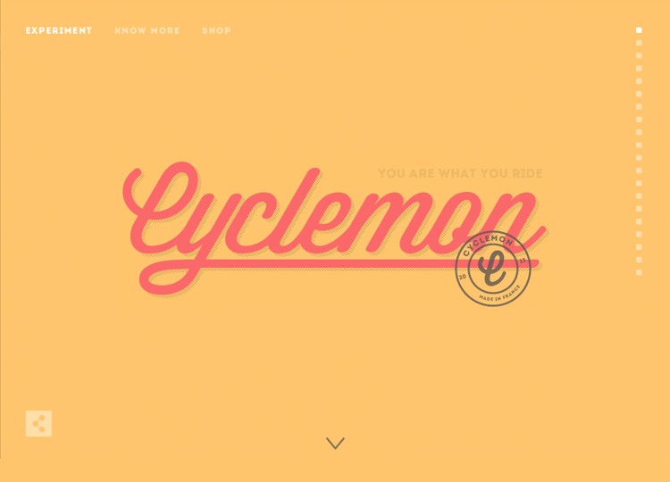
In fact, this isn’t an online bike retailer at all. No, it’s a site owned by two graphic artists selling their artwork. This is a perfect example of how enticing the parallax effect can be.
Design and prototype parallax websites with Justinmind. It's Free. Unlimited projects!

This website focuses on the scientific brilliance of the city of Oxford, UK. The website uses the parallax effect with division of sections – the past inventions that arose from the city, and the current promising research that will lead to innovation in the future.
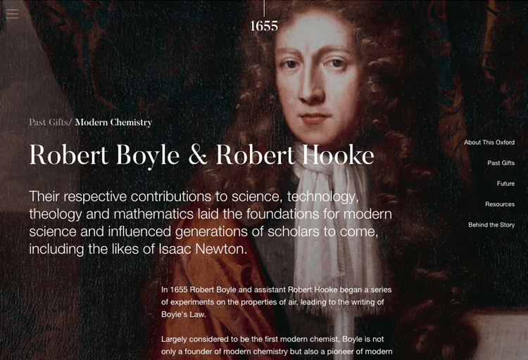
The parallax is implemented in a smart way, so that the user has the illusion of depth when the text moves at a different pace to the background image. No muss, no fuss.
Mobile design and development agency, Fueled, has an incredible website. The use of parallax effects, combined with the bold colours contribute to a unique website that represents the agency perfectly.
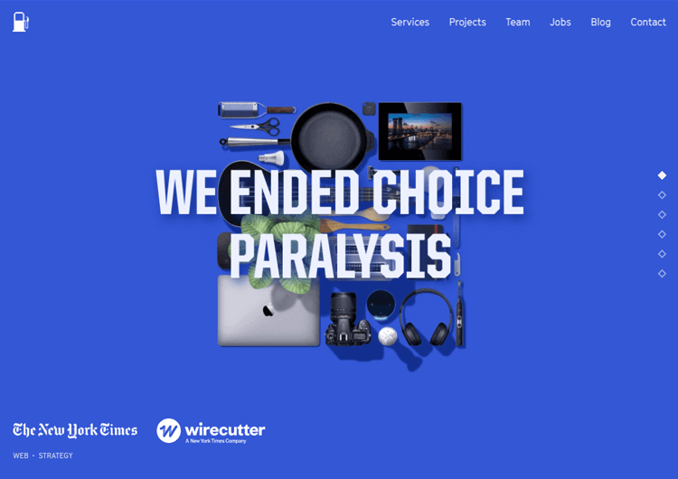
We fell in love with the mid-part of the homepage, in which as we scroll we are greeted by a phone screen that displays some of the agency’s top projects. But here’s the twist: as you scroll, you’ll see that intense changes in colors with parallax scrolling signify different projects, with the projects being shown on the same, unchanging phone skin. Creative and memorable!
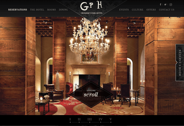
This website makes heavy use of the parallax effect, using it to not only separate sections and create depth – it helps the Gramercy Park Hotel to showcase its strong points. The design uses card-like elements that move at a faster speed than that of the background, casually nudging the user to focus on that content first.
This Goonies fan website works hard to rake the user in creating a spooky vibe as creepy music starts to play immediately upon entering, setting the vibe immediately.
The first thing the user sees is a background image of Goon Docks from the trees at a distance. As they scroll further down, the camera zooms in, as if they were spying on the docks. As the user continues to scroll, a vertical bar stretches downwards to indicate scrolling progress. Further scrolling causes you to fly past pieces of eight which rotate in unison.
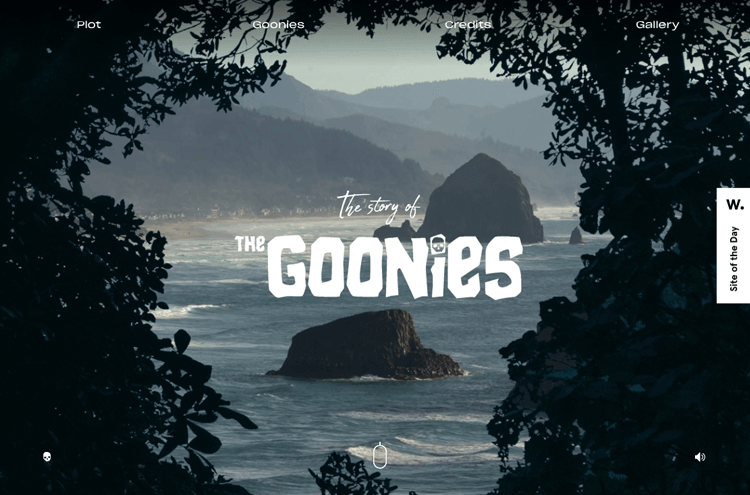
However, the plot starts off well but doesn’t continue, leaving thin content on the rest of this one-page website with little more than credits, gallery and bios for the Goonie characters. With a little more work, this website could be the ultimate Goonie fan site and a brilliant example of visual storytelling with parallax effects.
Toyfight offers web design and content strategy services. As soon as you land on their website, you’re presented with a bold colored background that contrasts nicely with two uncolored, white toy molds depicting a funny fight scene.
The first sight of the parallax effect are the toys moving with cursor. Scrolling down progressively reveals more about who toyfight are – web designers, directors and strategists.
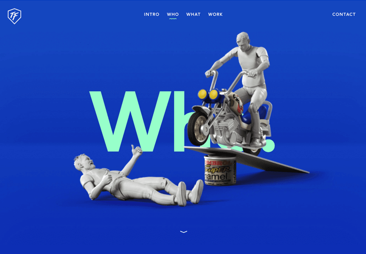
Scroll down further and you’re introduced to the members of the company who take the form of paintless plastic toys. When you reach the bottom, a toy hand making the rock-on hand horns symbol jumps up from footer.
However, it doesn’t end there – there are yet more pages with the parallax effect, something that is great for SEO, as single-page websites tend to rank worse. These other pages demonstrate consistency, showing the same scrolling behavior, just changing the main color of the page.
Words alone cannot do this design justice, you have to see it with your own eyes!
Bad Diesel is an impressive example of the parallax effect. It has two options which you can control via a slide switch: you can learn how to be a badass or discover Diesel Bad’s fragrance.
The Bad Guide is the option selected by default and instead of a normal scroll – the user clicks and then shifts the content vertically, diagonally, sideways – every direction possible.
The user is given a hand symbol to indicate that they can click to drag and move the content, however, at first, your instinct might be to scroll rather than click first. This could be a problem for users who don’t use desktop sites that often.
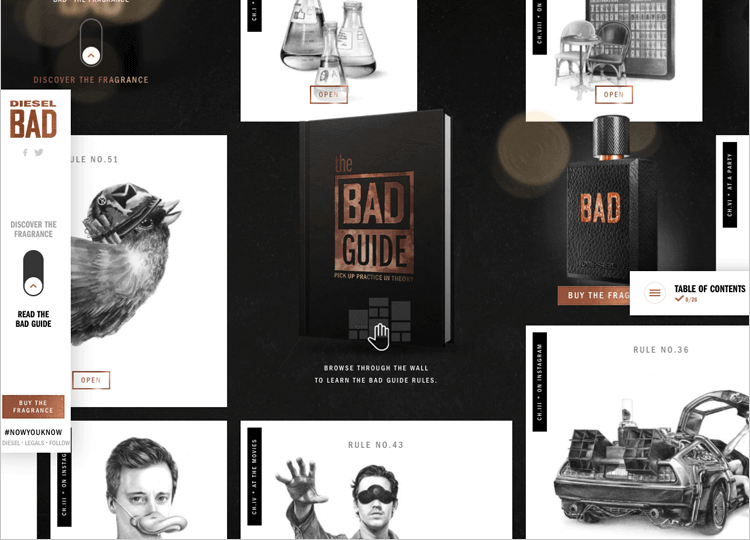
However, discovering this feature is a treat, as the user can spin the content around or slide it, with the content responding accordingly, similar to a large sheet of paper, like a map.
With each card UI you click on you get a new tongue-in cheek lesson on how to be bad, such as always sitting next to an exit seat at a cinema for “all eventualities” or to keep in touch with your ex on Thursdays via Instagram.
First Born is a parallax scrolling feast for the eyes. This is hardly surprising – a company that has worked with big brands such as Dre Beats, Royal Caribbean and Adidas needs to have a smashing website that does it justice
And the website does do it justice with its interactive parallax scrolling effect which uncovers the stories of the brands First Born has worked for. Animated images reveal themselves as you scroll further down the screen in a motion that suggests a paper or poster unfolding as the user scrolls.
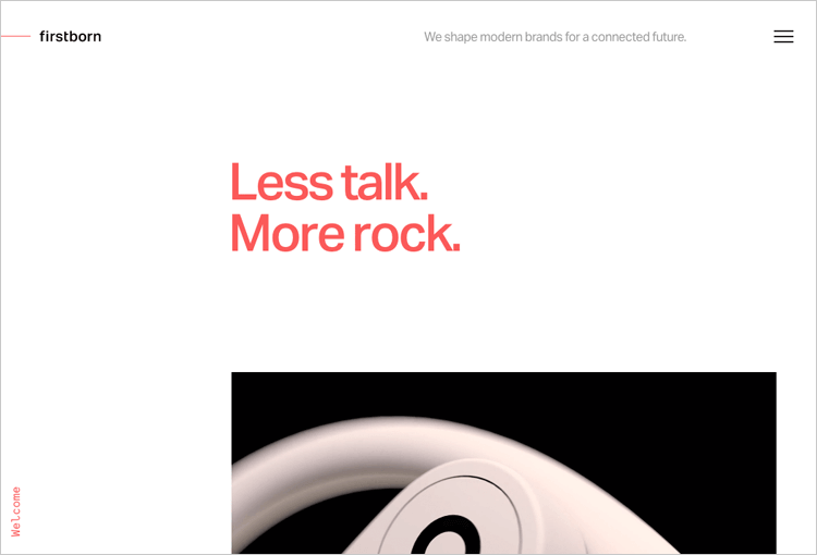
Clicking on any of the brand stories will take you to another screen with similar parallax effects that discuss how each brand first came to contact First Born, what their problems were and so on.
This is a great example of how consistent parallax effect design can be used to catch the user’s attention and lock them into a story.
Tomato Can Blues, while not a website, is a piece featured in the New York Times which documents early amateur cage fights prior to the birth of MMA.
What’s most impressive about this page are the iconic sketched illustrations by Attila Futaki that depict the main character the writer follows, Rowan, getting boxed in a cage. As the user scrolls down below the fold, the audience moves out towards the screen to make it look as if they are retreating from the fight and into the text.
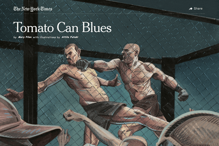
This parallax scrolling effect is a great way to generate interest in the mind of the reader and convince them to start reading the text!
Design and prototype parallax websites with Justinmind. It's Free. Unlimited projects!

Alex Dram is a designer from an agency called Finsweet. His website portfolio features a dazzling parallax effect arrangement – as the user scrolls down, the logo design opens out into a short paragraph of an intro.
You’re then greeted with two buttons: “About” and “Works” at either end of the page.
It’s aesthetically pleasing, showing a planet in a lilac space emitting radio frequencies and an envelope element resembling a paper aircraft following the cursor around the screen.
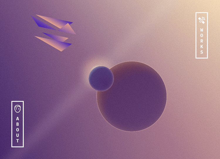
This site gets tops marks for beautiful aesthetic design. The only gripe we have with it is that, as the thunder and radio frequencies keep flashing, it’s not immediately clear if it is a response to the user’s scrolling or if it’s just automatic. As it turns out, it’s automatic. There’s no indication of when you arrive at the footer, meaning that there may be some excess scrolling before the user realizes it.
OnCorps shows how an AI data analytics company can reduce your workload, risk and errors by spotting patterns in the data that your company produces
Normally, this information might not stand out or be pretty boring to the average layperson, but the fascinating parallax storytelling makes it easy to learn and remember. As you scroll down, you’re treated to a burst of stars arranging themselves into various shapes, bar charts rising up like cliffs and line charts swooshing like the waves of an ocean.
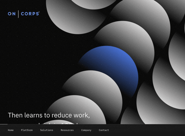
This is a great way of storifying an otherwise heavy and sober topic and turning it into a spectacle to marvel at by using the parallax effect.
The best thing? The design is consistent; it’s clear to see when the parallax effect ends and when the footer of the website has been reached.
What we like about Weglot is the intuitiveness of its parallax scrolling feature. As soon as the user lands on the page, they’re told to scroll downwards and shown a progress bar depicting how far through the page they are.
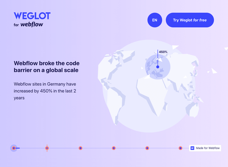
The design is aesthetically daring, showing you a white earth against a calming pastel background with website growth figures on different continents sprouting up as you scroll down. As the user scrolls on, a side panel of large text slides out onto the screen informing the user that there is a huge language barrier and is then presented with a chisel to break the barrier.
This storytelling parallax website is definitely worth a gander, even if you’re not going to use their services.
You arrive on the Steezy Studio landing page and you see a large hero image. Nothing special there. Nonetheless, when you scroll down, you’re treated to a dazzling, layered parallax effect design.
As you scroll, the hero image begins to unfurl even more, checkboxes of the lessons and goals you can achieve highlight themselves on the right and snapshots of a video with a dancing instructor spring out in a domino arrangement.
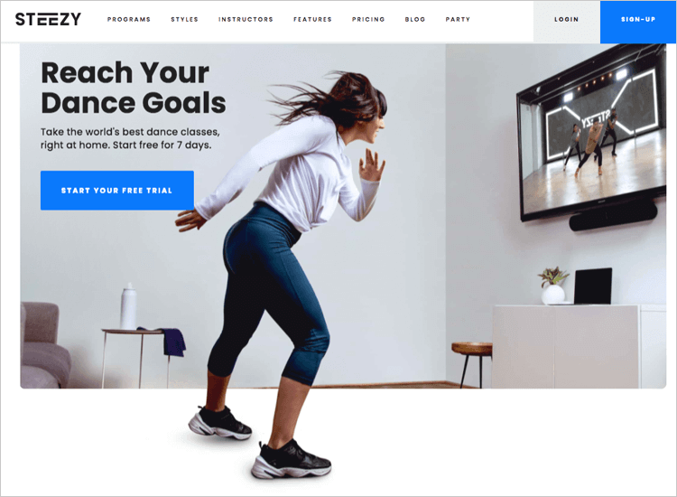
As far as parallax can go, Steezy’s design is minimalist enough in the sense that it doesn’t continue much below the fold, however, the little bit that is included provides the user with an energetic vibe. It also helps reveal the most important dancing lessons you can learn and emits a sense of the brand’s personality.
Sychronized Studio’s goal was to create a glitzy parallax effect with bold white type against a dark background, along with a few bright flares of bold color throughout.
First off, what do we not like? From an accessibility point of view, the auto-scroll banner at the top leaves a bit to be desired. It brings you to an archive of digital studio images. We get that this is an important showcase, but there are other ways of drawing attention to a section without giving prone users a migraine with a banner scrolling so fast it’s difficult to read the words.
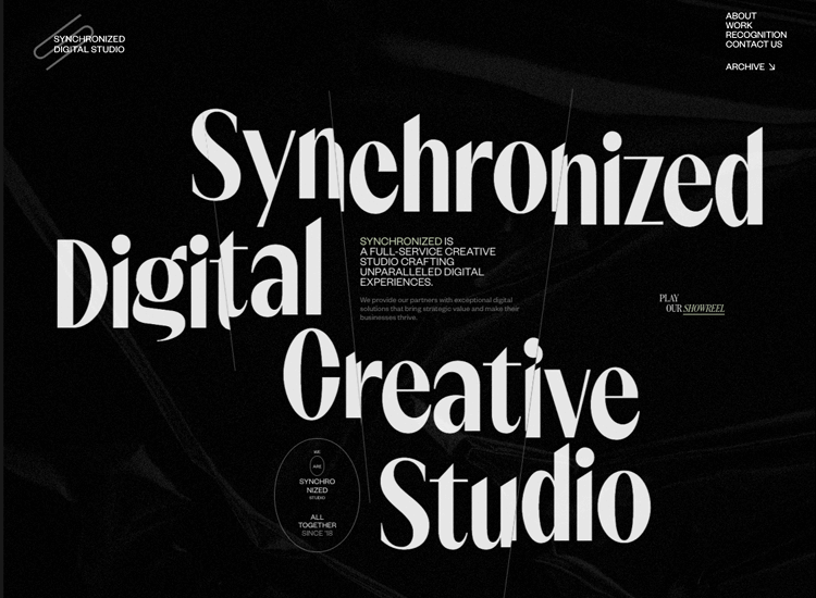
Furthermore, while this site is an impressive progression of storytelling, those who are prone to motion sickness might not appreciate the jarring effect that is bright fonts moving in circular fashion and multiple layers moving at different speeds. The whole effect is like being on a roller coaster minus the thrills and plus the motion sickness.
A strangely helpful aspect is the neon-green marker line that follows the cursor about the place and clashes with the background colors so that it is easily distinguishable from everything else.
More Milk, a Russian milk company, has a parallax effect website that helps unfold the story behind its milk production in a visually pleasing way. It features a nice pastel color scheme, with a milk bottle layer moving at a different speed than the background layer, giving the appearance of someone throwing up a bottle of milk into the air.
As the user scrolls, they’re shown a vertical progress bar to the right of the UI so they can see how far they’ve scrolled out of 100%.
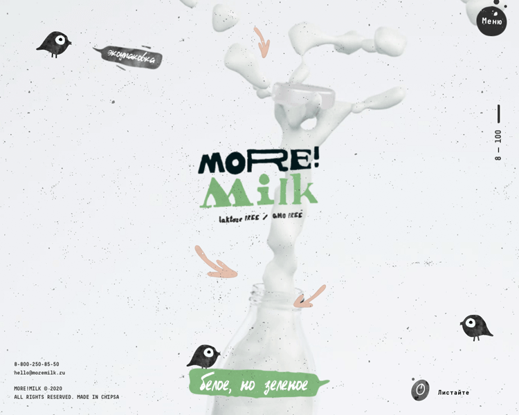
More Milk is a fantastic example of how to incorporate horizontal scrolling in parallax design. As you progress down below the fold, you’ll see fancy typography emerge from left to right at your own speed as you scroll. As you scroll yet further down, you’ll see more milk bottles spinning on the spot until you get to the footer, at which point, a contact form jumps up and fills the entire form.
Throughout the site there is storytelling at play, with each element meant to draw the user in to the quality and the story behind the milk, why it’s healthier and better then normal milk, with light-hearted sketches of birds and cows.
What better example of marketing and capitalism is there than Times Square itself? Candy Fish has a unique approach to drawing the user into its marketing story. The space above the fold is crucial for capturing the user’s attention and they’ve decided to dedicate the entire space to a comic hero image of Times Square.
What’s even more fascinating is that, as the user scrolls, they’re drawn into the crowd and treated to a horizontal moving image layer as a taxi scoots past. Immediately afterwards, in brutalist bold print, you’re given all the keyword services Candy Fish wants to rank for, such as “Marketing & Strategy”, “Rebranding” and “Corporate style”, etc.
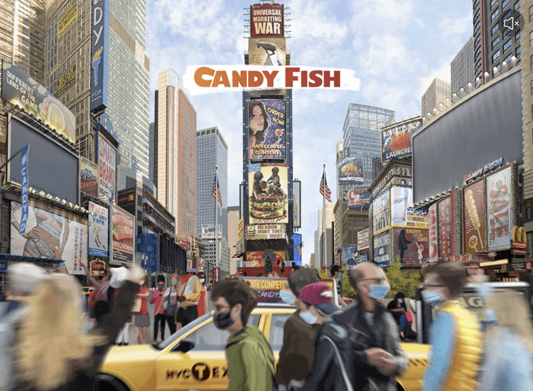
Scroll even further down and you’re treated to more breathtaking sketches of American landscapes with vehicles moving through them in the form of a horizontal sliding image layer as you scroll. It certainly makes the user want to keep scrolling through – exactly what the parallax effect is all about!
The only thing it doesn’t get quite right is the sound. Although it is automatically muted when the user lands on the site (which is always a plus in UX), the sounds don’t play in sync as you scroll. For example, once you scroll down to a quiet desert gas station scene, you can still hear the bustling sounds from Times Square. Moral of the story? If you include sound in your parallax effect design, always make sure it matches the pace of the user’s scroll.
Design and prototype parallax websites with Justinmind. It's Free. Unlimited projects!

Cuberto, as a parallax effect website, does something a little different – they have a circular moving image that follows your cursor around the screen, resembling a looking glass peering in on its services.
As you scroll down, there’s an image with an underwater effect to the right, accompanied with a paragraph on the left describing their clients’ stories, with the image to the right corresponding to the story.
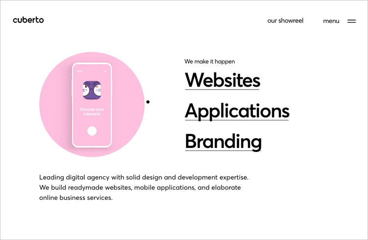
Scroll down further and the paragraph scrolls upwards as normal, with a new story paragraph sliding in to replace it. What’s impressive is that the image element on the right’s position remains static. Instead, as you move down, a fade effect replaces the image with a new one using a splashing effect, giving the impression of moving water.
Delassus Group, a fruit and flower producer in Morocco manages to bring the parallax effect back to its basics, while managing to not make it look basic in any way.
As soon as the user lands on the site, they are immediately drawn in with bold colors, large pixelated fruit, representing their major products, citrus, grapes, avocados, and flowers. Where the parallax comes in is in the subtle movement of the fruit and text overlaying images as the user scrolls or moves their cursor. This gives an illusory 3D effect which enhances the website and makes it come alive.
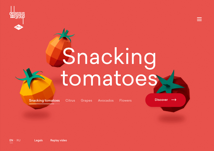
With the vibrant colors and movement, the user is drawn in to read more about each fruit and what the story behind the product is or the story behind Delassus.
This is an example where the parallax effect doesn’t directly impact the storytelling of the website, however, it adds to the storytelling experience somehow. It makes the user feel in control somehow by their scrolling and cursor movements having an effect on the position of the fruit and the text.
Jess & Russ is a single-page parallax website to tell the story of how two designers met and fell in love, without sounding too much like a Tom Petty song. The whole point of the website is to allow guests to RSVP their invites to a wedding celebration.
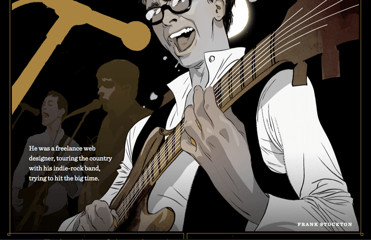
In fact, it’s the perfect way of laying down the colorful history that their relationship is built on and is a fabulous example of visual storytelling using the parallax effect.
Each image features moving components as the user scrolls downwards towards the footer, followed by a small paragraph of text quickly and humorously describing each of their lives in a specific year. It’s worth a read!
Does the parallax effect have a positive impact on your website? The answer is it depends on the type of content on your website.
What we do know is that, done right, the parallax effect can increase your website’s ability to catch your users attention and reduce your bounce rate. Whether or not you ultimately decide to use the parallax effect in your website design, we’ll leave to your judgement.
If you choose to embark on the parallax effect route, make sure that you make content and storytelling your first priority.
PROTOTYPE · COMMUNICATE · VALIDATE
ALL-IN-ONE PROTOTYPING TOOL FOR WEB AND MOBILE APPS
Related Content
 There really is no faster way to get started than using a pre-designed web app template that you can tailor to your taste.6 min Read
 Looking for a quick start in a new project? Discover these 37 free practical app templates made by the Justinmind team just for you.13 min Read
 Looking for a quick start in a new project? Explore these 30 practical 100% Free website app templates designed by the Justinmind team just for you.14 min Read

