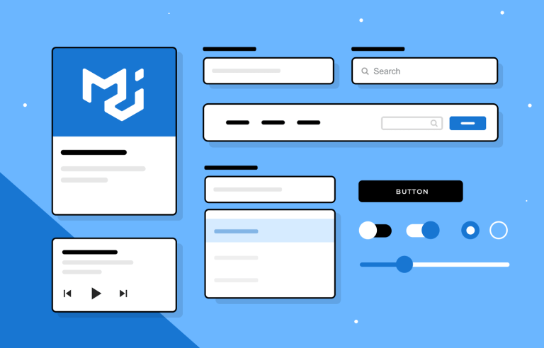
Justimind’s free MUI library offers a comprehensive and easy-to-use UI components collection that has you covered for any app design you have in mind!
With its simplicity, React is becoming increasingly popular to create dynamic mobile and web applications, and designing your own project has never been easier! Our free MUI library is now live and it seems it is making it to the favorites list.
As expected our library is based on the latest MUI framework so you can quickly and efficiently design screens and prototypes for any type of apps following the best practices of user interface design.
See how to get started designing MUI app UIs right away!
Our MUI library is a complete UI component library based on latest Material UI. It includes prebuilt components that designers can use to create web and mobile application designs. Justinmind’s up to date UI components will provide you with a solid foundation to get started.
All components in our Material UI library have been designed to be flexible and customizable so that you can build unique interfaces while adhering to Material design principles.
This vast selection of intuitive UI components will help you create a consistent look and feel, and cohesive user experience for any design projects in general.
MUI is an open source project that implements Google’s Material Design guidelines. With a complete collection of ready to use components for you to customize, it allows users to create their own custom design system faster.
In other words, using Material UI allows you to create new products or add new features to your products faster without having to sacrifice usability and style.
For designers this means you get more time to design great user experiences rather than creating and testing UI components from scratch.
A top priority for us when creating this library of UI components was to make Material UI easily accessible to designers –from the very start of the design process.
As a result you got a set of highly customizable components to help you build high-quality and, of course, beautiful experiences for your users in the least amount of time.
Of course, these UI components have been crafted to design MUI based apps, but thanks to its versatility they can be used for any web or app design.
Our drag and drop MUI component library will help you design user-friendly and visually appealing apps. From buttons, forms and icons to ready-to-use cards and modals, including pre-designed animations that ensure the design process goes smoothly and efficiently.
Here’s a list of the UI components you can find in this library:
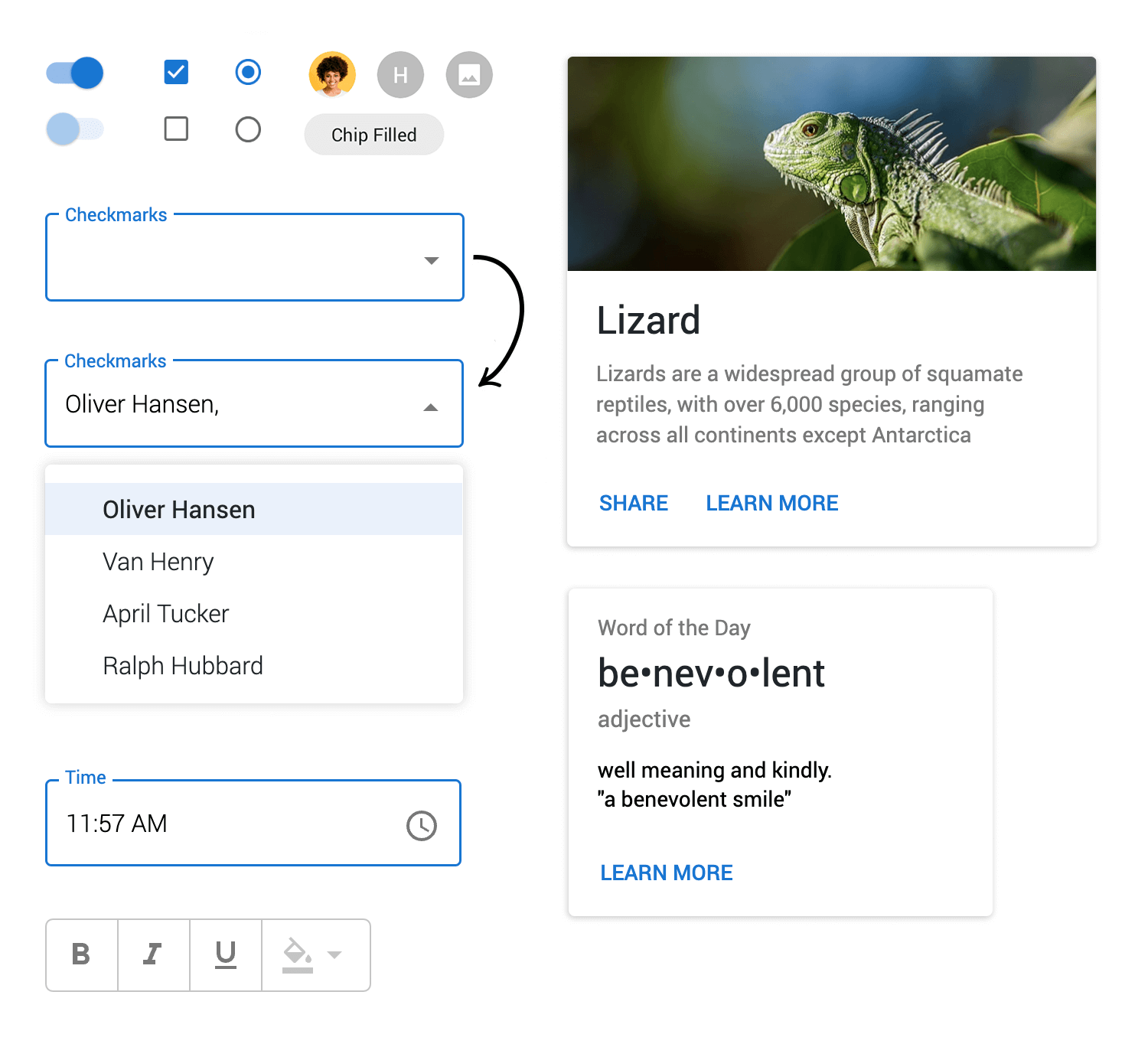
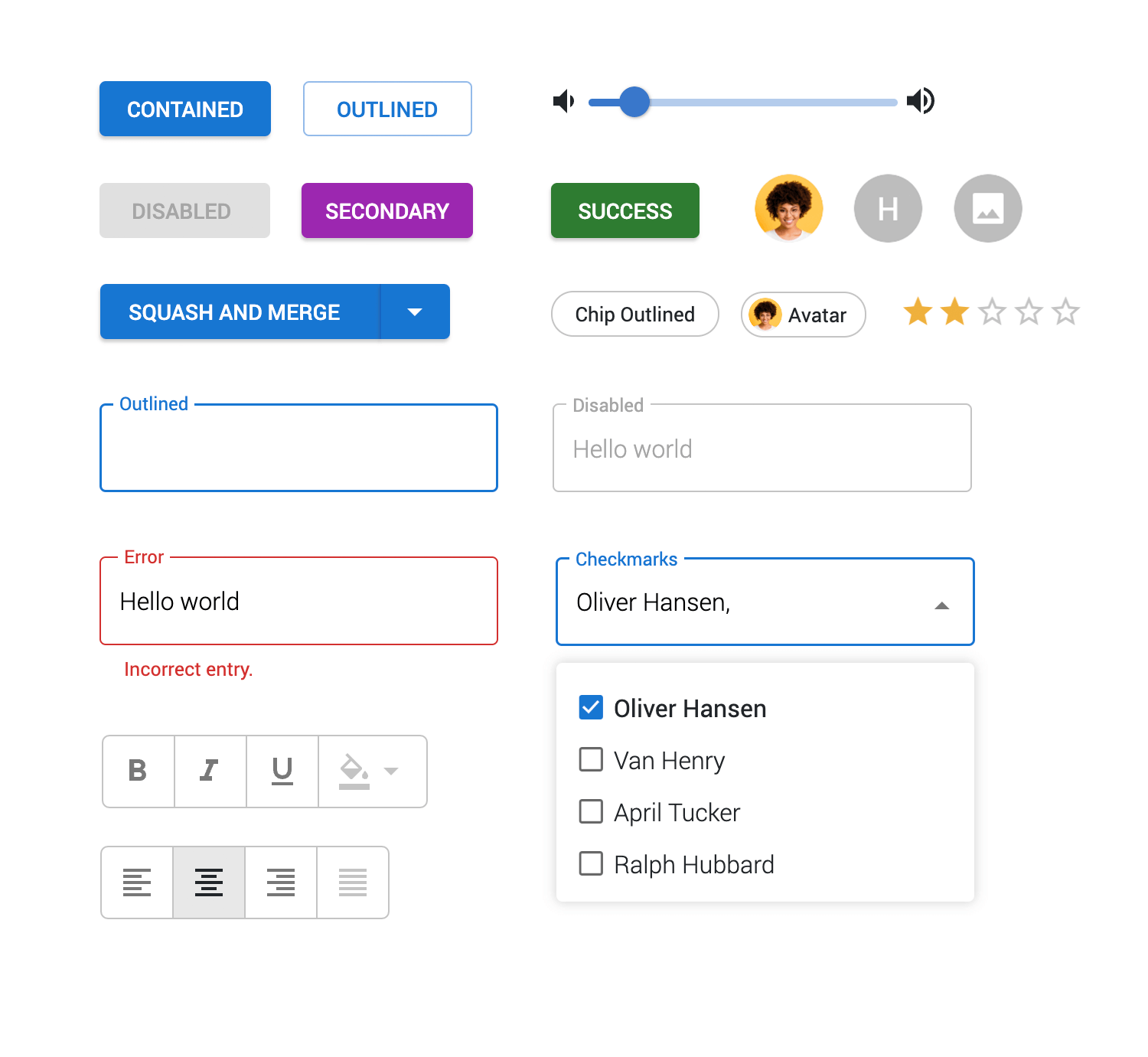
- Texts and buttons: In each category correspondingly you’ll find a variety of pre-designed typography styles as well as button styles such as primary, secondary, and outlined group buttons.
- Forms: Essential for any user input, this category offers you a variety of text input fields for sign up, login, search, etc. These include inline validation and working number pikers.
- Selects: Here you’ll find a selection of pre designed Select menus, including single selection and multiple selection dropdowns. All easily configurable to your app’s look and feel.
- Lists and controls: The UI components available in these categories already have all the basic interactions built in, which you can try out by clicking “Simulate”. The lists range from basic to enhanced transfer lists and checkbox lists. Control components include the most popular date and time pickers as well as different rating widgets, and single and multi select toggles.
- Navigation: Here you’ll find a variety of navigation components that will help you make the user’s journey around your app design simple and intuitive. From basic navigation menus to more advanced options, you can go for a classic Tab navigation bar or help users accomplish tasks with horizontal or vertical steppers.
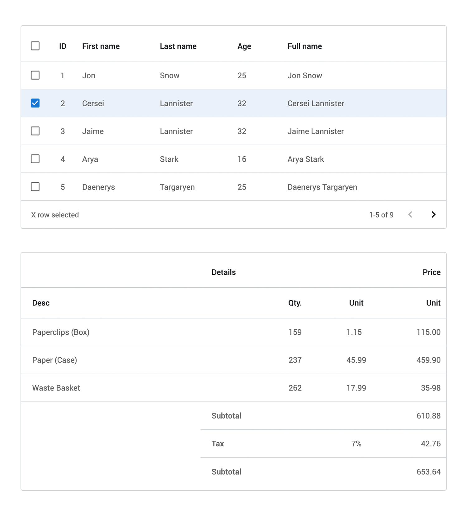
- Data tables: Data tables, when used correctly, can be an efficient way of organizing data information and maximize the user experience. You’ll find a table for any type and quantity of data or its intended use. Table components include options like a sorting table to find specific items, or spanning tables to customize your data layout.
- Data display and Feedback: These categories include all the primary, secondary, outline, and icon chip buttons and tooltips available in material design. As well as all alert components such as success messages, warning messages, and error messages which are key for communicating with users.
- Cards and dialogs: Card components are useful for displaying and structuring information, so we’ve included various card designs and modals that you just need to drag and drop.
- Drawer: Similar to modals, drawers allow you to display additional content and functionality while staying on the same page. If you need to display more complex content, you’ll sure find an option for your design in this category.
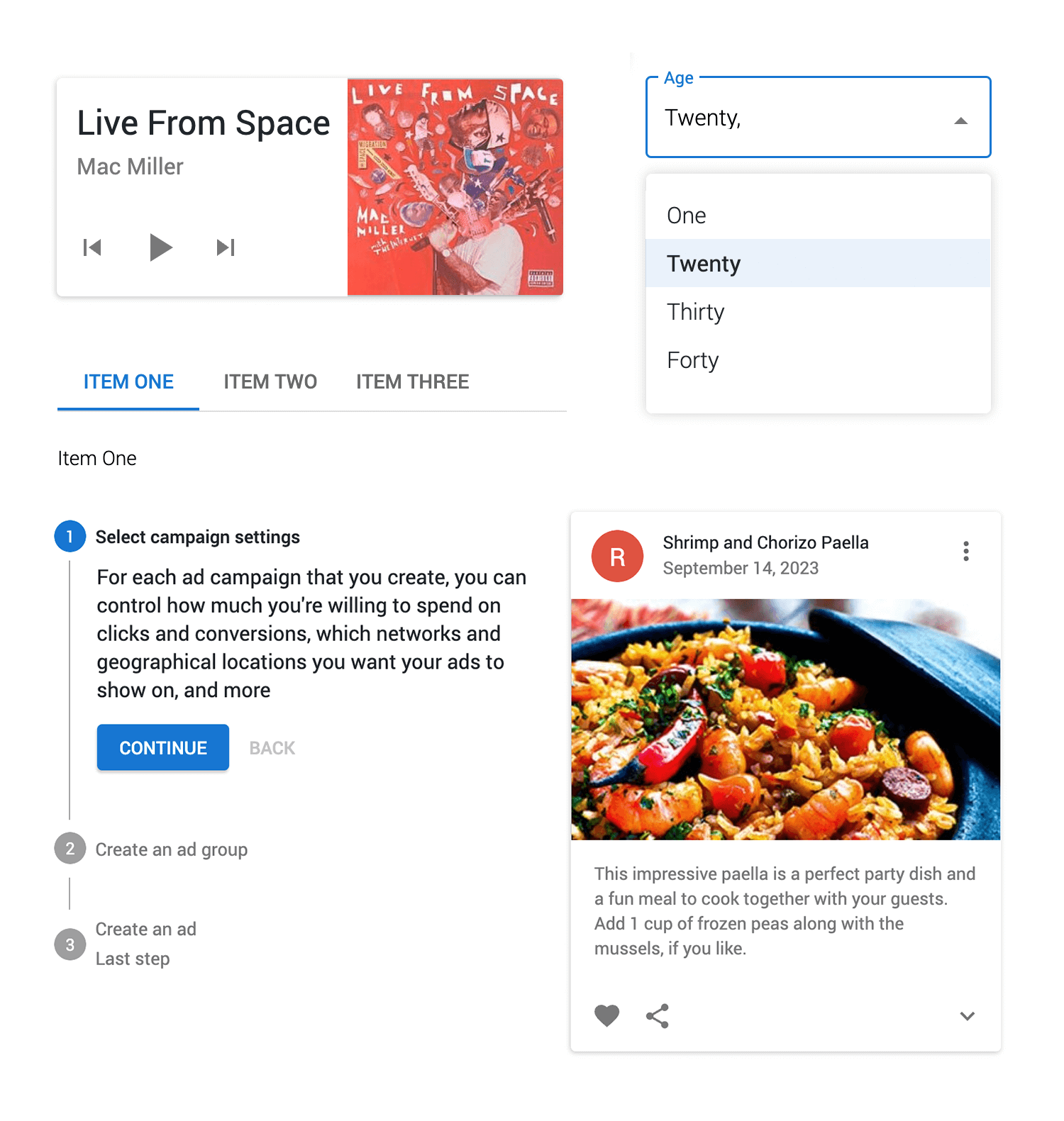
Our MUI component library will help you start designing MUI app UIs confidently and efficiently in no time.
To get started designing a better app with our free MUI component library you must first download the Justinmind prototyping tool if you haven’t already. Follow the steps below and start designing.
- Download the free MUI library from our Interactive UI components page
- Justinmind will open on your desktop
- Navigate to the Libraries palette, where you should see the MUI library
- Browse, select and drag and drop!
As explained in their website, the MUI vision is “to provide an elegant React implementation of the Material Design guidelines that can be customized to fully match your brand.”
Designing a web or app compliant with these guidelines doesn’t have to be complicated. Here are a few tips for optimizing your design experience.
Now that you are familiar with Material UI and have a reliable set of components available, take a good look and explore them to get an idea of how and which components fit best your design project. This will help you to design more efficiently.
While our MUI library offers you a lot of component options and ready-to-use cards and modals that are easy to customize, it is important that you focus on usability and a simple and enjoyable user experience. Avoid cluttering with unnecessary elements or overdoing colors and typography styles.
With such a complete range of components available, consider the functionalities and visual style of your product or brand, and select the ones that are right for your prototype and can best meet or adjust to your design goals. This will help you style your UI components much faster while following the Material design guidelines.
Material UI focuses on creating a consistent user experience. Which means you should follow and keep a unified structure and hierarchy of information across all pages, as well as browsers and devices. And remember with the Justinmind prototyping tool you can test and use user feedback to refine your design.
This Justinmind UI components library is based on Material UI, which means any product you design using this library can be used universally. With fully interactive MUI components and cards it is simple and uncomplicated to start designing MUI app prototypes.
Our MUI library is the perfect building block to design interactive user interfaces that you can test with users and hand off to developers. Once you have the free library enabled in the Justinmind editor you are ready to start a seamless experience from start to finish!
Get started now and see how Justinmind and its vast collection of free UI components libraries can simplify, and even better, level-up your design process.
PROTOTYPE · COMMUNICATE · VALIDATE
ALL-IN-ONE PROTOTYPING TOOL FOR WEB AND MOBILE APPS
Related Content
 Justinmind 10.2 includes SSO, a new Figma plugin, updated iOS UI library, improved Masters and more, including shared Fonts for a more efficient workday.5 min Read
 Our new free Bootstrap icons UI kit is here with new icons to enhance your web apps!11 min Read
 Our new free Vuetify UI Components Library is here to tune up the way you prototype your digital products!8 min Read
