User flows can make your life and your users’ lives easier. Learn how to make them for a design that goes with the flow!
Imagine you’re a builder, standing beside a foundation. Your boss hands you a bunch of bricks and a cement mixer and says “just build something cool with those…”. No blueprint, no layout.
Design user flows and hi-fi prototypes with Justinmind
How many houses have you been in where you had to enter through the bathroom, then out into the garage, into the bedroom and into the kitchen? Hopefully none – it doesn’t happen. This would be the housing equivalent of a digital product built without a user flow!
Fortunately, we have UX designers who draw up user flows for the apps and websites that are supposed to make users’ lives easier. Read on to learn how user flows lead to better product design and how to create them with the Justinmind prototyping tool. We’ve also thrown in some awesome examples!
A user flow is a diagram that shows at a glance, the path your user will take through your app or website to achieve a certain goal. You can create user flows at any stage of the design phase and this will help determine the information architecture.
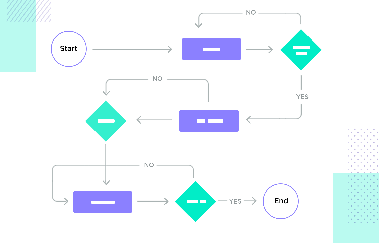
Depending on where you are in the design phase, the form that a user flow diagram can take varies. For example, many design teams create user flows before they create their UI wireframes. Preliminary user flow diagrams usually take the form of a chart comprising some or all of the following shapes with often universal meanings:
- Rectangles (notes)
- Diamonds (decisions)
- Circles (entry points)
- Transition arrows (user navigation)
- Squares (sometimes used for notes)
However, once the design team wireframes their product’s screens, their user flow diagrams often substitute the rectangles for these screens. This combination of a user flow and a wireframe is sometimes referred to as a “wireflow” in the design world.
Depending on the company, many design teams continue to create user flows up to the prototype stage, substituting the wireframe screens with prototype screens. In some cases, design teams may create a user flow to improve an existing product or new feature. In this case, there will already be an existing user flow. In fact, you can analyze your user flow with Google analytics for free.
There are many reasons you should consider creating user flows, especially if you’re just commencing your product’s design phase. Here’s how they can help you with your design:
User flows make you think about how the user will navigate through your app or website to achieve their goal so that you can design your screens in a productive way.
User flows also help unveil any hesitations they may have as they attempt to navigate through the different options, screens, features and controls of your product, as well as reveal any possible areas of friction. This can be helpful in that it forces you to consider alternative user flows or to simplify the original path before expensive and time consuming errors are made.
The London App Brewery, in a lesson on user flows, points out that if you need to change the way a user navigates or uses a feature, this can take a UI designer a few to several hours in Photoshop. Moreover, if this realization hits when the project’s at the development phase, it can take a few days to alter all the code and can be very expensive.
On the flipside, changing a user flow can take anywhere between a few seconds to a few minutes!
Saying there are a lot of terms for the various deliverables of the UX design world is somewhat of an understatement. One of the documents that many (and particularly newbies) tend to confuse with user flows are user stories.
Whereas user flows focus on charting how a user progresses through different screens of the app to achieve a goal, a user story is one of two lines that explains a feature requirement from the point of view of the user, i.e. what they’re looking to accomplish and why they need it.
Furthermore, user flows only focus on the technicalities and logistics of how a user uses your app or website. On the other hand, user stories describe the user’s motivations and frustrations in brief detail. It describes the feature they need that would make life easier for them.
Sometimes, following a user story is a user story map. This often consists of arranging sticky notes on a board with your team, although this is not always the case.
User story maps document the bigger picture, i.e. how the user hears about and discovers your product and the various touch points they may access it through. User flows specifically relate to how a user carries out a particular task on your app on or website.
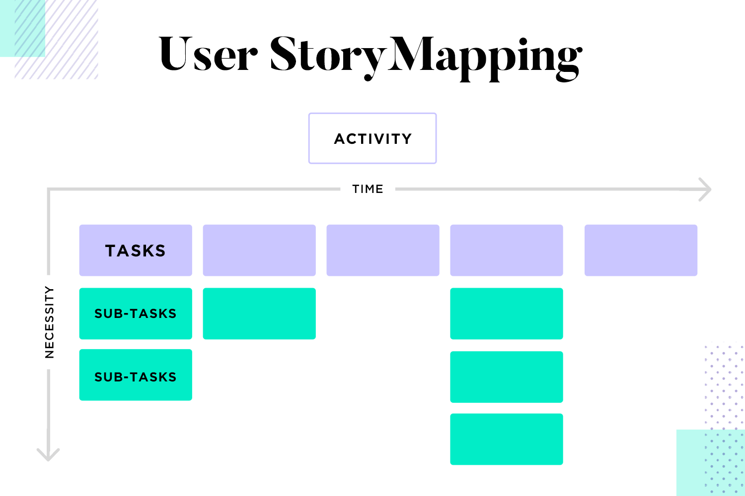
Lastly, the stages at which you would generally create these deliverables also differs: the user flow normally comes after the user persona and story. User stories can be helpful when it comes to creating your user flows.
You may also be forgiven for getting user flows and user journeys (sometimes called “journey boards” or user journey maps) mixed up. But don’t worry – we’ve got this one covered too. Here are the precise differences again, between this design deliverable and user flows.
User journeys, like user stories, tend to look at the macro experience the user has, whereas your user flows will hone in more on the specific details, that is, the specific solutions to your user stories. The latter looks at the micro experience of your user as they navigate your product.
Journey boards, in a similar fashion to user story maps, will look at how your user came to use the product and through which channels. It also adds an extra dimension by outlining the user’s frustrations and emotions throughout each step of your product features. User flows, on the other hand, tend to focus purely on the logistics of navigation.
Oftentimes, the user journey makes it more of a personal story and takes into account the user’s experience. It might even contain sketches of the user or emojis to demonstrate delight, frustration or indifference. A user journey board may also describe the users’ thoughts throughout each step, whereas the user flow simply describes decisions.
Design user flows and hi-fi prototypes with Justinmind

So how and when do you implement user flows in the design phase? The answer is that there isn’t a specific time that you should use them. However, we at Justinmind recommend that you start drawing one up before you even sketch out or wireframe your screens. Here’s how to go about it:
Start with user research. Once you get a good idea for who your users are and a clearer picture of the solutions they need, you can start to analyse the competition. Check out what their user flows are like simply by navigating through their apps or websites and sketching out the flows.
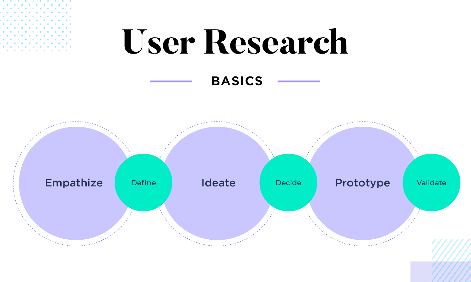
After this, you can draw up your own user flow. You might find you’re able to improvise on your competitor’s flows, providing a unique experience or even improving it.
You may start with a basic chart containing the shapes we mentioned above, such as the circle shape to represent the entry, for example, a login page. The user then logs in or registers with a new username or password. You might add in two more screens to demonstrate this.
When that user has logged in, you might use a diamond shape to show they have to decide whether to start recording videos or browsing ones.
Once you have this basic user flow chart drawn up, either on paper or by using one of the many great user flow tools available, you can then start to sketch out or wireframe your screens with confidence. After you’ve wireframed your screens, you can then add these screens in place of the rectangles, and add the text from the rectangles to notes.
Once you have that flow defined, you can then go on to create your final prototype. You might wish to add these screens to your user flow. Doing this always helps give your client a much bigger and clearer overview and of how the product is turning out. It also helps convey the type of experience the user is going to have.
Then you simply iterate and reiterate on those flows until you get them exactly right.
When designing user flow diagrams, there are right ways and wrong ways to go about it. What you don’t want is to end up with a mind-boggling, confusing document that very few people, apart from the design team, can read. Let’s take a look at some of the ways you can create easily legible and intuitive user flows.
Always give a descriptive, straightforward name to your user flow that describes what it’s about. For example, you might call it “navigation from homepage to dashboard”. This will also encourage you to break your flows up, rather than including every flow for every action in one document, which can quickly get very confusing.
Ever meet a driver going the wrong way down a one-way street? Even just imagining the scenario is scary, right? Imagine a big design task that the client is investing a lot of money in with a user flow that flies back and forth between screens!
We’re talking about those user flows packed to the brim with lines, shapes and arrows in every direction – something that looks like a complex highway system. Make sure your user flow doesn’t end up like this. The flows (lines and arrows) should always go in one linear direction – there should never be two-way flow between screens for one action.
As we mentioned above, it’s better to design flows with one goal at a time. If you’re not able to keep your attention while designing your product, how is the user supposed to keep theirs and stay focused on one task?
There should never be any sidetracking issues when the user is trying to complete a task. The product will seem incohesive and the user could get distracted. Help them to achieve one goal at a time, rather than throwing them off and distracting them. Imagine being asked to update your profile bio while in the middle of making a post!
Using a legend key will help make your user flow instantly more understandable to the uninitiated (who aren’t used to reading these types of deliverables on a regular basis) and help them decipher what those shapes, screens and arrows mean.
For example, in your key, specify that circles are entry points, rectangles are screens and that diamonds represent decisions, etc.
It’s very important that your user flow document start off with a clear entry point. If your user flow doesn’t have a clear entry point, i.e. starting from the login screen, or from the homepage, it can be very difficult to establish a linear start-to-finish journey as your user navigates to their goal.
If there are multiple possible entry points, make sure they’re clearly specified or consider breaking them up into different flows. The main point is, make sure it’s clear where the user is entering the app or website because this indicates where the flow starts.
It’s always important to clearly label each action, screen and decision in your user flow. By this, we mean labeling the login screen “login screen” if it’s a rectangle, or “log in or sign up” if it’s a decision. Try to avoid long-winded, wordy labels and unnecessary information, such as “login if the user has an account or sign up if the user wishes to use services”.
If your user flow document includes actual screens from a wireframe or prototype, then you can label them or include brief notes below each screen.
If you’re going to include a splash of color into your user flows, then you’re better off using it with purpose or not using it at all.
For example, use a separate color for each different element in your user flow so that readers can easily understand the color code. In such a case, you might have green for decisions, blue for screens, yellow for entry points, etc.
Always make sure your user flows are complete when it comes to a goal. Don’t leave anything to speculation, otherwise it defeats the goal of the user flow in the first place.
For example, imagine a user is signing up for a newsletter. They might have to go through an extra screen if they are from Europe due to GDPR rules. Don’t have a situation where the end goal has been reached after the standard user has signed up, leaving just a note saying “EU users will have to accept privacy policy and then redirect to the same landing page.” Instead, map this out as an alternative path with this extra screen included.
By making sure you map out everything, you’re eliminating ambiguity and spotting the potential for any errors or friction. You’ll also make sure you don’t leave anything out!
Design user flows and hi-fi prototypes with Justinmind

When it comes to designing user flows for mobile apps, one of the nice aspects is that, if the app is native to iOS or Android, there are less possible entry points. The user will almost always access the app directly from their handset and won’t normally be landing on any of the screens from elsewhere on the internet.
However, in the era of mobile-first design, we need to take special care that our native mobile apps are up to par with mobile-responsive websites. Here’s a list of well thought-out examples of mobile app user flows at differing fidelity stages:
What we like about this delivery app design user flow is that the screen wireframes are large and clear, with each onscreen element clearly labeled, with the blue arrows pointing to notes which contain zero surplus information. Each screen is linked with a broken orange line.
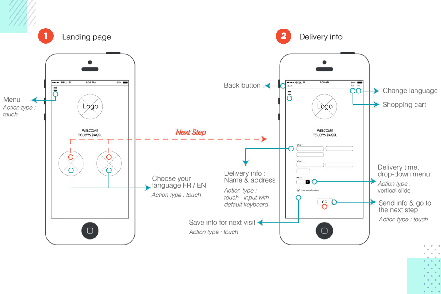
The steps and the elements are clearly distinguished in this example, giving us a clear picture of the flow: landing page, choose language, enter address details and send information.
This music app user flow is a great example of how a potentially complex user flow can be simplified and interesting with a consistent color scheme – in this case: neon red against a black background.
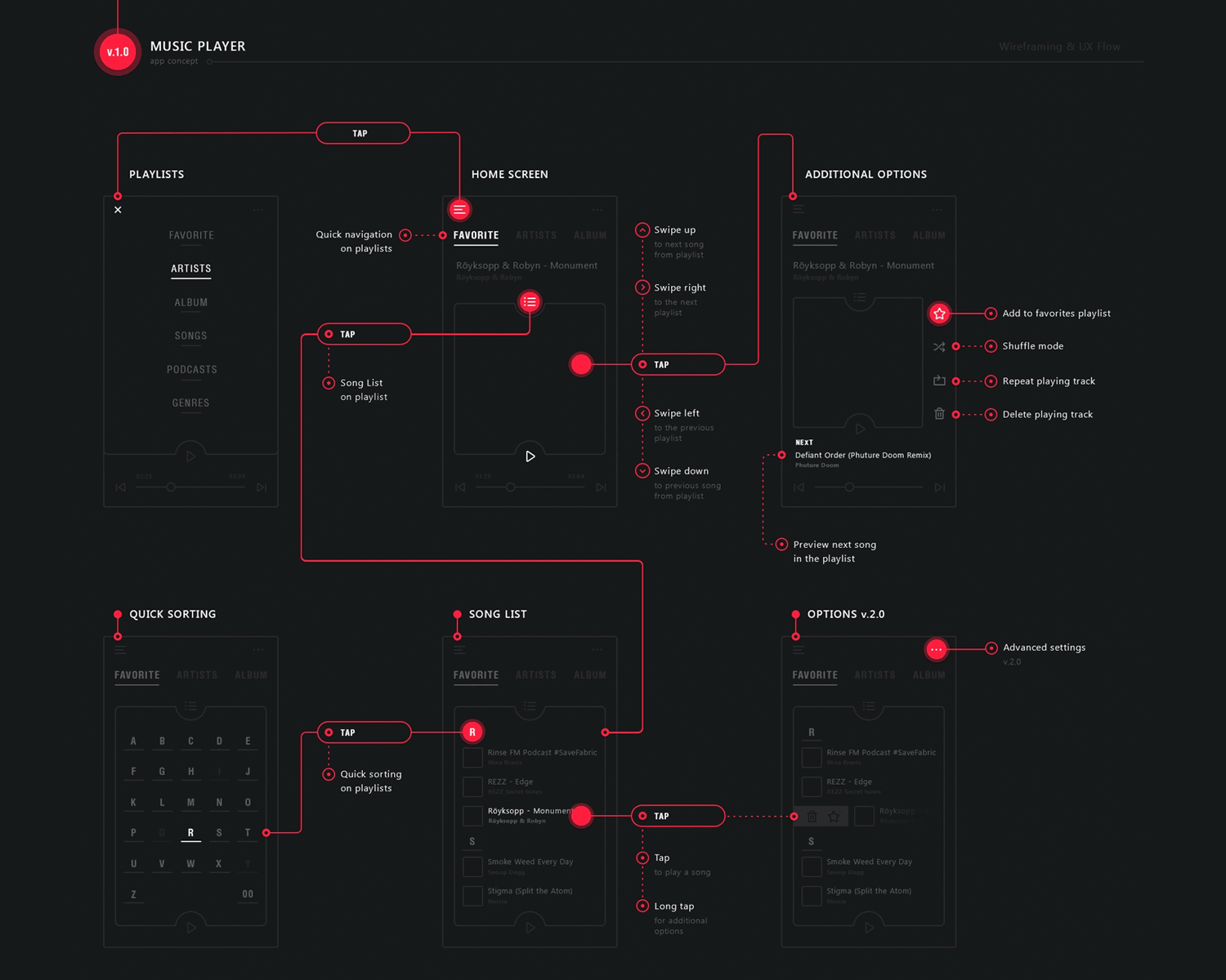
What’s particularly helpful about this user flow diagram is the fact that each user interaction, such as taps and swipes are all clearly laid out, rather than simply showing the navigation between the screens.
This is a glorious example of the versatility of insight that user flows can offer; they can even be used to indicate the user’s path through small screen devices like the Apple Watch.
This Apple Watch user flow is simple, easy on the eyes and actually pleasant to look at. The familiar homescreen of the Apple Watch is displayed, then all of the flows and alternate flows are succinctly laid out and flowing in one direction.
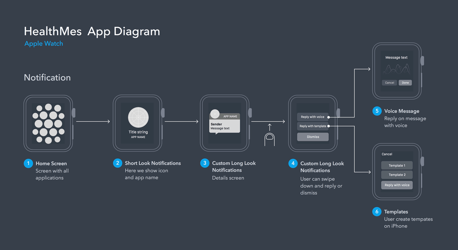
The notes are short and sweet, taps are indicated and the watch outline and screen remains consistent, eliminating any potential confusion.
This vector-based user flow of a news app demonstrates very clearly the typical navigation that a user might be expected to go through when they open up the app on the native app on their cell phone.
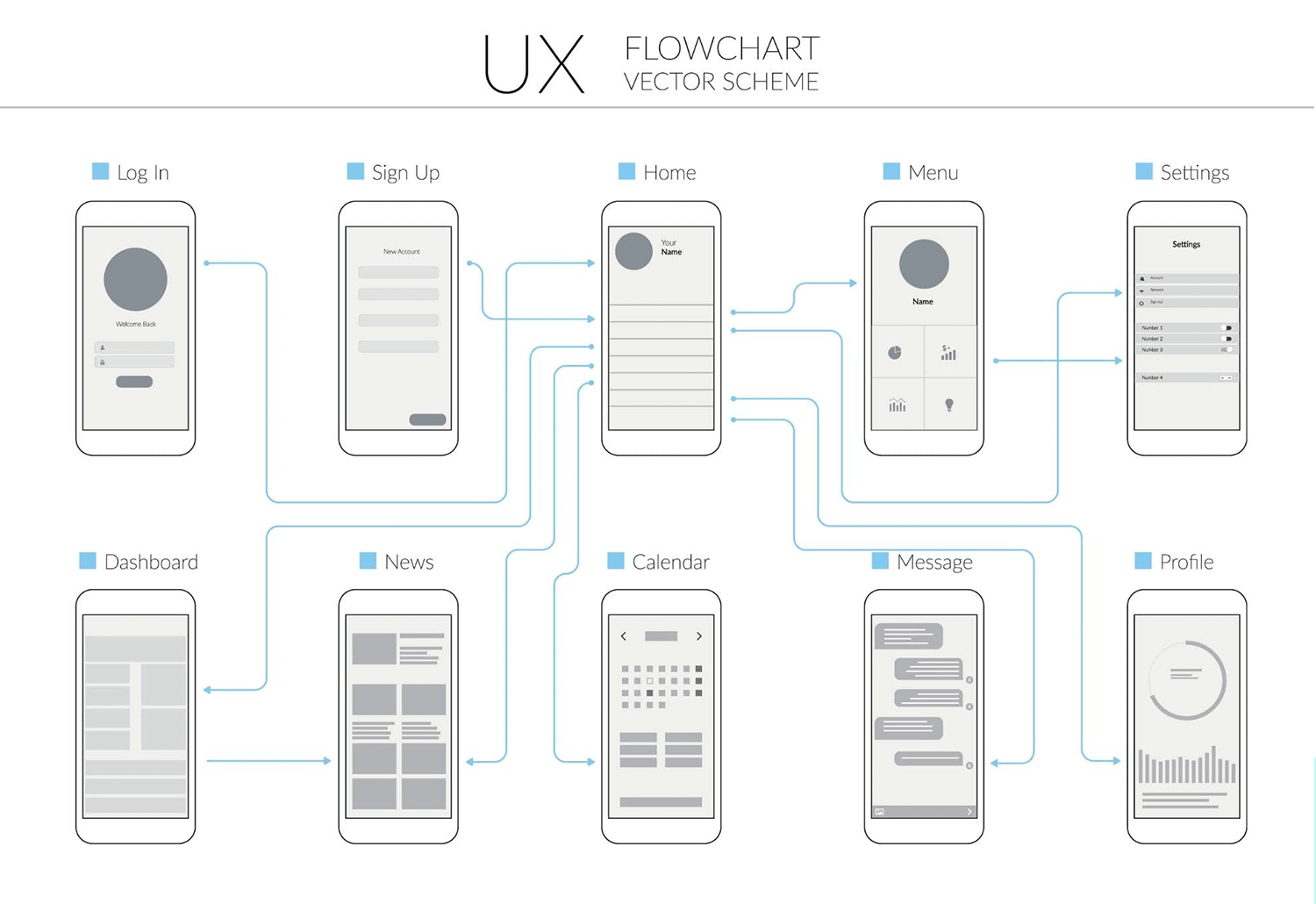
For example, the user logs in and is immediately taken to the home screen unless they haven’t signed up, in which case they will go there after they sign up. They then have a few other choices, such as navigating to menu and settings, to their dashboard, to news articles, etc.
This user flow is a great example of using simple screen wireframes, clear labelling and a consistent flow with transitional arrows to easily convey an otherwise complicated and potentially confusing navigational spaghetti.
This is a brilliant example of an early conception of a mobile app user flow that just uses shapes to tell the story of how the user navigates through a new instagram feature to join their Marketplace.
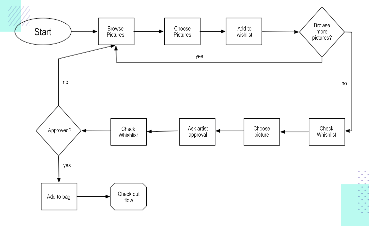
What we see is an unmistakable simple navigational flow from editing the profile, to uploading a cover photo and uploading artwork to be sold. The many complex steps on the way to this goal have been laid out in a simple way that anyone can understand. It provides an ideal launchpad to start fleshing out wireframe screens, which otherwise might have been a lot more complex and error prone without the information this user flow provides.
Design user flows and hi-fi prototypes with Justinmind

Website user flows are very similar to mobile app user flows. The only aspect that distinguishes them is the possibility of multiple different entry points, along with clicking, as opposed to finger interactions.
Let’s look at some brilliant examples of how to organize a website user flow:
This user flow for a student guide website already has its screen wireframes completely, or could be seen as a “wireflow”. The user starts off at the homepage, where they can then navigate to the categories page, with a further listing of the subcategories. Every flow follows a linear direction.
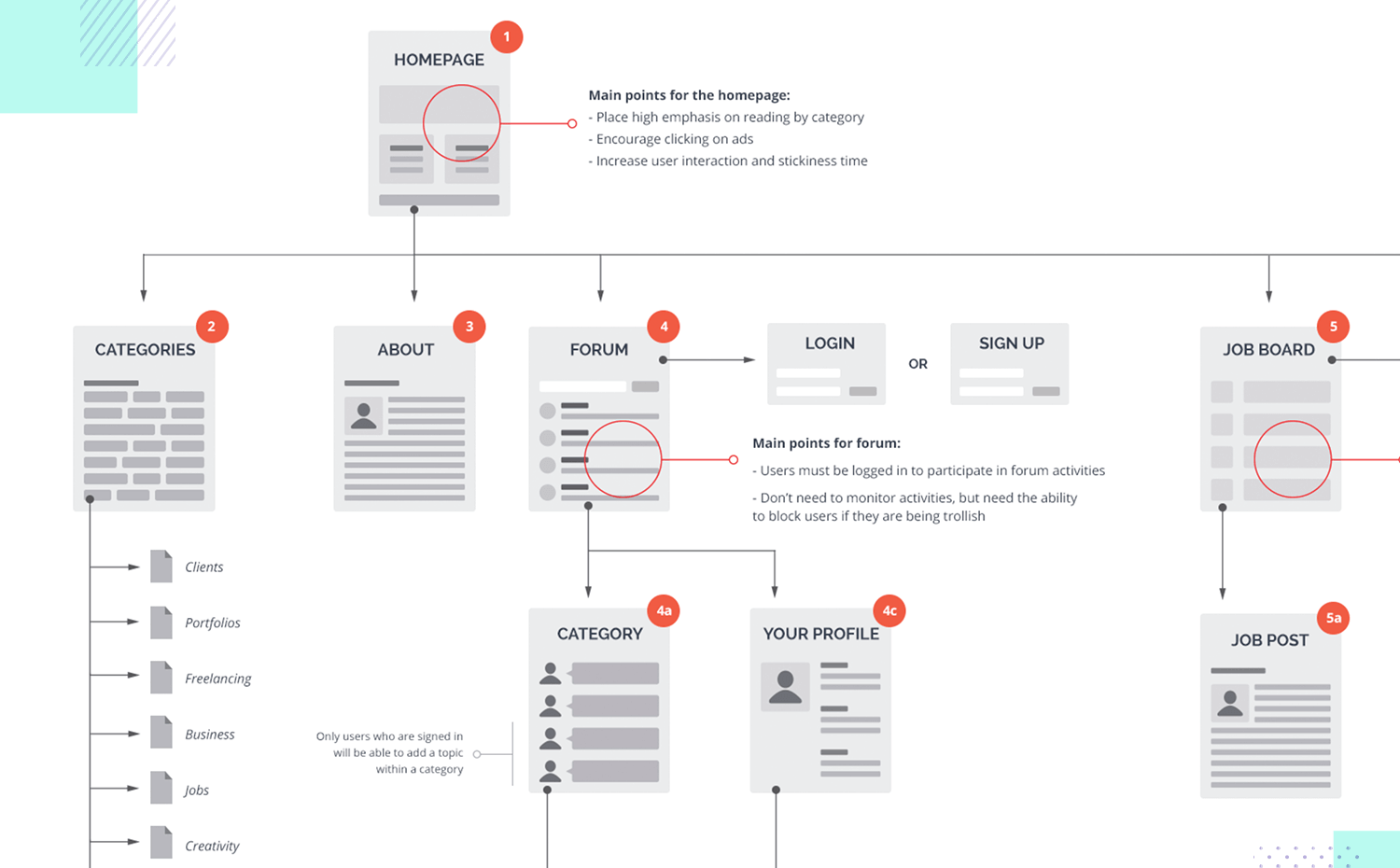
Each screen is clearly labeled and notes briefly demonstrate the main purpose of the screens with multiple options.
What we like about this colorful user flow is the simplicity of its organization, along with the fact that it uses color for the purpose of coding and easy visual assimilation.
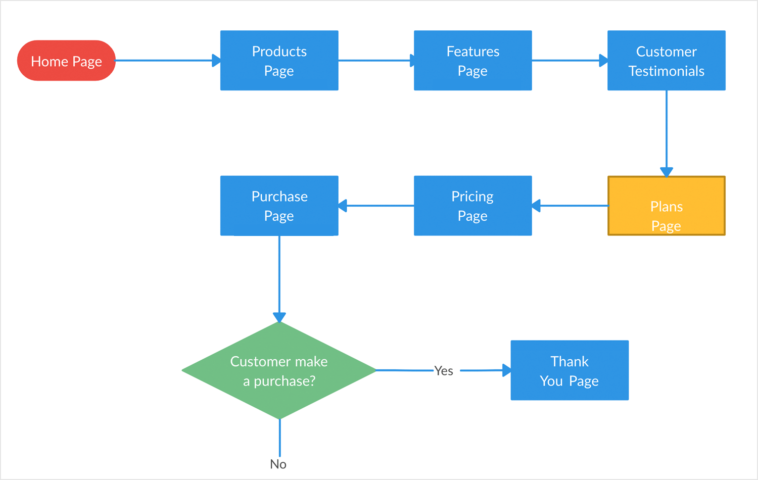
The user flow in this case represents the goal of the user making a purchase and receiving a discount via a pop up window. This is all clearly displayed with just a few shapes. Screens can quickly and easily be recognized as they are in blue and the crucial decision diamond where a user chooses to make a purchase or not is clearly represented in green.
Sometimes, designing an ecommerce or simply a website where purchases can be made isn’t always so straightforward. Usually this is because there are multiple paths the user can take before making a purchase depending on whether they’re registering for the first time or if they’ve forgotten a password.
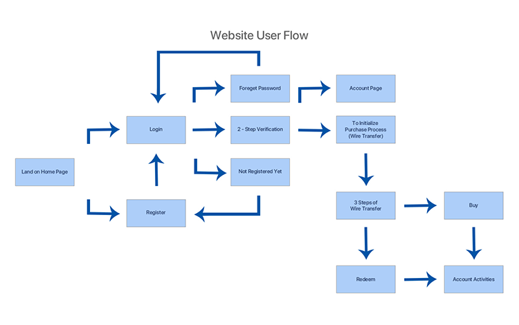
This ecommerce website user flow clearly demonstrates the complexity of the interconnectedness of all the screens that lead to one ultimate goal. Yet the flow itself doesn’t look complicated and gets the messages across in a simple, clear way.
Here’s another great example of an ecommerce website where the user starts off and moves towards one main goal – to buy something (or to arrive at the order confirmation page).
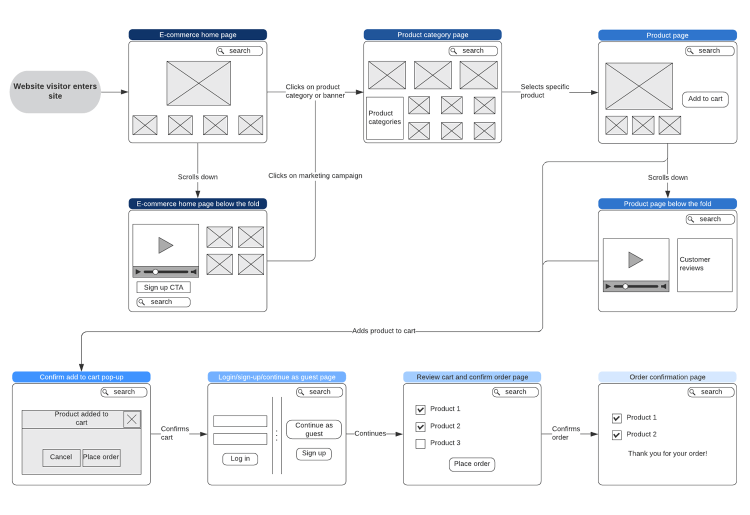
Unlike the above example, this user flow is a more developed wireflow, with the main layout for each of the screens already deliberated. The user lands on the homepage and has three different options: click on product or category banner, click on a marketing campaign or scroll below the fold. Each flow ultimately ends up at the order confirmation page.
Each different option is demonstrated with a simple, minimalist wireframe screen, for the ultimate simplicity. This is the perfect foundation to further develop the fidelity of these screens into a prototype that can be tested out on users.
We decided to include this website user flow with a legend key because it’s a great example of how to create a simple user flow using shapes and a clear color coding system, so that anyone can understand the main functionality of the website.
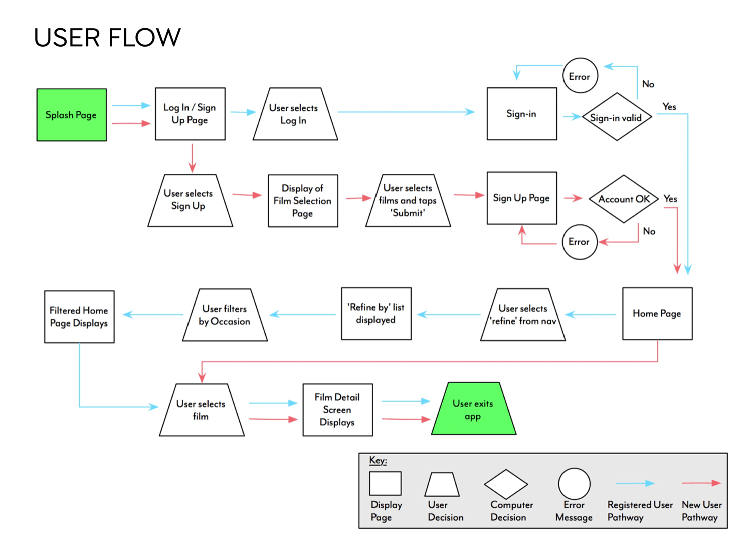
Green is used when the user enters and exits the web app. Blue and red reflect the alternating flows the user can take depending on whether they log in or sign up. Rectangles represent screens and actions, whereas user decisions are clearly distinguished from computer decisions.
Design user flows and hi-fi prototypes with Justinmind

Did you know that you can create user flows in Justinmind with the Scenarios module? To do so, you have two options: you can either create a user flow using shapes or screens from existing wireframes and prototypes that you create in the User Interface module.
You can get to this feature in justinmind by clicking on the dropdown arrow beside “User Interface” on the top right of the screen and clicking in the scenarios module.
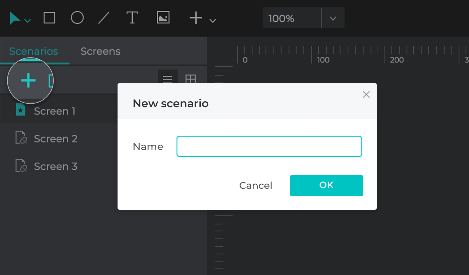
This will then open up a canvas where you can drag and drop the following components:
- Actions
- Screens
- Decisions
- Notes
- images
You can link these features up using the transition arrow icon from the top menu bar. You can also import your wireframe and prototype screens to add to your user flow.
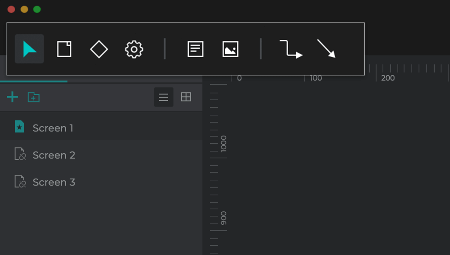
To create user flows with your wireframe screens, just open your wireframe or prototype file and select the Scenarios module. The scenarios canvas will open up and you’ll see your wireframe or prototype screens in the Screens panel to the bottom left of the screen.
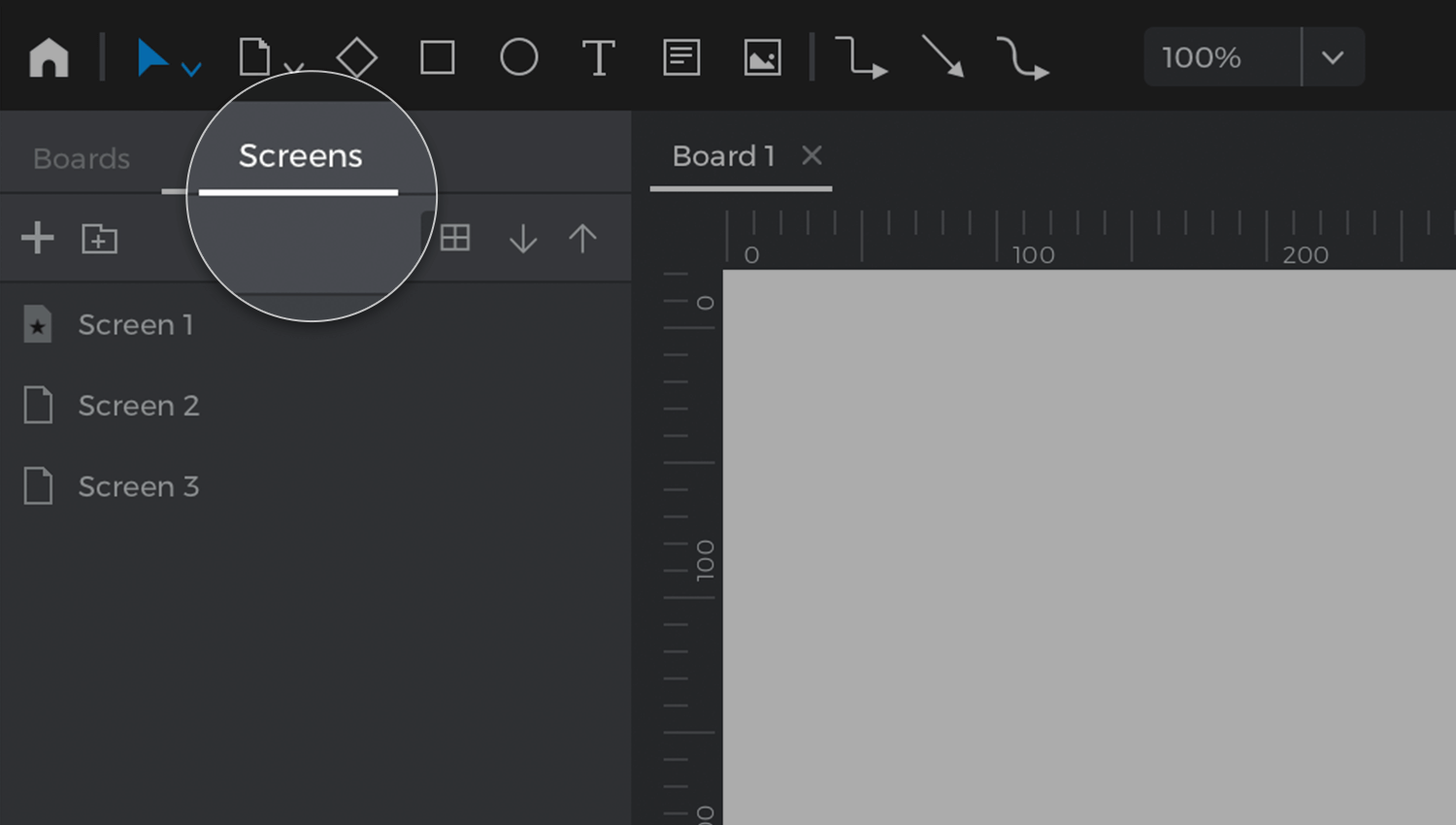
When you link up screens with transition arrows, if you haven’t already added in the appropriate link interactions in the wireframe or prototype, an error symbol will appear. Don’t fret! All you have to do is go back to the User Interface, add in a simple click interaction and the symbol will disappear.
When you create your own user flows and wireflows in Justinmind, you can also simulate them! Just hit the simulate button in the User Interface module, click on the hamburger menu in the simulation and click Scenarios. Then select the scenario you want to simulate. You should be able see your user flow in the simulation window. Click on the first screen and let the show roll on!
The best thing? Like all features in Justinmind, the Scenarios feature lets you collaborate with your team via the comments and requirements window at the bottom of the Scenarios canvas.
User flows help us focus on user-centered design, to create a consistent experience for the user with the minimum friction possible. But they also help make the designer’s life easier as well because they save time and money.
User flows help us to identify any possible problems before we start designing high fidelity screens and prevent re-designs after the product has entered the development stage. They also force us to consider the easiest way for a user to complete a task and to consider alternative flows, leading to the best user experience possible.
In short, to map out a user flow is to shine a light on the path to UX success. All the more reason to start making one before you begin your next design!
