Best UX tools to help UX designers build better prototypes and products with data visualization UX
OK, UX Designers – get ready for some big numbers. According to IBM, 2.5 quintillion bytes of data are generated every day. That’s almost 50,000 GB a second. Or the equivalent of 10 million blu-ray discs stacked vertically, reaching 4 times the height of the Eiffel Tower (thanks Ben Walker for the handy infographic). They don’t call it Big Data for nothing.
This quantity of raw information poses a problem for the human brain. Cognitively, we just can’t process those kind of numbers. You can say quintillion (maybe), but you can’t see it in your mind’s eye.
For data to be meaningful and impactful, it has to be distilled into visual form. UX Design is one of the fora directly impacted by the data glut, so UX Designers have to be on top of their visualization game when using a prototyping tool. A great way to emphasise key UX findings or activities with with visualization: presenting data visually to users and internal stakeholders will reveal previously unseen patterns.
What is data visualization?
Data visualization (data viz to aficionados) is simply the act of visualizing a data set in a way that can be easily understood. We’re all familiar with simple visualizations such as bar charts and timelines. Increasingly, data viz designers are souping up these simple graphics into interactive visualizations and multimedia experiences, such as with dashboard design.
Whether static or interactive, data visualizations help us understand information faster and often reveal insights that would otherwise have gone unnoticed. Also, there’s no arguing that visualized data is more attractive and digestible than a ton of grey stats.

Why do UX Designers need data visualization UX?
UX Designers have access to more data than ever before. This is great when it comes to product development, but UXers have to ensure that they get real insights from the data glut. Data visualization can help UX Designers understand trends over time and space, and find design solutions based on fact, not feeling. Data visualization can work for UX Designers in two main ways:
- Data visualization to inform the design process: UX Designers collect and collate data to improve the design and development of a product. Eg, UX reports
- Data visualization to inform the user experience: UX Designers design interfaces that will allow users to visualize and contextualize data. For example, a tool dashboard
Once data is visualized and contextualized into journey maps, infographics and charts, you can start to prototype solutions. Luckily, Justinmind allows you to incorporate real user data into your prototypes! Find out more about data-driven prototyping with Justinmind here.
Why not check out our charts UI kit? It’s full of the UI elements and components you need to design intuitive dashboards a matter of minutes.
Additionally, read these tutorials to learn how to create and populate data masters and display data master records in your prototypes.
Data visualization UX tools for UX Designers
There’s a huge range of data visualization tools out there to help UXers get a handle on information. From the basic bar chart to interactive timelines and complex visual mappings, these 8 tools have got your UX data visualization needs covered.
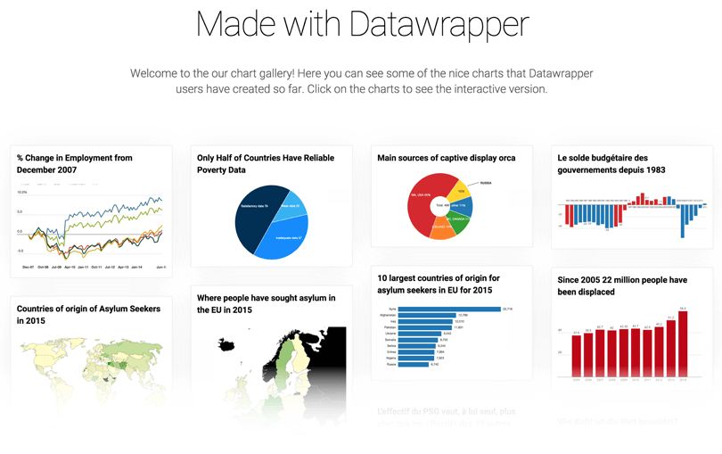
Datawrapper
Datawrapper sells itself as helping you “add the power of data to your stories.” This focus on graphics as part of a larger narrative has made Datawrapper a favorite tool for media types, and makes it perfect for UXers looking to create internal reports as well.
The app is as simple as Charted but gives you more flexibility in the type of visualizations you create – just upload online or CSV file data, select the type of chart you’re looking for and that’s it. Datawrapper churns out the graphic and the CMS-ready embed code. You can even add branding to the visualizations – perfect for UX agencies using graphics with clients.

Tableau Public
Tableau is a popular visualization tool among non-developers, and it’s not hard to figure out why. Even the application’s free version (Public) has a huge range of flexibility and power – bubble maps, heatmaps, scatter plots and more can be created without coding or a design background.
While using Tableau Public is easy when you know how, there definitely are some elements that take effort to master. Luckily the application offers both solid support and sample visualizations that help newbies get going. Once you’ve built the visualizations they can be embedded into a webpage or built out into a report.
Timeline
As you probably guessed from the name, Timeline is all about… making timelines. The open source tool allows beginners to make a Timeline with just a Google sheet of data, while those familiar with the tool can customize their outputs with JSON. The timelines are interactive – add videos, audios, maps or social media materials to encourage dynamism and interactivity. Timeline would be great for mapping user journeys over a product lifespan or activities during the UX design process.
Plotly
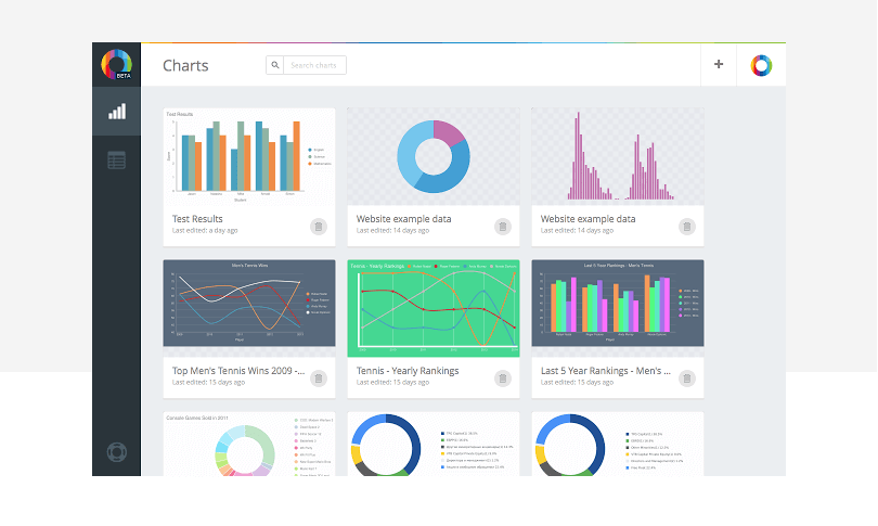
Plotly allows users to build charts right there in their web browser. There is a substantial number of chart design options, although some – such as satellite maps – are available only for paying subscribers. The app interface is super clean and friendly looking: to make a graphic all you have to do is upload the information you want to visualize and play around with the layout and legend. The resulting graphics come out looking professional and comprehensive. If you’re not feeling inspired then check out Plotly’s gallery to see what you can do with the tool.
Chartist
If you’re pressed for time then Chartist is a great little data visualization tool. It’s super simple – it lets you create custom charts in a few moments with a simple UI. It doesn’t depend on DPI, and is customizable with SaS. Chartist offers responsive configuration and offers media queries configuration as well. Users can enjoy all sorts of animation and all but endless possibilities in chart behavior.
ChartBlocks
Another quick and easy data visualization tool, ChartBlocks allows you to combine data from multiple sources into one comprehensive graphic. There isn’t a great range of chart types to choose from, but you can export the visuals to SVG or PNG. Perfect for use in Justinmind later on!

RAWGraphs
“The missing link between spreadsheets and data visualization”, RAWGraphs lets you upload spreadsheet info and convert it into the kind of graphics that are tough to produce with other tools. The gallery page is chockfull of awesome, inspiring data visualization examples that will have you itching to get started.
InstantAtlas
UXers who need to create visuals with mapping, look no further. InstantAtlas lets you create interactive, kinetic reports based around statistics and maps. The tool works on servers, browsers or desktop and gives users the power to geographically contextualize complex information in a dynamic form. Great for mapping global usability testing trends.
Data visualization UX tools for UX Designers: the takeaway
UXers rely on data to make important decisions throughout thew UX design and development process, from validating solutions with stakeholders to understanding user trends. These 8 data visualization tools will help UX designers make their data comprehensive, comprehensible and compelling.
Related Content
 Why should you use user personas and how do you create them? Get all the steps to build one, as well as a great example and a list of user persona generators!15 min Read
 UX design books that cover everything from layout design to the theory of user testing. Want to expand your horizons? Check out this awesome list!9 min Read
 UX design portfolios are your chance to showcase your top skills and best work. Check out this post for awesome portfolio examples and websites!10 min Read


