An understanding of gestalt principles can help UX designers create websites that influence user behavior and give an intuitive and visually pleasing user experience
Creating a good user experience is at the heart of UX design. UX designers have many tools to hand when it comes to putting together a website or a mobile app that users enjoy. Each UX designer has their own way of tackling a design problem. Some may be experts at sketching or creating interactive prototypes in Justinmind, others might know Sketch like the back of their hand. Either way, the Justinmind-Sketch integration has something to suit everyone!
However, there are other less obvious tools that designers can use when it comes to improving user experience. Tools that aren’t confined to a laptop or computer. One such tool is gestalt psychology. According to Andy Rutledge, there’s no tool as powerful as understanding these principles.
Many UX designers have a basic understanding of psychology, the brain and why we perform tasks in the way that we do – such rudimentary knowledge is necessary to improve our ability to design and solve problems. Gestalt psychology, however, deals with the theory of visual perception and this theory can be put into practice so you can design user experiences that are intuitive and rewarding.
What is gestalt theory?
Gestalt is a German word that means shape or form. Gestalt theory came to prominence in the early 20th century when German psychologist Max Wertheimer observed that a series of blinking lights created the illusion of motion. Theaters and cinemas use this very tactic to create the illusion of lights racing around the titles of their productions on marquees.
What this illustrates is that we humans recognize the whole of something in lieu of its individual parts. It’s not so much that the whole is the sum of its parts but that the whole is something different from its individual parts. We perceive a singular light in motion instead of a set of multiple lights individually turning off and on.
It makes sense. Our brain is designed to see structure and patterns for us to understand the world we’re living in and we’re the best at it, according to Dominic Basulto.
While the impact of this may not be immediately obvious, understanding human perception can play a big role in creating good user experiences – essential for any mobile app or website. Good UX design with proper perceptual structure makes it easier for people to understand and interact with the user interface of your website wireframe.
Gestalt principles
There are six cognitive principles at work when it comes to visual elements in a group. These cognitive principles can influence greatly our arrangement of visual information within UX design and they can be used to understand how and why visual information can be misinterpreted by users. By reflecting these principles in your design from the beginning, even if it’s just a paper prototype, you’ll deliver a much better final product. These are a wonderful way to enhance the experience and ensure you don’t stray too far from the basic UI design principles.
The six cognitive principles are:
- Closure
- Continuity
- Similarity
- Common fate
- Figure and ground
- Proximity
What do these principles mean?
Closure is the principle that people perceive objects as being whole when they are incomplete. When parts of an image are missing, our brain does the rest by filling in the blanks to complete the image. The IBM logo plays on the principle of closure.
Continuity states that once something is introduced as a series, the mind will perpetuate the series. Our brains link things that form a predictable pattern and our eyes will naturally follow the smoothest path.
The principle of similarity suggests that elements which are similar tend (color, shape, quality etc.) to be grouped together and seen as part of the same form.
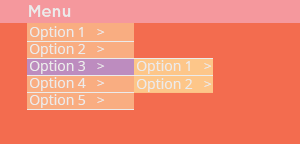
Common fate is when elements that move in the same direction are perceived as more related than elements which are stationery or which move in different directions. Slide menus create associations between elements on the page which is an example of common fate.
Figure and ground is whereby elements are perceived as either figure i.e the element of focus or ground i.e background on which the figure sits. This principle essentially tells our eyes what to focus on first.
Proximity dictates that elements which are closer together will be perceived as belonging together.
How do gestalt principles relate to web design?
The gestalt principles deal with visual perception. By understanding these principles, you can organize UI elements in your web design to create a pleasurable and successful user experience.
Closure
Many websites use the principle of closure using positive and negative space, contrast and color. Icons, especially, make use of closure.

For example, this email icon looks like an envelope because it uses positive and negative space to create the illusion of an envelope when in fact the envelope is a variation of 3 triangles and 2 joined together positioned in a way to create the illusion.
Our prototyping tool‘s automatic alignment feature lets you quickly adjust and define relative spacing between elements on a screen. Screen templates then let you use the same screen layout throughout your prototype.
Closure is great if you want to highlight a message and improve the flow of your web design, according to Alan Smith.
Continuity
Since continuity deals with how our eyes follow the smoothest path, this can be used in areas of web design in the form of menus or lists. Navigation menus, for example, rely on continuity. Continuity helps with the hierarchy of a website and guides the users’ eyes in the right direction. Elements arranged in a continuous line will be perceived as a unit.
Similarity
The human eye makes relationships between similar objects and so similarity is a good way to tell users what is the most important UI element on the page, where to put their focus and what action to expect.
The principle of similarity can be applied to content, links and headers. By using colors and shapes we can help the user distinguish different types of content. Links should always be uniform and usually in blue – without similarity, users may have an unsatisfactory user experience and leave your site because of poor UX design. Not fun!
Common fate
Common fate principle is seen in drop down menus which move in the same direction.

We perceive elements that move in the same direction as being related and so when you click an option in a navigation menu, for example, you know that those elements within the menu are related because of the movement.
Figure and ground
In web design, the figure is something distinct from the ground. When we design, we want the figure to be prominent and demand attention. A bold call to action button on a minimal page with white space is a good example of the figure and ground relationship. There’s plenty of benefits to using white space too, with minimalist websites taking it to a certain extreme. To create distinction between the figure and ground use bright colors, blur the background and focus on the position of the UI element you want to draw attention to.
Some styles have an edge approach to minimal design and really push boundaries. Neumorphism is a good example.
Proximity
White space can be used to create proximity and it’s a key to successful user interfaces. If you imagine an empty space with random circles place on the page, your mind will perceive these elements as unrelated. However, when you place all the same circles together, uniformly, then the mind will see these as related.

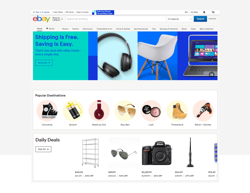
In web design, proximity and similarity work well together, as complementary – this can be done to create stronger relationships between different UI elements. A good example of this is above on the eBay page above under the ‘Popular Destinations’ content grouping. Notice how the navigation bar uses the principle of continuity, and the content boxes use the principle of similarity to break up the content.
Prototyping using the gestalt principles
In Justinmind, it’s really simple to design a high fidelity prototype using the gestalt principles. Our ready made, drag and drop content blocks include UI elements such as lists and navigation bars that can be used to create continuity in your interactive wireframe. Our customizable buttons means creating a call-to-action that gets all the right attention, ticking the Figure and Ground box. And put your Common Fate knowledge into practice with our menus, menu items, data lists and dynamic panels.
Conclusion
A firm understanding of gestalt theory will equip any UX designer with the necessary knowledge to create interactive prototypes and websites that are both visually pleasing and balanced. By analyzing the space and positioning elements using the gestalt principles, designers will be able to design in a way that is effective and efficient.
Related Content
 Why should you use user personas and how do you create them? Get all the steps to build one, as well as a great example and a list of user persona generators!15 min Read
 UX design books that cover everything from layout design to the theory of user testing. Want to expand your horizons? Check out this awesome list!9 min Read
 UX design portfolios are your chance to showcase your top skills and best work. Check out this post for awesome portfolio examples and websites!10 min Read


