Modal windows are a great way of grabbing your user’s focus and providing important information. Here are 5 essential best practices for getting them right
Whether you love them, hate them or simply ignore them, the modal window is a useful tool. It helps get user’s attention, encourage user participation and provide them with relevant and specific information.
In this post, we’re going to uncover what the modal window is, when to use it and go through 5 essential best practices for designing your own with your prototyping tool.
What is a modal window?
If you’ve ever tried to save a file or exit a document without saving then you’ve interacted with a modal window. They’re fairly common in UI design and can be used when the user is forced to make an important decision.
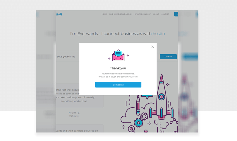
In simple terms, a modal window (or modal dialog) is a dialog which appears over the main content of the user interface and requires action from the user. The modal window will usually appear after the user has already carried out an action.
That action can be but is not limited to:
- Closing multiple tabs in your browser
- Exiting an application without saving
- Doing something that is irreversible i.e “Are you sure you want to permanently delete these 5 items?”
When a modal window appears on the screen, the main application window will often be disabled (it has changed the mode of the user interface) because the user must interact with the window in order to return to what they were doing.
When to use a modal window?
There are times when you’ll want to make use of a modal window in your websites and mobile apps.
• Getting a user’s attention
If you need to draw attention to an important piece of information then a modal window can help. For example, your virus scanning software may have a modal window pop up to tell you that it’s ready to scan for update or maybe you’re about to close an application without saving.
Although, Raymond Chen wrote that this is a problem because many people are scared of the dialog box. People are afraid to answer the question in case they answer it incorrectly. Most people’s go to response is to click “Cancel” as a result of habit.
• Getting input from your users
You can use a modal window when you need the user to input information, especially if that information is necessary in order to continue using the interface. Usually in the form of a sign-up or log in dialog. However, on mobile it might be easier to create a separate login and sign up page for the sake of space.
• When you need to ask for information which could lessen the users’ work or effort
Models work especially well if they’re used to get information to make the user’s’ journey a little easier.
Let’s say you want to apply for a loan through a banking website. As you click the loan application, a modal window could pop up to ask whether or not you own your own home.
This information could be helpful for streamlining the rest of the process, preventing the user having to fill out a whole chunk of information relating to their mortgage, for example.

Image credit: Anna
5 essential best practices for designing modal windows
Getting your modal window right in your prototypes is important. You want to avoid the habitual click of the cancel button from your users while keeping any distractions or frustrations to a minimum. Follow these simple guidelines when you make your own.
Feel free to check out our list of awesome wireframe examples for some more inspiration. For a more general overview of the design process, check our full guide to wireframes.
Pre-qualify your modal window
You should present your modal window only after an appropriate pre-qualifying event so as to avoid any confusion and disruptions to the user flow. Closing your document without saving is the pre-qualifying event for the modal window asking you if you wish to save your work. This kind of validation comes into play somewhere between low and high-fidelity prototypes.
If the modal window appears at random without the user having done anything then there will be no context for the window. Most likely the user will want to close the window without looking at its content so that they can return as quickly as possible to what they were doing before the interruption.
Use modal windows sparingly
Ideally, you want to keep modal window use to a minimum. Therese Fessenden writes that modal windows can cause users to forget what they were doing.
This disruption can create additional cognitive load and make the user forget details associated with their original task. If there are too many modal windows in your mobile app or UI design then your user is going to be in for a hard time.
Design modal windows responsively
UX designers should be designing responsively. When it comes to modal windows, we’re talking about ensuring that it works well on desktop and mobile. If your modal window isn’t designed with mobile in mind, this can hurt usability.
Bear in mind is that users can get frustrated with modal windows, especially if they encounter them while browsing on mobile.
75% of people rely on their thumb and 49% of people rely on a one-handed grip to get things done while on their mobile, according to a study conducted by Steven Hoober.
The limited real estate isn’t forgiving when it comes to modal windows, which can be quite large and require awkward scrolling around. Not a great user experience.
Why not save the hassle of designing your modal from scratch and choose one from our many UI kits to use in your prototypes?
That is not to say that you shouldn’t use a modal window on a mobile phone, it’s just if you’re going to then it’s best to make sure it’s designed responsively.
Ensure visual coherence
When designing a modal window, you want to make sure that it looks and feels like it’s part of the parent application which it’s blocking out.
If the modal window wildly diverges from the rest of the interface, whether that be aesthetically or in copy, the user might ask themselves it it’s spam. This can make building a trusting relationship with your user much harder.
Avoid using a modal window for mailing list pop-ups
It’s quite common in web design to visit a website for the first time and be struck with a modal window pop-up asking you to sign up to a newsletter.
Of course, companies want to get users to sign up to their newsletter but doing it in this way can damage trust. Plus it’s annoying. The user has had no time to get any value from the web page so why would they want to sign up to your newsletter?
Modal windows should provide only essential information related to the user flow. It isn’t a user’s goal to sign up to a newsletter the moment they reach a website.
Conclusion
There is debate out there on it’s better to incorporate the content of the a modal window into a page instead of creating an interrupting window. Whatever side of the debate you’re on, it appears the modal window isn’t going anywhere fast. So, if you’re tasked with having to create your own follow our best practices to stay on track.
Related Content
 Why should you use user personas and how do you create them? Get all the steps to build one, as well as a great example and a list of user persona generators!15 min Read
 UX design books that cover everything from layout design to the theory of user testing. Want to expand your horizons? Check out this awesome list!9 min Read
 UX design portfolios are your chance to showcase your top skills and best work. Check out this post for awesome portfolio examples and websites!10 min Read


