Ten helpful guidelines for user-friendly website form design – design online forms that won't have users running away.
Forms may not be the most exciting part of web design, but they sure are important. After all, forms help users send information to sites or apps in order to achieve their end goal. That could include signing up for a new service or sending a product review – forms are a bridge between user and product.
Start prototyping and testing forms today with Justinmind

Your users should be able to complete forms quickly and easily. Spending long minutes filling out a form is no one’s idea of a good time, and your product’s UX will depend on users being able to reaching their goals while still enjoying themselves. Not following web form guidelines opens the possibility of your forms being confusing, chaotic and hard for users to navigate.
Spending a little time reviewing your form design could do wonders for your site’s usability, user experience and conversion. Here are ten important lessons for UI/UX designers who want to perfect their web forms.
If you’re looking for some inspiration, feel free to check out our list of awesome research survey examples.
Before we get into the common pitfalls UX designers tend to succumb to when dealing with web forms, let’s go over two basic concepts that are crucial.
- Interaction cost: filling out a form requires quite a bit of mental effort on the behalf of the user. And while there is little physical effort involved, even the cognitive effort users need to invest in some forms are a bit too much – those are the forms users abandon halfway through.
- Perception of complexity: from the get-go, when users first take a look at your web form they will try to analyse the amount of questions, their format and wording to try and estimate how complex the form really is. The more complicated it looks, the more users will walk away without even starting the form.
Ultimately, you want to bring the interaction cost down to a minimal – which is just another way of saying you need to make the website form as easy as possible on the user. Don’t make them break a sweat.
On a similar note, you want the perception of complexity to also be down to a minimum, even if your form is of a complex nature. Users already expect to suffer when completing forms, but being confronted with a form that looks like it’s directed at a rocket scientist is a massive discouragement – something your users can do without.
With the following guidelines, we’ll always aim for the same outcomes while employing different tactics. Some tactics can contribute to both of these goals, such as breaking up the form fields into sections, which makes it easier for the user to understand while also giving the appearance of a simpler task. A win-win.
We also recommend the use of a professional prototyping tool, so you can make the most of the testing of your web form before it is released. You can also check out our one-stop-shop for everything you need to know about creating a prototype.
Let’s start off with a classic and yet challenging rule of thumb in web forms: less is more. And you don’t have to believe us! Just check out what Expedia went through when they made a small change to their checkout website form design.
When taking a closer look into why many customers found the perfect lodging option only to abandon checkout before the actual purchase, Expedia was surprised to find what had users ready to walk away: a single unnecessary and confusing form entry. You can read all about how and why that was the case on the article How one extra field can cost 12M USD, but the bottom line is quite simple:
Upon deleting that field entry, the company experienced a surge in revenue of 12 million USD. How’s that for a sales hack? And, the best thing about what Expedia discovered was that the field in question wasn’t at all required for the purchase – it wasn’t even mandatory. But it was there, and users didn’t appreciate it.
Tip: Every additional field entry you add to the website form, means a certain number of users you automatically lose - the trick? Finding the right balance for you.
Users don’t like filling out web forms, and the number of fields is a key factor in how people make the decision of committing to the purchase (or any task), or abandoning it and looking for an easier alternative.
You want to be very selective of what you ask users as you design your web form. Ask the bare minimum, so that users can achieve their goal quickly instead of experiencing boredom and losing momentum when faced with a form with 30 field entries.
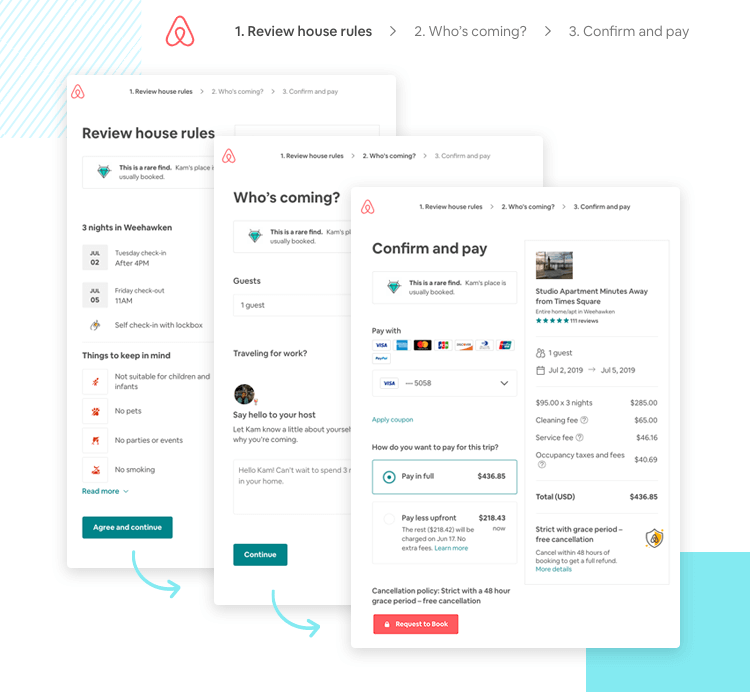
However, sometimes long forms can’t be avoided. Whether it be when users are signing up for a complex service or product, or something that legally requires a lot of information – sometimes, there’s no escaping the dreaded long form. When that happens, the best way to tackle website form design is with stepped forms.
Stepped web forms allow you to break up your forms into sections, and if necessary, different screens. Use drop downs or multiple choice with radio buttons instead of custom fields to help users get through lengthy forms quickly and efficiently.
You may also want to include a completeness meter or progress bar to show users how far along in the form they’ve come.
Now we all know that you should try to limit the number of field entries in your web form – let’s take a look at how you ought to present the entries that make the cut to users. The entry fields should follow a logical order in the eyes of the user, which decreases the risk of people being confused by your form.
Consider what an effective website form design is. It is a way for your product or the company behind it to gather, process, and store data from users. If a user gets lost or bored and abandons the form before submitting it, the web form has effectively failed – while potentially costing you a user and client.
A nice trick to have in your sleeve is presenting the form in a certain way, so that users can go through the entry fields like they would if a real person were asking them questions. In a way, you want the form to read a bit like a conversation – which means that asking someone for their postal code before asking them their name is a no-go.
Group field entries together based on their topic, and leave the tough questions for last. The reason you want to group questions together is so that those very questions offer context to users – so even if they don’t get the questions, they are likely to deduce it.
As an added bonus, by creating sections within the web form, users feel like they have achieved something as they progress along the different sections of the form.
Now that all the field entries of the web form are presented in a way that helps the user get through them quickly and logically, let’s look into why you ought to leave difficult questions to the very end of your web form.
It boils down to Dr. R. B. Cialdini’s 6 principles of persuasion, which he explores in his iconic book “Influence: The Psychology of Persuasion”. Cialdini found that people are much more willing to go through with a task if they have already committed some time or effort into it. A person who just spent 10 minutes filling out 3 pages of field entries – it would make sense for the user to hesitate to abandon it all in the last minute.
Known as the principle of commitment, this means that you need to lure users in so they invest some time into the form – even something small, that takes only a few seconds.
While this can be more or less true depending on what kind of user will be filling out your forms, it is a general rule of thumb that you want to give people as much context as you possibly can. This is due to the simple truth that people are easily confused or lost – even if your users consist of tech-savvy 17 year olds, you still want to make sure no one gets left behind.
In short, web forms need labels outside the entry fields – and it should be a sign that users can follow and identify what kind of information the entry calls for. Having confused users is a very short step away from annoyed users. This could either result in users leaving the form before completing it, or completing the form with inaccurate data – both of which are conversion killers.
On a similar note, you can (and should) use placeholders for added clarity. Placeholders provide direction to the user, telling them what information is needed from them. You can use place holders to convey the type of information or the format the data needs to be in – such as a birthdate: DD/MM/YY or DD/MM/YYYY.
This might seem like a silly distinction, but it could make the difference between the user entering the wrong format and being confronted with an error page – keeping the user from advancing towards their goal – or simply moving on towards finishing the form without any added frustration. This, in turn, leads us to the next guideline: validation.
Start prototyping and testing forms today with Justinmind

Like we mentioned before, forms need to offer all the context they possibly can. Since forms don’t really respond to users in the way a human would, the conversation between user and form tends to feel a bit like a monologue to most users.
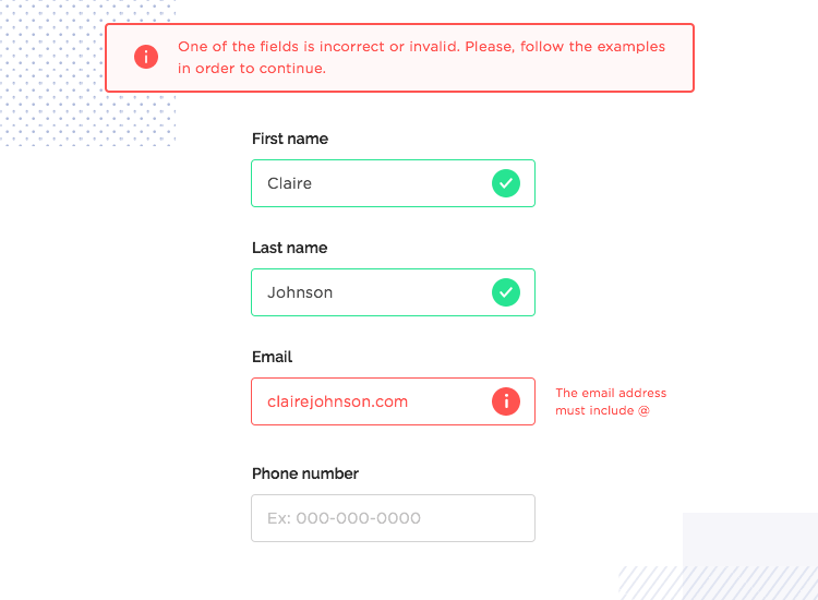
In order to curb the feeling or talking to oneself, and to eliminate most of the risk of users feeling confused or even frustrated, designers can use assistance and inline validation. And while these two are slightly different, they both have the same goal. Their aim is to illuminate users as to what they need to do, or point out where and how the user went wrong.
Assistance takes place in any helpful insights the designer wishes to provide users as they progress in the form. They can be another element on the webpage, a permanent presence that offers some hint or note for users to bear in mind.
On the other hand, inline validation is a type of response the form has when the user introduces a wrong type of data, or the wrong format in the web form. This can be done in a number of ways, and most platforms have their own type of inline validation – the most common of which is a red text under the entry field that shows the data isn’t valid.
Part of why implementing these elements is helpful is that people prefer to know they have made a mistake on the spot, rather than waiting until they try to move on and find they can’t.
Input controls allow the user to carry out a certain set of actions, such as selecting a file from their device, or establishing their preference when it comes to receiving weekly emails. They serve an important role for the form to work, and come in many shapes and sizes.
UX designers can use elements such as checkboxes, dropdown menus, or radio buttons to allow for users to carry out the actions the website form calls for – but they aren’t without controversy. The most common example is the everlasting debate on the use of checkboxes.
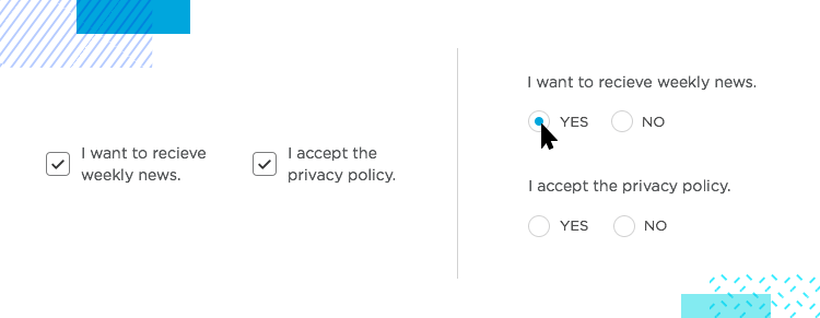
Ideally, checkboxes are the element to use when giving users multiple choices that can be selected simultaneously – and they work just fine for that.
The issue many designers have with checkboxes is that if you use them in your form in order to establish consent or permission, they can be quite ambiguous. After all, pre-checked checkboxes could have been simply overlooked, as unintentional subscribers to magazines will tell you. On the other hand, some types of pre-checked boxes might even be illegal, as is the case for privacy settings within the EU.
That’s why many designers are firm believers in replacing checkboxes with radio buttons, whenever possible. This leaves little wiggle room for users, and leaves us with trustworthy data regarding user’s answers. You could also use a picklist in a dropdown style.
You can read all about the debate in our blog post UI battle between checkboxes and radio buttons and get to know these classic elements a little better.
In your effort to make your form as easy to fill out as can be, you want to make sure users can immediately tell which field entry they are typing in at any given moment.
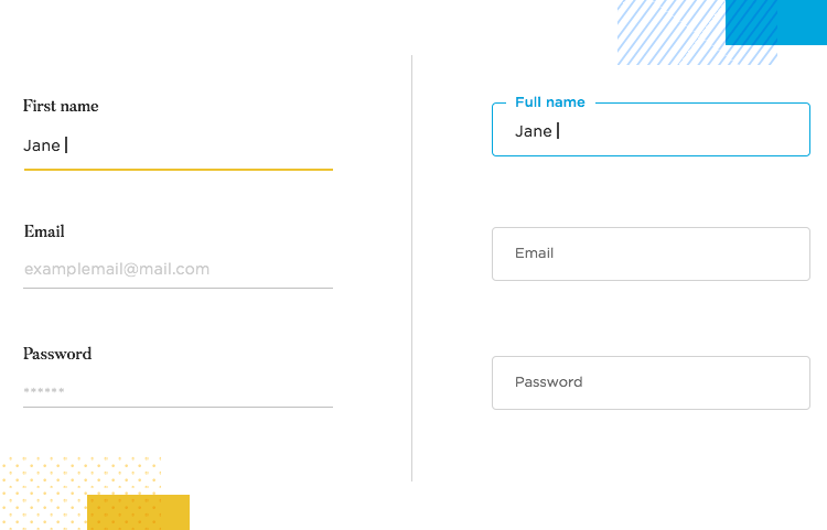
Field focus should be a visual cue – such as changing the color of the border or background of the selected input field, or simply showing the cursor in the input field. Think of it as a hint you leave users regarding where they are.
A nice way of going about it is automatically activating the first field in the form, so users know at once where to start. While all platforms apply their own brand identity and style to their autofocus, the important thing is that you help the user find themselves within the web form at all times.
Start prototyping and testing forms today with Justinmind

We all know filling out web forms is far from exciting – we’ve all been there. One of the many ways you can make this tough task easier on the user is to offer the user a little help when completing the form – users tend to appreciate autofill.
An online lead generation solution, Formstack, released a report on form conversion in 2015. In the report, they found that simply by implementing social autofill, conversions went up to 189%. How’s that for a powerful force of conversion?
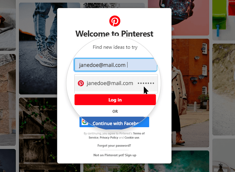
Google has a very useful walkthrough of how you can use Chrome to apply user’s saved data to the form, and save the user the time and effort – it’s right here on their post “Help users checkout faster with Autofill”.
Many common attributes you can involve autofill in include things such as email addresses, names or phone numbers. Autofill in website form design is not without its dangers as well – security and data safety are two major concerns – so you definitely want to get this right.
Humans make mistakes – there’s no avoiding that. Sometimes, people will make typos or get certain fields mixed up or get the format wrong.
Yes, as the designer you can configure the entry fields to adapt data into the right format – but you can only go so far. Sometimes, the system itself will experience some sort of issue and fail to submit the information. In all these cases, it’s important to have a good error message in place.
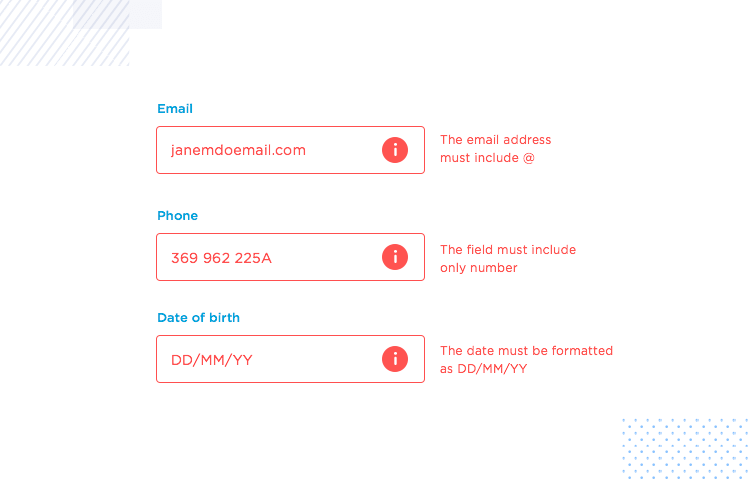
It can be very frustrating to dedicate time and commit to a task, and have someone tell you there’s something wrong just as you thought you reached the finished line. Precisely because of that, tactics such as inline validation enjoy such popularity.
But aside from letting users know straight way when a mistake has been made, you also want to have proper error messages for all types of situations that could go wrong. Logically, the type of message can vary greatly depending on the type of error – but the bottom line remains the same for them all. They need to be helpful.
When it comes to error messages, having clear and coherent microcopy is key – but we’ll get to that later on.
Don’t just tell users they did something wrong – which can feel a bit like salting a wound – tell users what is wrong. Give them the exact formula to make it right. And so, instead of letting users know their email address isn’t valid, tell them they need the full email with the @ sign and correct domain.
You can read a more in-depth post of ours on How to design error messages to know more about the topic.
Buttons are going to direct your user to the next page of the form, or let them know they’ve reached the form’s end and can accomplish their task. Whether it be signing in, changing a password, or checking out – button design is important and deserves its due attention.
As a whole, there are a few well-known basic rules of button design, which can include things such as making sure your button looks clickable. All of these rules apply when it comes to website form design, however we do have a few aspects of button design that have even more importance here.
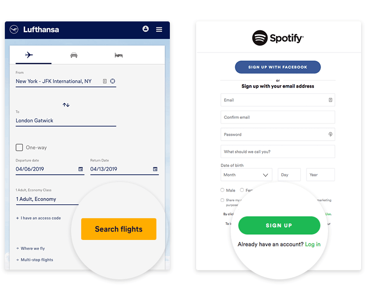
A key part of the button design in your form is that primary and secondary buttons need to be easily identifiable. The primary button tends to be the control to submit the information or achieve the task, while the secondary button tends to be related to support. Consider the login web form of any platform. You’ll find “Submit” and “Cancel”. Aside from the microcopy, both buttons need visual distinctions in order to avoid confused and frustrated users.
As to which buttons to have: consider having a “back” button only for long forms that have several pages – and ensure this button in particular is clearly different to the primary “next” button.
Another important aspect of buttons in forms is visual feedback. Remember that users need to know if the system is working properly, which makes it important to let them know the system status. A handy way to achieve this, is by using microanimations that let the user know their pressing the button has been registered by the system.
We mentioned this above, but what the heck – it’s so important we wanted to make this as clear as possible for everyone. Copy is absolutely crucial for clear communication, and it applies to every piece of text users see in your website form. That includes not just the buttons, but also labels, placeholders, actual questions, any assistance elements and so on.
“Forms are a words-based interaction. So how the question you’ve asked and what information as help you give and what the buttons say really matters most.”
Jessica Enders - Designing UX: Forms: Create Forms That Don't Drive Your Users Crazy
Not attributing the correct amount of attention and care into the microcopy of a form tends to lead to vague labels, meaningless placeholders and buttons users have to try out in order to understand. Like other aspects of the product, the wording on all elements of the web form matter.
Always use the desired result as opposed to the action the user will take. The most common example of this tactic is the use of “Subscribe to newsletter” as opposed to the basic “Submit”.
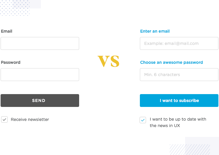
Another good guideline when writing the form copy is to be specific and give the details to the user. This will lead to a faster completion time as users will be more likely to get things right on the first try, improving the efficiency of the form and the experience of the user.
As an example, consider a checkout form with an input entry field with the label “Name” – now imagine a similar form that reads “Name as on card”. Which is more likely to get users past the page on the first try? Or a label that says “Insert card number with no spaces”.
Yes, most of these are fairly simple, and it’s unlikely that all your users will be lost without the added detail that stipulates they aren’t meant to include any spaces in the card number. The important thing is that some of them might be – and you want to offer a good user experience to every single one of your users.
Just because filling out forms doesn’t fit anyone’s idea of fun doesn’t mean that web forms have to be terrible.
As the designer behind the whole thing, there are a lot of things you can do to make the whole experience easier, quicker and more enjoyable than most users would imagine – it just takes attention to detail and the imagination to create a design that leaves no room for doubt or interpretation.
Now that you got all the basics covered, it’s time to put all these guidelines into practice and deliver forms your users won’t suffer with!
