This is a guest blog post written by Amanda Cline. Apart from working as Developer with Xicom Technologies Ltd – a leading Mobile Application Development Company, Amanda has a flair for writing and dancing. She strongly feels that internet has changed our lives and we can use it as a great medium to share our knowledge.
Plethora of devices blurs the focus!
Speaking of trend in devices, we saw ample lot of Smart (phones, TV, tablet, PC, Laptop, Gadgets, Wearables) that were launched in 2015. Thus, one of the most prevalent trends in 2015 was device proliferation. Further, we had cloud servers that were utilized by applications to sync with devices that catered ubiquitous information to the users, irrespective of the device they are using or the place they are at.
The craze for these devices is increasing with the advancement of technology and as per Nielsen’s U.S. Digital Consumer Report average Americans own smart devices and invest 60 hours on them. People who own different devices, 50% of them use more than one simultaneously and 90% of them begin a task on one and complete it on another. This was one aspect that we were talking about, however another perspective is when the user has only one device. Providing a seamless user experience is not contingent upon the fact that there are several devices used by the user. You need to provide a sublime user experience irrespective of any assumptions.
Responsive is in!
As we know, when we have a lot of things to focus on we tend to lose the quality. Further when we have numerous devices, bifurcated in variety and quality. Design and development focus also deviates to the content and further how to present the content is a subtle manner. Though responsive web design was not a brand new concept, it became a design standard in 2015.

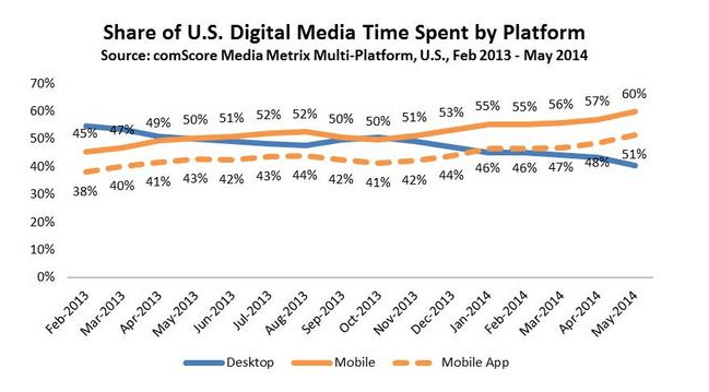
Share of US Digital Media time spent by platform
Source: ComScore
Responsive for Larger Resolution takes on a new focus
Though mobile devices are sprinting very fast, as per a report from W3, we can see that most of the visitors come from a resolution of 1024 × 768 pixels or a higher resolution of 1366 x 768 pixels. Market is flooded with devices of higher resolution, thus designing app that suit well on screens of high resolution becomes a major concern. Your website must be flexible enough to fit on a screen size of 1500 pixel or more. Further, you need to ensure that the quality of the content should remain undisrupted irrespective of the size or resolution of the device.
UX Design ENGAGEMENT TRENDS
Continued Evolution of the Scroll
2015 completely discarded clicking and brought scrolling into the limelight. You may call it the mobile effect but was a sure shot method to enhance the user engagement and UX quotient of your website. To add further, fast processing is one of the extra benefit of scrolling that also helps to retain your audience. This not at all implies that clicking is not necessary for websites, as it plays a pivotal role in easing the flow of information in an eCommerce website, still scrolling has chosen over as it provides easy flow of information without straining the fingers. Further, it reinstates the fact that clicking through pages is less effective in delivering information.
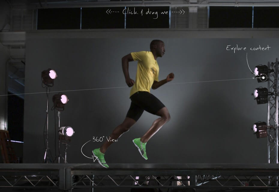
Though there are a lot of websites that have adopted this technique, I would like to mention Puma Mobium. This serves as an exemplary for this design technique and one can learn a lot from it.

Puma Mobium serves as an exemplary for scrolling design technique
Creating a digital story
Gone are the days when we used to read stories, in this busy-as-bee world now is the time to display the stories in a very crisp manner. Interactive narratives were proved as the most workable methodology to hinge conversions as they catch their fancy in the very first go. Interactive story telling pages are statistically proven to have better engagement due to interactive images, videos or we can say that they easily seduce the audience by empathy.
Remember Canada’s award winning Welcome to Pine Point website, which was certainly a revolution in the way we make websites.

Interactive narratives were proved as the most workable methodology to boost conversion rate
Card Design/Tiled Navigation
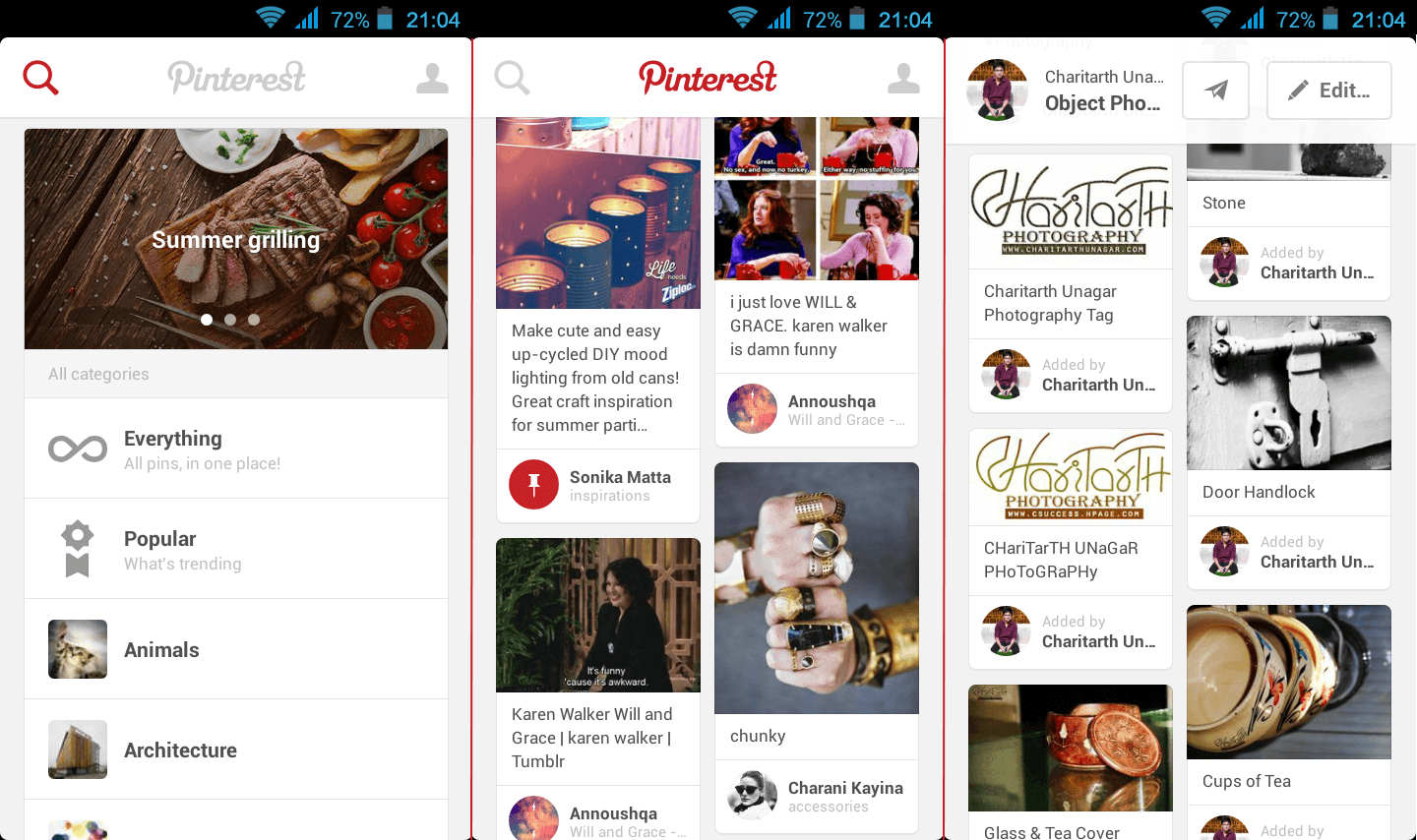
Another trend that became one of the favorite trends across design strategist worldwide was Card design. It was we adopted by websites of all genres, specifically news or social networking, as they seem more fruitful in organizing the plethora of information. Renowned Social networking sites, namely Pinterest, adopted this design style that after this became widely accepted and has proved to be a critically acclaimed website.
This design trend not only intends to properly utilize screen space but made information palatable to the users. This card layout is also one of the most flexible development approach and fits easily on all the screen sizes and thus is one of the best approaches while designing responsive websites.

Renowned Social networking site Pinterest adopts the Card Design style, one of the best approaches while designing responsive websites.
Design Layered Interface
Apart from designing clean layouts, it is advised to design layered interfaces. This gives a 3D look and feel to the smartphone users and enhances the user experience. For getting a multilayer interface you need to keep non active widgets at the back of the screen and active ones on the front.
Using these trends will certainly help you in creating one of the most competitive and fresh web designs. For the best tips and design methodologies feel free to drop us a line.
Related Content
 Why should you use user personas and how do you create them? Get all the steps to build one, as well as a great example and a list of user persona generators!15 min Read
 UX design books that cover everything from layout design to the theory of user testing. Want to expand your horizons? Check out this awesome list!9 min Read
 UX design portfolios are your chance to showcase your top skills and best work. Check out this post for awesome portfolio examples and websites!10 min Read


